Much of what you’re about to read draws on the principles found in Greg Merrilees’ book, Next Level Website Design, strategies that have consistently proven to increase conversions. In this article, we will cover one of the most surprising areas of your website that, when optimised, can produce incredible results.
Why Most Mobile Menus Hurt Conversions, And What To Do Instead..

Imagine walking into a store where every aisle is hidden behind a locked door. Would you stick around?
Probably not, you’d walk right out. That’s exactly what a poorly designed mobile menu does to your website visitors: it hides the very things they came looking for and leaves them frustrated (and likely to bounce).
Too many websites treat the mobile menu as an afterthought, and it’s costing them leads and sales.
Ready to fix that?
In this article, we’ll share real-life case studies from various businesses, from eCommerce to service providers, where a mobile menu makeover led to incredible boosts in conversions.
The results speak for themselves, and by the end, you’ll know exactly how to unlock similar gains on your own website.
Let’s dive in…
What is Mobile Menu Optimization?
Mobile menu optimization is the strategic redesign of a website’s mobile navigation to improve user experience and increase conversions.
It’s not just about “making it look great.” It’s about making it easy for visitors to find what they’re looking for, faster. Here are some common issues:
- Just shrinking your desktop menu
- Hiding everything behind a hamburger icon
- Throwing in every possible link “just in case”
It’s a purposeful, user-first design decision. Think of it as your website’s concierge, guiding every tap, every scroll, every sale.
Why Mobile Menu Optimization Is Crucial
Your mobile menu isn’t just a feature, it’s a make-or-break part of your website. With over half of web traffic coming from mobile devices, your mobile navigation experience is often your visitor’s first interaction with your brand. If it doesn’t guide them clearly and quickly, they’ll bounce… and likely never return.
The Upside of Doing Mobile Navigation Right
- More Conversions – Users reach key pages faster, and friction is removed
When your most important pages are just one tap away, your visitors are far more likely to take action. Whether it’s “Shop Now,” “Book a Call,” or “Get a Quote,” optimized mobile menus reduce the number of clicks it takes to convert. That means higher conversion rates across your entire mobile experience. - Lower Bounce Rates – They don’t give up out of confusion
Confused visitors don’t stick around. A well-structured, user-friendly mobile navigation gives people a clear path forward, no head-scratching, no dead ends. This leads to lower bounce rates and keeps users on your website longer, increasing trust and intent. - More Engagement – Visitors explore more of your website
When your mobile menu highlights the most relevant and enticing sections of your website (instead of hiding them behind a hamburger icon), you increase page views per session and guide users deeper into your funnel. That’s the sweet spot where curiosity turns into commitment. - Better Mobile SEO – Google notices usability
Google prioritizes mobile-first indexing, and mobile usability is a key ranking factor. Optimized mobile menus contribute to a better user experience, which can boost your mobile SEO rankings and visibility in search results. A smoother nav = more time on website = stronger SEO signals.
The Downside of Getting It Wrong
- Users feel lost, frustrated, or ignored
Ever landed on a website and couldn’t find the thing you were looking for? That’s what a poor mobile menu creates: friction, frustration, and failure to convert. You only get one shot at a first impression, don’t blow it on bad UX. - Essential pages are buried or hidden
If visitors can’t easily find your product categories, service pages, or contact info, you’re essentially turning away business. A buried nav link might as well not exist at all. That’s lost traffic with no return. - Cart abandonment skyrocket
In eCommerce, if users can’t quickly jump to their cart, wishlist, or checkout pages from any screen, they’ll quit mid-purchase. Every additional tap is a chance to lose the sale. This directly impacts your cart abandonment rate and your revenue. - You waste your mobile traffic, especially from paid ads
You paid for that click. But if your mobile website greets them with a clunky, hidden menu that’s hard to use, you just paid to send someone to your competitor. A poor mobile menu kills your return on ad spend (ROAS).
Mobile Myth to Bust:
“Everyone knows how to use the hamburger menu.”
Nope. While the hamburger icon is familiar, it’s still less effective than visible navigation options. Studies show users are more likely to engage with visible icons and link bars than with hidden menus. Out of sight, out of mind. That’s why visibility = usability, especially on mobile.
Common Mobile Menu Mistakes to Avoid
Not all mobile menus are created equal, and some do more harm than good. Here are three common missteps we see (and fix):
- Overloading with Too Many Links
Cramming every page of your website into your mobile menu overwhelms users and leads to decision fatigue. Prioritize what matters most, then simplify the rest. - Using Vague Labels
Menus that say things like “Explore” or “More” confuse users. Be direct: “Shop Now,” “Book a Consultation,” “FAQs,” etc. - Forgetting About Thumb Reach
Mobile usability isn’t just about looks; it’s about ergonomics. Important buttons and icons should be placed within natural thumb zones for one-handed use.
How to Optimize Your Mobile Menu (3 Ways That Work)
Let’s shift gears and talk about solutions. Here’s how we help our clients transform clunky mobile navigation into conversion-driving experiences.
1. Show Your Best Stuff, Don’t Hide It
The hamburger menu is useful, but it shouldn’t be your only path to navigation.
Expose your most high-impact links using:
- Top link bars with scrollable product categories or services
- Sticky bottom navs with clear icons like Home, Shop, Search, and Cart
- Promo banners inside the menu for special offers or lead magnets
These make your most important pages instantly accessible, no guesswork required.
2. Prioritize Links Like a Pro
Your mobile navigation should reflect what your users care about, not your org chart.
Here’s how to prioritize:
- Shop/Product Pages – Revenue drivers
- Services/Offers – High-conversion content
- About/Trust Pages – For reassurance and brand story
- Cart/Account/Search – Must-haves for mobile UX
Use Google Analytics or Microsoft Clarity to see where mobile users go, and what they skip. Your most-used links should be most visible.
Stick to 4–6 main nav items max. Don’t make your visitors scroll through a grocery list. Move lesser-used links into a collapsible sub-menu or footer.
3. Make It Easy to Tap & Navigate
This is mobile. Fingers are fat. Thumbs have short reach. Make every element friendly to tap, scroll, and explore.
Best practices:
- Minimum 44px tap target size (don’t make people zoom!)
- Sticky nav that follows users down the page
- Clear, icon-backed labels, no guesswork
- Expandable search bar or floating search icon
Bonus Tip:
Use heatmaps or session recordings to see where users try to tap… and what they miss. You’ll spot menu blind spots fast.
Tools That Help You Track & Improve Mobile Menu Performance
Optimizing your mobile menu isn’t a one-time fix; it’s an ongoing process. The good news? There are plenty of tools that make it easy to track what’s working and what needs refining.
Here are some of our favorites:
- Microsoft Clarity
Free and incredibly powerful, Clarity lets you watch session recordings, see heatmaps, and spot where users rage-click or drop off. It’s like watching your users navigate your website in real time, super insightful for spotting mobile navigation issues. - Google Analytics 4 (GA4)
Use GA4 to track user behavior by device. Look at things like mobile bounce rate, mobile sessions per user, or how mobile users navigate your website. It’s key to understanding whether your menu is helping or hurting performance. - Hotjar
Another heat mapping and behavior analytics tool that’s fantastic for seeing where users click, tap, or scroll. Their feedback polls are great too, ask mobile users directly, “Was it easy to find what you needed?” - VWO or Optimizely
These tools are perfect for A/B testing. Want to see if a sticky bottom nav converts better than a hamburger? Test it. Want to try icons vs. text labels? Test that too. Real results beat assumptions.
Real-World Results: Mobile Menu Wins
Here’s how mobile menu optimization helped three very different businesses remove friction, improve engagement, and create smoother paths to conversion.
Kamari
Kamari’s original mobile experience buried product categories deep in the hamburger menu. It looked clean, but customers had to work too hard to shop.
What we did:
- Replaced the traditional text-heavy filter with a visually-driven, icon-based menu for faster, more intuitive navigation
- Featured Best Sellers are directly within the menu to inspire product discovery
- Integrated real customer reviews to build trust and social proof right at the decision-making moment
- Streamlined the layout for a mobile-first shopping experience, ensuring effortless browsing on any device
- Prioritized performance by simplifying product categories into expandable sections that reduce cognitive load

Results:
Kamari’s team has already seen smoother customer journeys and a measurable lift in both engagement and revenue, just 80 days post-launch.
- 105% increase in mobile menu engagement
Shoppers are navigating faster and exploring more products with fewer taps. - 8% increase in average order quantity
Customers are buying more per session, driven by clearer category access and featured best-sellers. - 57% increase in returning customers
The improved experience keeps them coming back, reducing drop-offs and building loyalty.
Enterprise Fitness
Enterprise Fitness had great content and a strong brand, but its mobile menu didn’t reflect that clarity. Important links like booking and location pages were hidden beneath dropdowns.
What we did:
We redesigned the mobile navigation to make the user journey faster, more visual, and results-focused.
- Replaced a standard dropdown menu with a fully expanded, icon-based navigation for instant clarity
- Featured real client transformation photos right inside the menu to build trust and inspire action
- Prioritized high-intent pages (like Personal Training & Online Training) and removed friction

Results:
- Appointment Form Conversion Rate Increased by 17.65%
By reducing the drop-off rate from 32% to 20%, more users completed the “Book an Appointment” form, resulting in a significant lift in conversion efficiency.
- 137.5% Increase in Lead Magnet Opt-Ins
After optimizing the Enterprise Manual opt-in form, monthly entries rose from 8 to 19, more than doubling the average conversion rate.
- 8% Growth in Active Users on the Personal Training Page
Despite steady traffic levels, the page attracted more engaged visitors, reflecting stronger relevance and improved content accessibility.
Yosha Law
Yosha Law had a clean mobile website, but the navigation hid key trust-builders like attorney bios, case types, and consultation prompts.
What we did:
- Organized menu items around high-intent actions like “Free Case Evaluation,” “Cases We Handle,” and “Case Studies.”
- Introduced visual callouts for practice areas (e.g. car accident, truck accident) for faster user recognition
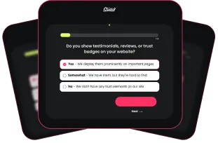
- Made testimonials and verdicts accessible from the menu, reinforcing trust early in the user journey
- Streamlined layout and interaction on mobile, reducing friction and guiding users toward lead-capture forms
- Added clear contact access and sticky call-to-action to support lead conversion

Results:
- 60% increase in Free Case Evaluation opt-ins
Despite a drop in user acquisition, conversion rates climbed significantly, proving the form and flow changes made a meaningful impact. - 1000%+ increase in U.S.-based views for the Indianapolis Car Accident Lawyer page
Targeted layout and menu visibility drove a dramatic rise in organic engagement on one of the highest-value service pages. - 69% increase in Contact Us form submissions
Subtle UX upgrades across key entry points and the contact funnel led to a measurable lift in leads.
Conclusion: Time to Rethink Your Mobile Menu
Let’s be blunt: Your mobile menu is either working for you or against you.
If it’s intuitive, prioritized, and always accessible, it keeps users moving, clicking, and converting.
If it’s hidden, bloated, or hard to use, it kills momentum and your sales.
Your Action Step:
Pull up your website on your phone right now. Ask yourself:
- Can you reach the most important pages in one tap?
- Is the menu visible, not buried?
- Are your top revenue drivers front and center?
If not, it’s time for a mobile menu upgrade.
And if you’re not sure where to start, we’d love to help.
Let’s turn your mobile experience into a conversion machine.
Ready to Turn More Visitors into Customers?
If optimizing your mobile menu opens your eyes to what’s possible, just wait until you see what happens when your entire website is built to convert.
At Studio1 Design, we go beyond good looks. Our Conversion Optimization service dives deep into your website’s user behavior, uncovering hidden bottlenecks and missed opportunities. From navigation to messaging to layout, we apply data-backed strategies that increase engagement, build trust, and boost conversions.
Want to know what’s holding your website back, and what to do about it?
Book a Free Strategy Call and we’ll walk you through a tailored plan to optimize your website for better results. No fluff. No pressure. Just clear, actionable insights.
Let’s make your website your best salesperson.