Key Takeaways
- Heatmap data showed visitors were not scrolling past the home page hero, which meant the most persuasive content was never being seen.
- Fixing the pricing page drop-off and improving how the offer was framed drove an immediate and measurable lift in both plan types.
- Mobile navigation and desktop navigation improvements reduced friction and kept visitors focused on the path to conversion.

Sax School Online is one of the world’s leading online saxophone membership platforms. Founded by professional saxophonist and educator Nigel McGill, the membership has helped thousands of students around the world learn to play at every level. With over 10 million YouTube views and a library of structured lessons built around real progress, Sax School Online had already established itself as the trusted choice for online saxophone education.
Studio1 Design designed the Sax School Online website, and the results spoke for themselves: more than 1,000 new paying members and over 25,000 new email subscribers after launch.
“Since our new website went live, we added over 1000 new students to our paid membership, and the rate of uptake on our free introductory offer has boosted our mailing list by over 25,000 people!”
But a great website is not a set-and-forget asset. After the website had been live and performing well, we reconnected with Nigel and asked a simple question: where is the next level of growth hiding?
So we went to work with our Conversion Optimization service.
The Problems We Uncovered
At Studio1 Design, we always start by auditing user behavior and analytics before touching a single element. Here is what the data revealed.
- Heatmap and scroll data showed that the majority of visitors were not scrolling past the home page hero section. The content designed to build trust, communicate value, and move visitors toward the pricing page was sitting below a scroll depth that most visitors never reached.
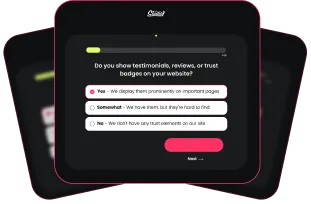
- There was no lead capture mechanism on the site. Visitors who were not ready to join were leaving with no way to follow up with them, and no path back into the membership funnel.
- The desktop and mobile navigation were creating friction. On desktop, the menu structure was adding cognitive load rather than guiding visitors toward the most important pages. On mobile, the experience was not optimized for the way mobile visitors actually navigate.
Nigel’s service was exceptional. The data was telling us that visitors were not getting far enough into the experience to fully understand that. That was the gap we needed to close.
Here’s What We Changed
After the audit, we implemented a systematic testing approach across four key areas.
1. Home page Layout and Copy
The scroll data told us visitors were stopping at the hero. So we redesigned the home page to front-load the most persuasive content. The value proposition, student results, and social proof were all moved into positions that visitors actually reach, not positions that assumed they would scroll.
We also refined the home page copy to lead with the outcome visitors were looking for: learning to play saxophone with real structure and real results, not a generic description of what the membership contained. The goal was to give visitors a clear reason to keep scrolling and a clear path to the pricing page.

2. Pop-Up Lead Magnet
During the audit, we identified that the website had no lead capture mechanism. Visitors who were not ready to join were simply leaving with no way to bring them back into the funnel. We saw an opportunity to close that gap.
We introduced a pop-up lead magnet offering a free Saxophone Starter Toolkit, giving prospective students everything they needed to get started in one place. The copy was written around the outcome the toolkit delivered, a quick, tangible win for someone who was curious but not yet ready to commit. The goal was to capture that interest before it walked away, and give Nigel a way to continue the conversation through email.

In the first 14 days after the pop-up went live, it generated 126 new email subscribers through Locker opt-ins. Those subscribers converted into 19 sessions back to the website, with 14 of those classified as engaged sessions, meaning visitors arriving from email who were actively exploring the membership, not just bouncing.
3. Mobile Experience
The majority of Sax School Online’s traffic arrives on mobile. Despite this, the mobile experience had room to work harder. We optimized the mobile layout to reduce friction at key decision points, improved touch target sizing on CTAs, and ensured the above-the-fold experience on mobile gave visitors an immediate, clear reason to explore further.
These changes directly addressed the gap between mobile traffic volume and mobile conversion rate.

4. Navigation Restructure
On the desktop, we restructured the navigation to treat it as a conversion tool rather than a directory. The menu was simplified to reduce cognitive load and point visitors toward the pages most likely to move them toward joining.
On mobile, we redesigned the hamburger menu to function more like a mini landing page, incorporating social proof and a clear primary CTA so that even a visitor who opens the menu and nothing else encounters a reason to act. This approach consistently outperforms a standard list of links.

The Results: 3 Months of Compounding Wins
- +82.6% increase in Yearly Plan Sales
- +72.9% increase in Monthly Plan Sales
- +114.8% total revenue increase during the split test period
- +130% increase in Yearly Plan Entries (more visitors choosing the annual option)
“Most importantly I feel that the new website design has been a welcome update to the look and feel of our business to new students and helped to unify the design and branding of our business over all our marketing. Although I was hesitant to hand off the design and web development to an expert, it was in retrospect the best decision I could make for my business because Studio1 did so much better than I ever could have. It allowed me to focus on building my business instead of tinkering with the website!”
What This Means for Your Business
Sax School Online already had a strong website and a proven offer. The conversion optimization work did not fix something that was broken. It found the headroom in something that was already working and made it work harder.
This is the pattern we see consistently across membership websites and online businesses. The traffic is there. The product is strong. But there are specific points in the journey where visitors hesitate, lose confidence, or simply do not get far enough to see why the offer is worth it.
Scroll data, heatmaps, and session recordings tell you exactly where those points are. Systematic testing tells you what to do about them. And the results compound every month you keep testing.
That is exactly what Studio1’s Conversion Optimization service is built to deliver.
Frequently Asked Questions
How long does it take to see results from conversion optimization?
Studio1 typically achieves statistically significant test results within 60 days. In Sax School Online’s case, the cumulative effect of three months of systematic testing produced an 82.6% increase in Yearly Plan Sales and a 114.8% increase in total revenue during the split test period.
Does my website need a full redesign before starting CRO?
Not necessarily. The Sax School Online CRO work was applied to an existing website that was already performing well after Studio1’s original design. Conversion optimization works best when your website has a solid foundation. If the foundations have issues, a redesign may be the better first investment. Studio1 assesses this during an initial audit.
Why does the mobile menu matter so much?
For most membership and online education websites, the majority of traffic arrives on mobile. If the mobile navigation is just a list of links, you are missing an opportunity to put social proof and a clear CTA in front of every visitor who opens it. Treating the mobile menu as a mini landing page consistently outperforms a standard navigation structure.
What analytics tools do you use?
Studio1 uses Microsoft Clarity for heatmaps, scroll maps, and session recordings, alongside Google Analytics 4 and Google Tag Manager. Together, these tools show not just what visitors do, but where they hesitate, what they ignore, and where they leave. That behavioral data drives every testing decision.
How much traffic do I need to run meaningful conversion tests?
Studio1’s conversion optimization service is ideal for websites with between 2,500 and 100,000 monthly visitors. Below this threshold, it takes longer to reach statistical significance, which extends the testing timeline.
Ready to Get More From Your Membership Website?
If your membership website is generating traffic but not converting it at the rate your offer deserves, the problem is rarely the product. It is specific friction points in the journey that visitors encounter before they reach the decision to join.
Studio1 Design’s Conversion Optimization service identifies exactly where those friction points are and what to test first. If we do not find an improvement in the first 60 days, we refund 100% and run one more test for free.