Key Takeaways
- Visitors decide whether your website is relevant within seconds, by scanning for answers to three unconscious questions
- Most conversion problems aren’t design problems, they’re alignment problems between what visitors expect and what they find
- Answering those three questions, in order, reduces friction more effectively than adding content, features, or visual complexity

Most business owners know their website should convert better. But “converting better” is vague, it doesn’t tell you what’s actually broken.
Here’s a more useful question: what is a visitor thinking the moment they land on your page?
Almost always, it’s some version of three things. Am I in the right place? Do I trust this? What do I do next? Visitors don’t ask these consciously, but they answer them instantly. If they don’t like the answers, they leave, often in under ten seconds.
In this post, we’ll break down each question, explain why it matters, and walk through a real project that shows what addressing all three looks like in practice.
What You’ll Learn:
- Why visitors are selfish, and why that’s your problem to solve
- Question 1: Am I in the right place?
- Question 2: How do I feel about this website?
- Question 3: What am I supposed to do here?
- The most common way websites fail all three at once
- Real-world example: Athleta Gymnastics
- FAQs
Why Visitors Are Selfish, And Why That’s Your Problem to Solve
Visitors don’t arrive to learn about your business. They arrive because they have a problem and want to know if you can solve it.
Most websites ignore this. They lead with the business, history, credentials, awards, answering questions the visitor wasn’t asking yet. Conversion-focused website design flips this around. It starts with what the visitor needs to know, feel, and see before they’ll take a step forward.
There are three questions every visitor is silently asking. Answering them well isn’t about clever copy or beautiful visuals. It’s about structure, clarity, and psychology.
Question 1: Am I in the Right Place?
This happens before a visitor reads a single sentence. They’re scanning for signals that confirm this page is relevant to them. If those signals aren’t immediate, they leave, not because they decided against you, but because they couldn’t decide at all.
Every visitor arrives with an expectation, from a Google search, an ad, a social link. They’re checking whether the page matches it. If your headline says “innovative solutions for a changing world,” you’ve made them work to figure out what you actually do. That work costs patience, and visitors have very little of it.
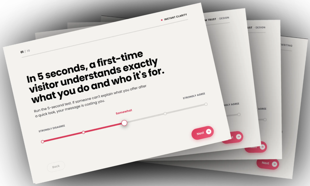
The five-second test is a useful check: if someone unfamiliar with your business can’t explain what you do and who you help within five seconds of landing on your home page, you have a clarity problem.
Question 2: How Do I Feel About This Website?
Once visitors decide they’re in the right place, the next filter is emotional. Do I trust this? Would I feel comfortable handing over my details here?
This assessment is fast and largely visual. A phone number in the header signals real people. Genuine testimonials with names and photos reduce perceived risk. Professional photography signals that the business takes itself seriously. An outdated or cluttered website creates doubt, and doubt delays decisions.
Conversion-focused design closes that gap by making every design choice communicate competence and credibility, not just aesthetics.
Question 3: What Am I Supposed to Do Here?
A visitor who’s decided they’re in the right place and feels good about the website still needs a clear path forward. If it isn’t obvious, they stall, and stalling usually means leaving.
When everything on a page competes for attention equally, nothing wins. One primary call to action with clear visual weight, navigation with fewer options, and content organised with the most important thing first, these reduce decision load and make the next step feel natural.
What hurts: rotating banners, pop-ups that fire on arrival, and dense pages where the entry point is buried. Movement is particularly disruptive, it triggers a low-level alertness response that breaks a visitor’s focus at exactly the wrong moment.
The Most Common Way Websites Fail All Three at Once
The pattern we see most often isn’t a website that fails just one question badly. It’s a website built around the business’s perspective rather than the visitor’s.
The home page leads with the company’s story. The about page lists history and credentials. Service pages describe features without connecting them to outcomes visitors care about. The booking form asks for everything up front, before the visitor is ready.
Before reviewing any page, ask: does this help a visitor answer one of the three questions faster and more clearly? If not, it’s adding friction. That single shift in perspective is what conversion-focused website design is actually about.
Real-World Example: Athleta Gymnastics
The Challenge
Athleta Gymnastics runs programs for children and young people, from Kinder Gym through to competitive gymnastics. Strong retention, experienced coaches, and a $25 trial class with a 21-day money-back guarantee, a genuinely easy offer to say yes to.
The website wasn’t reflecting that. The look and feel didn’t match the quality of the facility. The autoplay video background in the hero banner was slow to load, it added no value, and took the place of important copywriting. The mobile experience was poor. The booking form was a single long step that created unnecessary friction. Social media icons in the header were pulling visitors away before they’d engaged. Navigation was hard to follow. And the messaging didn’t speak directly to parents, the actual decision-makers.
All three visitor questions were going unanswered.

The Approach
Am I in the right place? Copywriting was restructured to speak directly to parents and address what they actually care about. Segmented landing pages created separate entry points for different programs, so visitors landed in the right context immediately. Navigation was simplified and made more logical.
How do I feel about this website? A new look and feel was designed to match the energy and quality of the facility. Professional photography and video were added. Trust elements, testimonials, awards, and the club’s history, helping over 4,500 students, were placed early in the page flow. A careers page was added to signal the club’s investment in its team, which in turn signals quality to parents.
Social media icons were removed from the header entirely, eliminating a leakage point that was giving visitors an easy exit before they’d engaged. A lead magnet was added for visitors not yet ready to book.
The blog was redesigned and integrated into the funnel, guiding readers toward the trial offer as a natural next step. The mobile experience was rebuilt from scratch.
We added testimonials directly on this page, reinforcing trust at the exact moment a parent is most likely to second-guess their decision.

What am I supposed to do here?
We restructured the booking form for the trial into a multi-step process, each step asking only what was needed at that point, with a progress indicator throughout.
The booking experience itself is where a lot of friction was removed.
Before, the form was presented as a single, embedded step. It asked for multiple pieces of information upfront, without context, and without any sense of progression. This creates a subtle resistance. Visitors don’t know how long it will take, how many fields are coming, or whether it’s worth starting at all. That uncertainty is often enough to stop the process before it begins.
After, the form was broken into a clear, step-by-step flow. Each screen asks one simple question at a time, reducing cognitive load and making the process feel shorter than it actually is. A progress indicator was added to show how far along the visitor is, which removes ambiguity and gives a sense of momentum.
Just as importantly, the visual presentation was simplified. The redesigned form sits in a clean, distraction-free space with clear hierarchy and contrast, making the next action obvious. Instead of competing elements pulling attention away, the entire page supports a single goal: completing the booking.
This isn’t about making the form shorter. It’s about making it feel easier to complete. By removing uncertainty, reducing decision load, and guiding the visitor step by step, the path forward becomes clear, and completion rates follow.

The ‘Thank You’ page was treated differently
Instead of acting as a simple confirmation, it was rebuilt as a continuation of the experience. Previously, it confirmed the booking but left a gap, parents had taken action, but still had unanswered questions about what happens next.
A face-to-camera video was introduced to welcome new trial bookings and immediately put a real person behind the brand. This helped reduce uncertainty and made the interaction feel more human. we added social proof and then frequently asked questions to set clear expectations, what to bring, how the first session works, and what both the parent and child can expect.
Instead of ending the journey, the thank you page now answers lingering questions, reduces hesitation, and moves the visitor forward with confidence before the first call even happens.
What Was Observed
Following the redesign, trial bookings went from a trickle to a consistent flow each week. The client has chosen to keep specific metrics private, but the direction of change was clear and sustained.
Every business is different. Results depend on market conditions, audience readiness, implementation quality, and many other factors. This example illustrates the framework in practice, not a template or a guarantee of specific outcomes.
Frequently Asked Questions
Q: Isn’t this just UX design? What makes conversion-focused design different?
UX design focuses on usability. Conversion-focused design includes usability but also considers decision psychology, trust-building structure, and the alignment between visitor intent and page content. A website can be easy to use and still not convert, if the messaging is off, trust signals are absent, or the path to action isn’t visually clear.
Q: How do I know which question my website is failing?
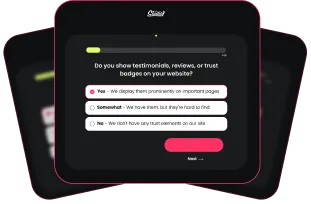
Ask someone unfamiliar with your business to look at your home page for five seconds, then close it. Ask what the business does, who it’s for, and what they’d do next if interested. Their hesitations will usually pinpoint the problem. Heatmap and session recording tools can also show where visitors drop off.
Q: Does this apply to B2B websites?
Yes. B2B visitors have longer decision cycles, but they’re still asking the same three questions. The answers look different, a case study portfolio instead of product reviews, a strategy call instead of a checkout button, but the framework is the same.
Q: How long does it take to see results after a redesign?
Structural changes can reduce friction from the moment the new website goes live. Meaningful patterns typically emerge over several weeks to a few months, depending on traffic volume. A redesign is most effective when treated as a starting point for ongoing testing, not a one-time fix.
Conversion isn’t about tactics. It’s about answering three questions, fast and clearly, before a visitor decides whether to stay or leave.
Am I in the right place? How do I feel about this website? What am I supposed to do here?
When a website is built around those questions, in that order, visitors find what they came for, trust more quickly, and take the next step. The discipline is structural, it doesn’t require a bigger budget, just a shift in perspective.
If you’re not sure how your website answers these questions, a fresh set of eyes is often the most useful starting point. We offer a no-pressure 15-minute strategy call for business owners who want an honest read on what their website is, and isn’t, doing for them.