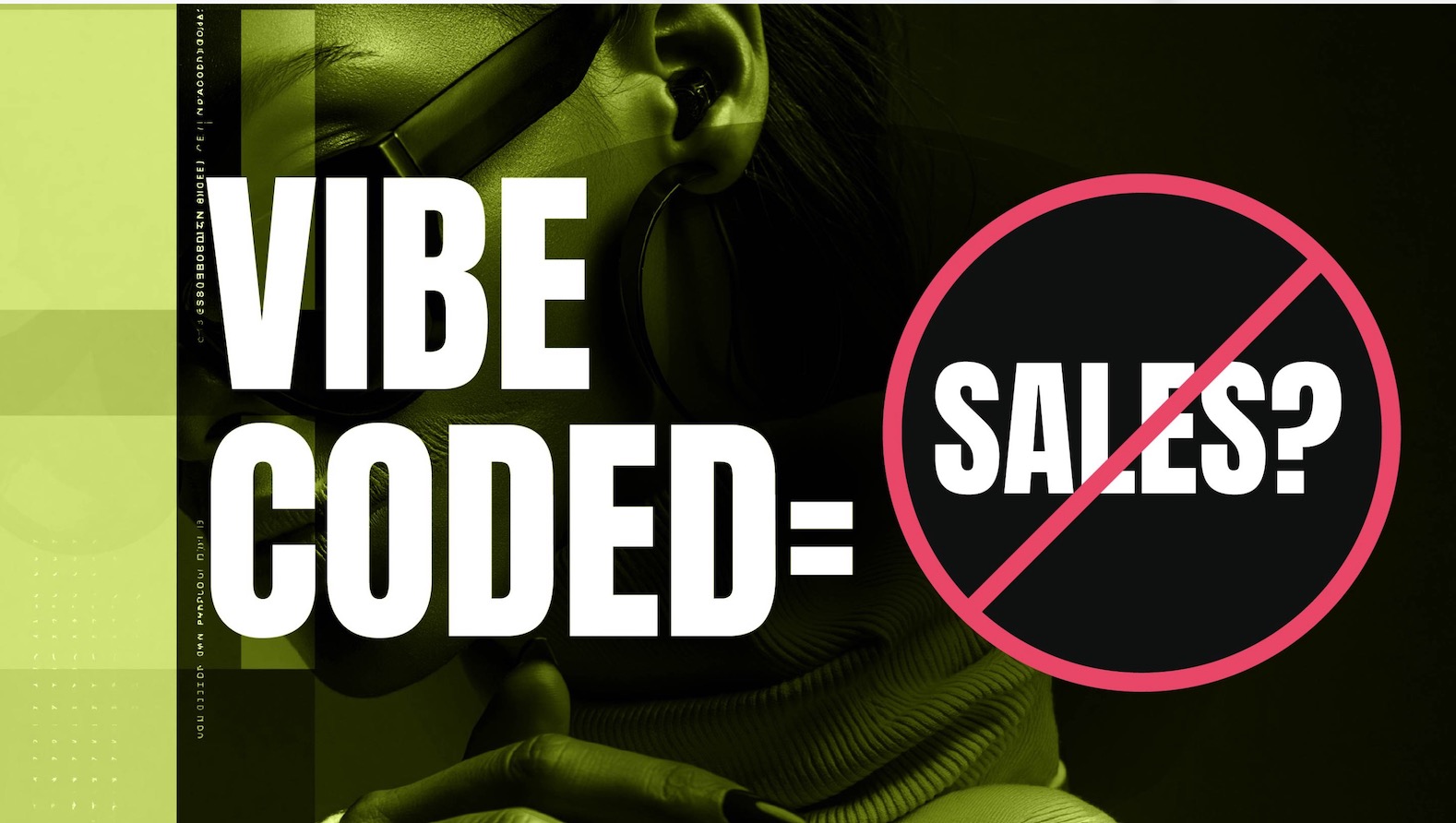
The latest website design trends in 2025 have evolved again, however, most of them are conversion killers if they aren’t cautiously approached.
You may also want to check out our top 10 Website Design Trends in 2025 to Embrace because they can boost your conversions.

Let’s be honest: designers can’t resist a shiny new trend, and many business owners feel pressured to keep their websites looking cutting-edge. It makes sense—nobody wants to seem outdated. But here’s the million-dollar question:
Is it worth sacrificing leads and sales just to have the latest design craze?
A truly effective website should do one thing well: draw in your ideal customers, persuade them to take action, and bring them closer to doing business with you.
However, this year’s latest website design trends may hurt your website conversions if they’re poorly executed and overly distracting.
Website Design Trends in 2025 that Can Hurt Conversions
The following are the top 10 trends that need to be approached with extreme caution or they can kill conversions if used poorly.
Next week, we will explore the top 10 website design trends in 2025 to embrace to boost your conversions…
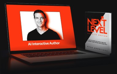
1. AI Design (Imagery, Animations & Interactions)
AI-generated elements can save time and produce innovative visuals, but poorly matched or overused AI imagery often looks off-brand and untrustworthy. You may impress curious onlookers, but you’ll lose those ready to buy if your website feels “robotic” or like every other website using AI too much. Tread lightly: genuine connection beats flashy AI-driven design when boosting your conversions.
- Pro Tip: Only use AI tools that enhance your brand’s story, and to be helpful for your visitors. Also, try to use real photos or illustrations that feel authentic and on-message.
2. Playful Animations
These quirky, eye-catching touches can add personality to your website. Use them sparingly, or risk distracting your visitors from the real goal: taking action. Too many bouncy visual effects may slow load times and overpower your copy & calls-to-action, undermining conversions—especially for small businesses that rely on clear messaging to win customers.
- Pro Tip: Use animations to highlight important elements like social proof, copy & and CTAs, rather than turning every scroll into a carnival ride.
3. Immersive Design
Engage your audience with 3D product demos, virtual tours, or VR/AR enhancements to showcase your offer. Be very cautious: while these features can wow first-time visitors, they can also become frustrating for repeat visitors, if they can’t find what they need quickly. And remember—loading times often suffer when you pile on immersive effects.
- Pro Tip: Provide a quick, user-friendly demo or walk-through. Nobody wants to fuss with overcomplicated complicated animation or having to put on VR goggles just to see how a product looks or works.
4. Scroll-Triggered Animations & Parallax
Engaging users with storytelling elements can be powerful—unless those animations are overpowering, distracting, disorienting, and taking the focus away from your essential messaging. Too many moving parts often slow page loading and leave potential customers frustrated. If you decide to implement these effects, keep them lightweight to ensure visitors remain focused on your main offer.
- Pro Tip: Employ these effects in moderation. Tell a compelling story that supports, rather than distracts from, your primary selling points.
5. Massive Brand Names or Logos
Bold branding can show off who you are instantly but don’t crowd out the rest of your content. If your logo gobbles up valuable space “above the fold,” visitors might miss your unique value proposition and never stick around to convert. Nobody cares about your logo, so use large branding judiciously, so it supports—not overshadows—your key messaging.
- Pro Tip: Keep your brand name prominent but balanced. Ensure your unique value proposition and CTA remain front and center.
6. Interactive 3D Elements
A 3D model or animated product demo can capture attention and add credibility to premium offerings. However, heavy 3D assets often slow load speeds and can be overkill. People won’t wait for fancy effects; they’ll leave. Deploy them sparingly and only if they truly enrich the buyer’s understanding of your product or service.
- Pro Tip: Use 3D tech selectively for key products or demonstrations. Integrate it only where it genuinely adds clarity or excitement without bogging down performance.
7. Minimalist Design
Clutter-free pages can load quickly, however, you don’t want to strip out crucial information (like trust signals, benefits, pain points, or important clarifying details). Going “too minimal” means visitors can’t figure out what you’re offering or why you’re credible before they even begin browsing your website.
- Pro Tip: Keep your layout clean and your messaging direct—but don’t sacrifice key reassurance factors. Ensuring potential buyers feel confident is just as important as a sleek design.
8. Minimalism with a Maximal Twist
If minimalism is your foundation, add your “maximal” touches in a targeted way—ensuring they guide, not distract, potential buyers. Try injecting bold color or huge typography into an otherwise understated design can highlight your calls-to-action. But too many loud details risk overshadowing your core pitch and confusing visitors.
- Pro Tip: Start minimal, then weave in occasional bursts of color or unique fonts to draw attention toward your call-to-action or product highlight.
9. Element Layering
Layering videos, animations, text, and images can create depth and keep users engaged. Yet, too many stacked elements might crisscross each other, muddying your call-to-action. People may be confused, and therefore your hard-earned visitors leave your website without you knowing why.
- Pro Tip: Use layering to guide your visitor’s eyes in a planned sequence—like stepping stones that trust in your brand & offer, and lead them naturally toward your CTA.
10. Huge Bold Fonts
Oversized headlines command attention however they can gobble up the entire screen, and visitors may have to scroll excessively just to see what you’re offering. Keep your headlines bold but balanced, placing your offer or next step within immediate reach for an easy conversion path.
- Pro Tip: Keep headlines big enough to stand out, but don’t let them overshadow essential product details, forms, or buttons.
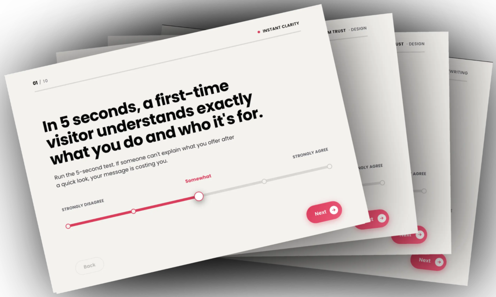
Always ground your design decisions in these conversion-boosting principles:
-
- Clarity
Does your design overpower your messaging and confuse your visitors? - Relevancy
How well does the design match your visitor’s expectations? - Distractions
Is the design directing the visitor away from your most desired action? - Take Action
Does the design have a clear pathway based on your visitor’s intent? - Buying Anxiety
Does the design make your visitor feel anxious about purchasing from you?
- Clarity
Worried about being left behind with an outdated website design?
I know it’s tempting to chase every shiny new trend! But trends come and go, so don’t get too hung up on them.
Next year there will be new trends emerging, so if you use the latest trends this year, next year they may be obsolete, so jumping on the bandwagon can backfire.
Here are a few essential tips for staying ahead of your competitors with your website…
Strong Branding – Work on positioning your brand as the trusted authority in your niche. This means being consistent with your brand voice across all your marketing, and constantly looking at ways to level up your perceived value.
Visual Storytelling – Use your website to tell your story, and your client’s stories, and to visually explain how you can solve your ideal customer’s pain points.
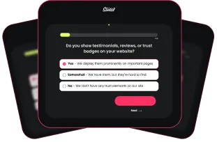
UX is King – A trendy but confusing website won’t get results. Before adding that eye-catching animation, ask yourself: does this make it easier for people to find what they need? User testing is a great way to make sure your design choices are working in the real world.
Fast load times – A mobile-friendly responsive design is essential. Invest in a skilled website designer and developer who understands conversions and optimization. Frustrating tech issues can undo beautiful design work in an instant and can tank your search engine results.
Summary: Be Trend-Savvy, Not Trend-Driven!
Design trends come and go, but your website conversions rely on clarity, consistency, and a frictionless path from curiosity to opting in or buying from you.
Before you jump head-first into these 2025 trends, ask yourself:
- Do they serve a real purpose in improving the user experience and driving conversions?
- Will they clutter or slow down your site, potentially frustrating visitors?
- How can you balance brand appeal with genuine usability?
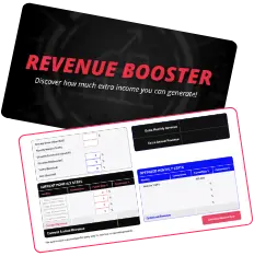
When in doubt, test. Implement design changes incrementally, measure results, and only keep what resonates with your audience and boosts your sales.
A trendy website design can be fun for you, but it may annoy your ideal clients. An effective website design is profitable for you, so aim for a good-looking, conversion-focused, modern design. Never lose sight of what truly matters—your leads and sales.
Need a Second Opinion? – That’s What We’re Here For!
Book a free consultation, and let’s talk strategy. Sometimes, it’s hard to be objective about your website.
We’ll pinpoint which trends could take your website to the next level and explore ways to boost your results.
No sales pitch, just a chance to see if we’re the right fit to help you achieve your website goals.
When designed the right way, your website can be a powerful tool for growing your business.