In last week’s article, we shared 10 website design trends in 2025 to beware of. They can hurt your conversions if they aren’t cautiously approached.
A truly effective business website should do one thing well: draw in your ideal customers, persuade them to take action, and draw them closer to doing business with you. Here are 7 Secrets of Persuasion in Website Design.

In this article below, we share 10 website design trends in 2025 to embrace because they won’t hurt your website’s conversions. If anything they can boost your conversions!
Before you implement any of these design trends, always ground your design decisions in these conversion-boosting principles:
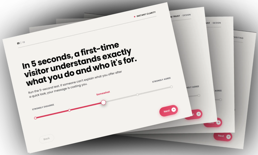
- Clarity
Does your design overpower your messaging and confuse your visitors? - Relevancy
How well does the design match your visitor’s expectations? - Distractions
Is the design directing the visitor away from your most desired action? - Take Action
Does the design have a clear pathway based on your visitor’s intent? - Buying Anxiety
Does the design make your visitor feel anxious about purchasing from you?
Website Design Trends in 2025 to Embrace
The following are the top 10 trends that have been curated based on the conversion principles above that we have learned after designing over 2000 websites, funnels, and landing pages for our clients.
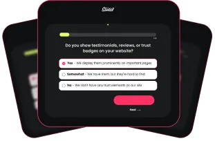
1. Interactive Avatar Videos
When a website integrates AI-generated interactive video avatars, visitors can benefit by having enhanced engagement and interest. A human-like presence is often more captivating than plain text or static images. This can help draw in visitors, encourage them to explore the website and keep them engaged.
Why it boosts conversions: People love it when you can help them instantly. When your website “knows” what they want, they’re more likely to take the next step and make a purchase.
- Pro Tip: Use the data you gather with their answers to your questions to tailor a pathway and segments based on their preferences. Then send them to relevant offers or content to see higher conversions.
2. Storytelling Design
Dazzle your audience with a narrative arc. Weave in milestones, images and copy that reveals extra info, and invite visitors to follow along.
Why it boosts conversions: A compelling story humanizes your brand, encouraging trust and engagement. Trust translates directly into more clicks on your call-to-action.
- Pro Tip: Visual timelines or step-by-step journeys can highlight your brand’s evolution, showcasing your expertise and credibility throughout.
3. Impact Metrics
Showcasing your numbers—like total customers served, podcast downloads, YouTube subscribers, or years in business—works wonders for credibility.
Why it boosts conversions: Hard facts and proof points (e.g., “Over 1,000 Happy Customers”) instantly reassure potential buyers that you deliver on your promises.
- Pro Tip: Position these metrics near your main CTA, and add micromovement to reinforce trust at the most critical moment.
4. Neon Glow
Add a dash of modern flair with neon glowing accents, especially on CTA buttons.
Why it boosts conversions: Small interactive touches grab attention and can draw the eye to where you want people to click next.
- Pro Tip: Keep the glow subtle yet noticeable. A gently pulsing effect on your “Buy Now” button can be more enticing than a static element.
5. Creative Typography
Elevate your text beyond web fonts—think creative fonts, customizing fonts, 3D lettering, or kinetic typography.
Why it boosts conversions: Unique typography can emphasize important phrases, making them more memorable. This keeps your brand voice distinct and persuades visitors to stick around long enough to convert.
- Pro Tip: Use creative fonts on your main USP to introduce visual interest, but avoid clutter by limiting it to key messages.
6. Sticky Table of Contents on Blog Posts
A sticky table of contents remains visible as readers scroll, providing quick access to each section of a post. This user-friendly navigation feature helps visitors jump right where they want to go without endless scrolling.
Why it boosts conversions: By letting readers immediately find the information they’re after, you reduce frustration and keep them engaged longer. An organized, easy-to-navigate blog builds trust and positions you as a credible authority—ultimately encouraging more opt-ins or engagement.
- Pro Tip: Keep your table of contents concise and well-labeled. Use anchor links so readers can instantly land on the section they need.
7. Light & Dark Mode Switch
Dark mode can reduce glare and project a sleek, high-end vibe, however, you must be careful with text readability and color contrast—especially if there’s significant copy involved. In bright outdoor conditions, text can nearly vanish, costing you visitors and sales. Above all, prioritize accessibility to accommodate visually impaired users.
Why It Boosts Conversions: Dark backgrounds often convey a premium feel, ideal for showcasing luxury products and services.
- Pro Tip: Provide a toggle between light and dark modes. That way, visitors can select the option that’s most comfortable for their eyes and environment.
8. Soft Gradients
Soft gradients blend subtle hues to create a gentle shift from one color to another. They add depth and visual appeal without the harsh contrast or busy patterns that can overwhelm a page.
Why it boosts conversions: By giving the eye a pleasant, non-distracting background, soft gradients can draw attention toward key areas such as headlines, calls-to-action, or images, making it easier for them to take action.
- Pro Tip: Experiment with complementary tones that match your brand palette. Too much could overshadow crucial information and hurt readability.
9. Glassmorphism
Think of sleek, frosted-glass overlays where background elements blur behind translucent panels.
Why it boosts conversions: This layered effect can spotlight important content like a product image or a feature, in a distinctly modern way that feels high-end and inviting.
- Pro Tip: Achieving that signature glass-like effect is often just a matter of stacking a few layers, adding some blur, and fine-tuning the values. Test your glassmorphic designs on multiple devices to ensure readability.
10. Nostalgic Retro
Vintage-style design elements or film-inspired imagery evoke warmth and familiarity.
Why it boosts conversions: Users who feel a sense of nostalgia often form an emotional connection with a brand. And when emotions are involved, commitment (aka a purchase or sign-up) typically follows.
- Pro Tip: Blend retro aesthetics with contemporary website functionality. Make sure your nostalgic look doesn’t distract from the user’s path to conversion.
Worried about being left behind with an outdated website design?
It’s natural to be drawn to every shiny, new design craze—but keep in mind that trends are temporary. In a year or two, today’s “must-have” trends could be out of style, so don’t get too hung up on them. As long as your website isn’t 3-4 years old, and it’s designed on conversion principles, that’s far more important than chasing the latest design trend.
Feel free to experiment with some of the above trends. Just remember to track your conversions to see whether they’re actually helping you meet your goals.
Want to stay ahead of your competition? Focus on these fundamentals instead:
Strong Branding
– Position yourself as the go-to authority in your niche. This involves consistent messaging across all marketing channels and continuously refining your brand’s perceived value.
Visual Storytelling
– Let your website convey a compelling narrative—both yours and your clients. Show how you solve real customer pain points in a way that resonates on both emotional and visual levels.
UX is King
– Trendy aesthetics won’t fix clunky navigation. Before rolling out a fancy animation, ask whether it helps visitors find what they need faster. And don’t be shy about running user tests in real-world conditions.
Fast load times
– A mobile-friendly, responsive site is non-negotiable. Invest in skilled pros who understand speed, conversions, and optimization. Technical hiccups can wipe out the benefits of good design and sink your search engine rankings.
Summary: Be Trend-Savvy, Not Trend-Driven!
Design trends come and go, but your website conversions rely on clarity, consistency, and a frictionless path from curiosity to opting in or buying from you.
Before diving into any new look, ask yourself:
- Does this truly improve the user experience and conversion rate?
- Could it clutter my site or slow it down, causing user frustration?
- How can I maintain brand appeal without sacrificing usability?
When in doubt, test on a small scale first. Track the data, then refine or drop the change based on actual results.
A stylish layout can certainly spark excitement for you, but it may annoy your ideal clients. Never lose sight of what truly matters—your leads and sales. Always put conversions at the forefront.
Need a Second Opinion? – That’s What We’re Here For!
Book a free consultation, and let’s talk about your website design and strategy. Sometimes, it’s hard to be objective about your own website.
We’ll pinpoint how to take your website to the next level and explore ways to boost your results.
No sales pitch, just a chance to see if we’re the right fit to help you achieve your website goals.
When designed correctly with our principles, your website can be a powerful tool for growing your business.