![]()
Anyone who’s ever looked up anything online knows how frustrating it is when you don’t quickly find the answer you’re searching for.
It goes something like this: You’re busy and you need to find a solution quickly. You don’t have time to surf the net and go down rabbit holes.
You Google long-tail keywords, something like ‘best online accountants for small business – and you skip the ads, then click on the top 3-5 results, which are usually blog posts.
Then you click on the home page of each website, so you can do a quick comparison to see who you think will best suit your needs, only to read headlines that are trying to be too clever!!
Here’s what I found in my quick search… (Without naming and shaming the websites =)
Most of these website examples have their main headline or Unique Selling Proposition (USP) written on one of those annoying image sliders!! They think they are clever, but they are proven, conversion killers!
Then you read their USPs and they too are trying to be too clever and vague, with catchy headlines like:
We help businesses breathe. (What do they sell, respirators??)
Online tax returns from $95. (Would you even trust them at that price??)
We are more than just accountants. (Great, can you clean my gutters or cook my dinner too please?)
Unlocking the value of your numbers. (I’m sorry, but that means nothing to nobody!! Trying waaaaay too hard to be clever!!)
You just want a reliable, trustworthy accountant that has a clear pathway for how they can solve your problems and that has social proof that you resonate with, from similar businesses to yours.
So what do you do? You hit the <close> button and look elsewhere…
You have just 5 seconds to be relevant
![]()
The response to a confusing website– or a cute, clever, irrelevant messaging – is a quick click on the back button.
If your visitors can’t find what they’re looking for quickly then they’ll move on.
After all, there are hundreds (if not thousands) of other websites out there that might provide what they’re looking for.
“If you confuse them you will lose them!”
There’s a term for how clearly and how quickly a website provides visitors with the information they need. That word is CLARITY.
In a world of 2 billion websites, the most valuable aspect of your website is its clarity to your VISITORS. The quicker and more effectively you give your visitors the information they’re looking for, the longer they’ll stay.
Unclear websites can be due to:
- Poor design that confuses and distracts instead of explaining and guiding. It doesn’t matter how cute/sexy/beautiful the images are or how clever the visual effects are. It doesn’t matter how much valuable information is on offer.
- Poor copy that doesn’t answer your visitor’s questions and help them solve their problem. It doesn’t matter how “clever” the writing is, it doesn’t matter how much information you pack into it, it doesn’t matter whether it’s humorous or full of scholarly expertise.
Fortunately, today it’s easier to diagnose clarity problems than you might imagine.
Avoid “clever” design that annoys and distracts
![]()
There are a surprising number of graphic designers working in website design who think that clever design is all that matters.
They have no idea about conversion-focused website design principles, and they’re often seduced by the “latest, greatest” design trends, where “unique” and “cool” triumph.
You can spot them by the way they use unconventional navigation, layouts that don’t make logical sense, bright-colored backgrounds, and busy images. Some are in love with distracting animations and parallax effects, moving background elements that follow your cursor around the screen. Often the effects they use take so long to load and are so irritating that visitors just get frustrated and leave.
Then some websites are super-minimal design – They don’t have enough written on them to give you clarity about their offer or how you will benefit from it.
They also have unconventional navigation or hamburger menus hiding all the important stuff and images that are so “conceptual” they confuse instead of communicating. This group can also get “clever” with copy – making it so vague or so specialist or so leading edge that it takes too much time and effort to figure out what the website is all about.
This isn’t just about “fashion” – there are ways that human eyes and human brains work that are hard-wired.
Too-clever designs that ignore how we scan pages and absorb images can drive your visitors away.
What does clarity look like?
![]()
So, what does a website with clarity look like? Let’s take a look at Airbnb.
Their copy makes their service immediately clear: Airbnb lets you book rooms anywhere in the world.
The imagery behind the copy backs up their offer, showing stunning boutique accommodation in a beautiful location.
Even if you’ve never heard of Airbnb, you don’t have to read their About page to find out what they do.
The call-to-action is masterfully clear: one carefully crafted sentence and a search function that lets you get started as soon as you open their website.
Airbnb’s website already provides everything you need to find a room. It’s all right there – above the fold on their homepage.
As a visitor to their website, what reason would you have to check out a different booking service?
Clarifying “clarity”
When someone visits your website, these are the questions they’re asking:
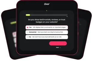
- What do you offer & do you have a solution to my problem?
- How will I benefit from your offer?
- Do you have proof that your solution works?
- Why should I choose you over your competitors?
- Does your website look credible and trustworthy?
- What action do you want me to take and do you have a clear pathway on how you will solve my problem?
- If I have a question, how can I contact you quickly?
The more effectively you supply the answers to their questions, the clearer your website will be Clarity involves both content and design. It requires:
- High-Quality Design
- High-Quality Copy
You need both to truly thrive online.
No matter how clear your website copy is, it won’t be effective if your web design buries it underneath a messy layout that uses ambiguous images, distracting effects, or annoying widgets.
No matter how beautiful your images are and thoughtful the design is, they won’t drive conversion if your copy is confusing and difficult to understand.
These are the markers of clarity on a website. Does your site measure up, or are there areas you need to improve?
1. Your web design reflects your content.
Content and design work hand-in-hand. Your website design should guide your visitors to the answers they are seeking.
Visual hierarchy:
Create a visual hierarchy (not just a menu structure). Good designers emphasize important information by making sure that visitors see it first.
Whitespace:
Whitespace is exactly what it sounds like: the white or blank spaces that don’t contain any written or visual content.
Whitespace is used to give the page some breathing space, to make the layout look relaxed instead of crowded and cluttered.
Surrounding an element with white space draws the eye to that element, making it a point of emphasis. That’s particularly important for CTAs.
Imagery:
The internet is a visual space. Images are critical in capturing attention, creating interest, and emphasizing a point. However, to provide clarity, using the right images is of utmost importance.
Think about the last restaurant website you visited. Just by looking at their photos, you would have made judgments about the quality of the food, the imagination of the menu, the atmosphere, and the price point.
Your website needs images and photos that reinforce your brand message, explain what you do, and demonstrate the value you deliver. The quality and relevance of the images are critical, whether you use stock images, take your pictures or pay a photographer.
2. Everything important is above the fold.
“Above the fold” is a concept that goes back to the early days of newspaper layout and design. Broadsheet newspapers were folded in half when they were displayed so that the upper half of the front page could be seen and read.
The most important news stories of the day – with enticing headlines – were on the upper half of the newspaper front page—” above the fold”.
In web design, above the fold refers to what site visitors see before they scroll down. If your home page doesn’t have clear, important content above the fold, there’s a good chance your visitors won’t go any further.
3. There is a clear hierarchy of information.
There is a reason logos are the first design element on any website: You want your visitors to see your brand name first. Then you want them to see the most important things (to them) about you.
So have a look at your website homepage or landing page.
Is the most important information the first thing they see? Or are your services buried underneath a pile of less important content?
Does the navigation make it easy to find out how you solve their problems? Or do they have to navigate through multiple menus?
Are the calls to action easy to see and is the text on them an enticing action? There’s a difference between CONTACT US and BOOK A FREE CONSULTATION.
4. Clear, helpful, useful copy.
Take a quick look at your website’s homepage, and read the first sentence displayed on your site. (Just the first sentence – no more!)
Does this sentence immediately and communicate what your business is about – from your customer’s perspective? Does it describe the problems you solve and how you solve them? Or do your site visitors have to figure out that information for themselves?
Then look further down the page with the eyes of a new customer. Will they quickly and easily find out what they need to know?
There are several ways to improve your website’s copy. They include:
- Be customer-focused. Your website is about your customer’s problem and how you solve it. What you do, your products, your expertise, your personality, your culture matter because they help solve that problem.
- Use the active voice. Not only does passive voice make sentences longer, but it also makes them dull. Active voice creates livelier sentences. See the difference between “Our product is designed to solve all your problems.” and “We designed our product to solve all your problems.”
- Keep it short. Long sentences, long paragraphs, and long articles don’t work in website copy. People scan websites – they don’t read through them like they would a book. Keeping your content short makes it easier for visitors to understand what you offer.
- Be consistent. If your brand uses a fun, conversational writing tone, then make sure to use that tone everywhere. Changing your writing tone will confuse your visitors
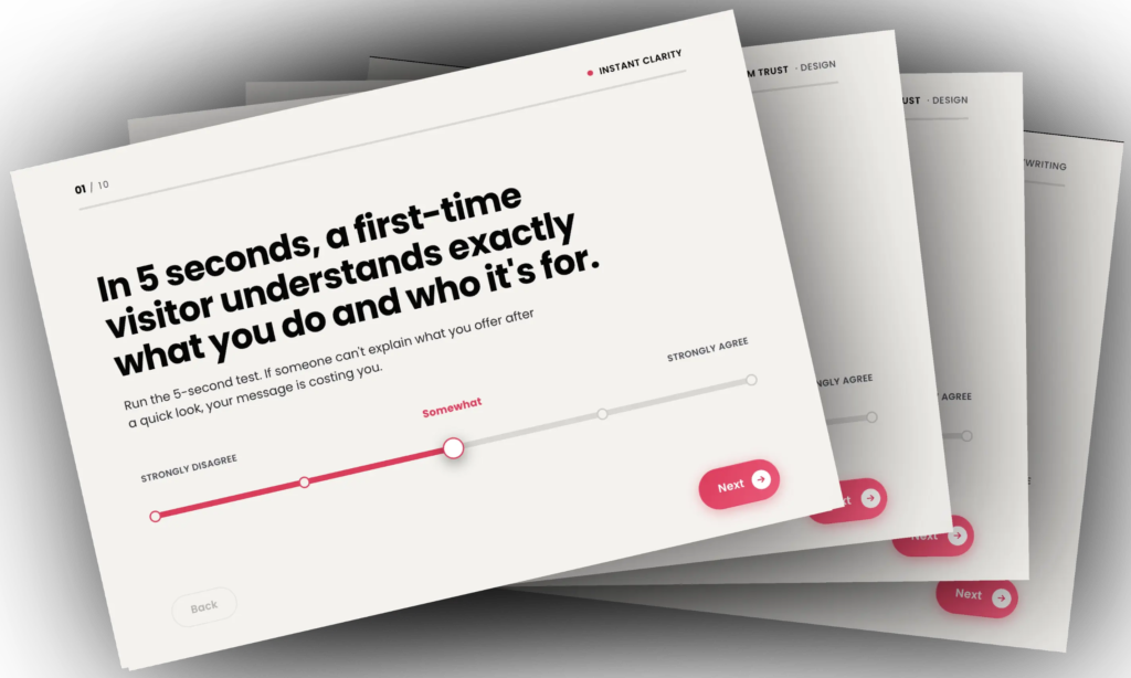
Does your website have clarity?
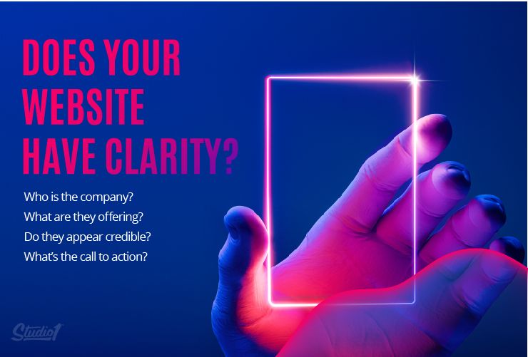
Finding the answer to this question only takes 5 seconds. Here’s what you need to do.
First, show someone your homepage for five seconds. Just five seconds, and not a second more. Afterward, ask them these four questions…
- Who is the company?
- What are they offering?
- Do they appear credible?
- What do they want you to do?
If they can answer all four questions, then that’s great! Your website likely doesn’t suffer from a lack of clarity.
If they can’t answer all four, then it could be time to reevaluate your web design. Do your 5-second test on Studio1Design.com and your own website =)