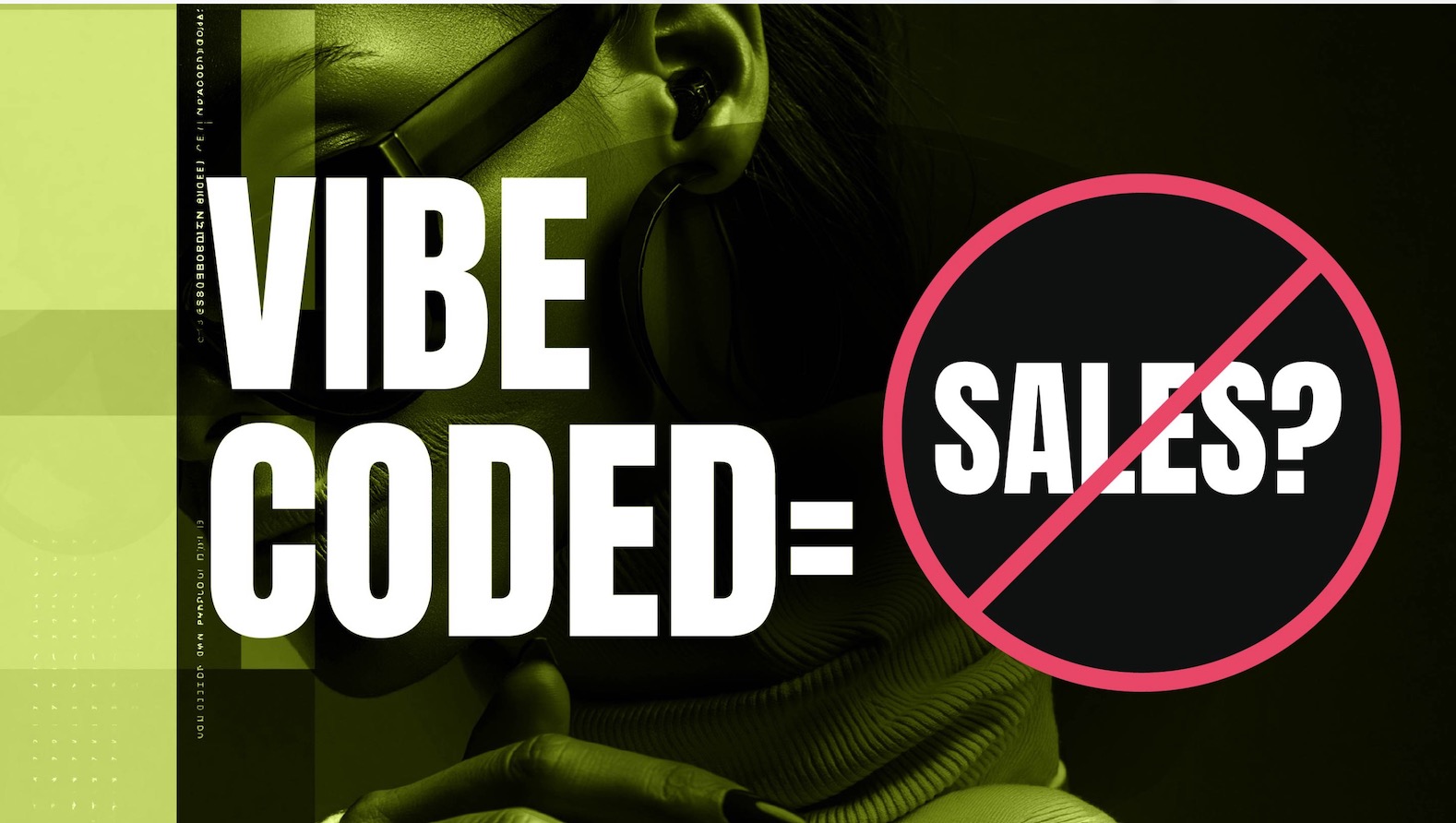
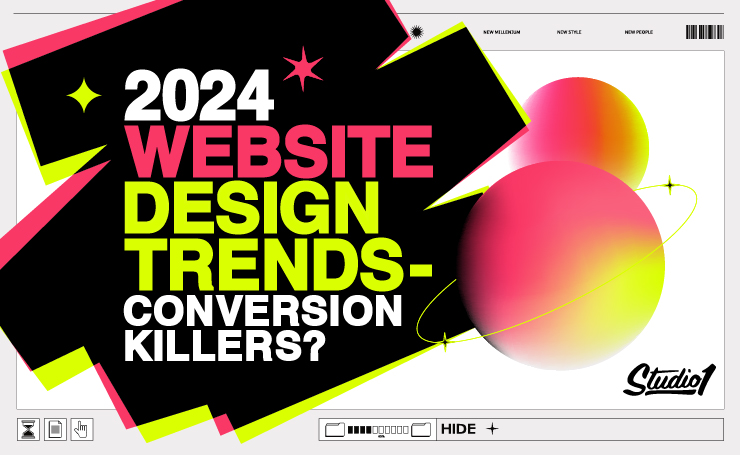
Web design trends in 2024 have evolved aesthetically again this year, intending to establish strong brand positioning through web identity and to fight tough competition.
The role of an effective website design should be to attract your target audience, influence them to take action, and essentially do business with you.
However, this year’s latest website design trends should be cautiously approached, because they may hurt your website conversions if poorly designed.
If you visit any of the ‘website design awards’ websites, you will see some cool & creative designs.
I agree that website design should always evolve, and some of these new trends this year look fresh and exciting.
Designers love creating new trends, and business owners are keen to update their websites with the latest design trends.
I get it. Nobody wants to be left behind, but I have to ask you…
Would you prefer to have the latest look at the expense of costing you leads and sales?
Experiment with some of the latest design trends, but be aware that they may be distracting and can overwhelm your website visitors especially if they do not enhance your offer with the following ‘conversion-boosting’ website design principles…
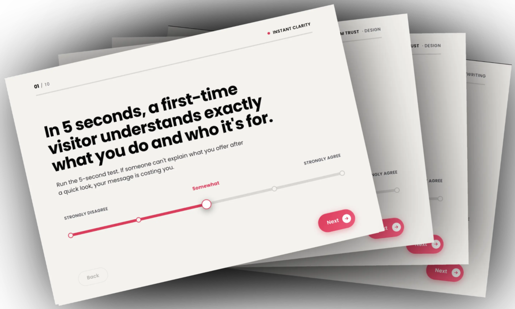
- Clarity – Does your design overpower your messaging and confuse your visitors?
- Relevancy – How well does the design match your visitor’s expectations?
- Distractions – Is the design directing the visitor away from your most wanted action?
- Take Action – Does the design have a clear pathway based on your visitor’s intent?
- Buying Anxiety – Does the design make your visitor feel anxious about purchasing from you?
12 Website Design Trends in 2024:
Some of the new design trends get our stamp of approval however, some of them are likely to kill conversions. So, please only use design trends that align with your brand values, and resonate with your target audience to entice them to take action.
1. Motion Effects
Movement and interaction are all the rage in 2024. Animations, & surprises that happen when a user scrolls down the page. It’s all about looking cool – these moving elements make your website look cool & fancy!
Why is that a problem?
Well, let’s face it, we’re easily distracted! Interactive elements on your website take your eyes off the all-important copywriting. Apart from your offer, your messaging does the heavy lifting for persuading your visitors to take action.
Fancy animated design elements with a lot of motion, and Parallax effects when scrolling, attract your attention, which takes away control from your visitors. This can annoy them, which ultimately hurts conversions.
Also, animations can take time to load, which can be annoying for your visitors waiting and waiting! On top of that, Google likes your website to load quickly, so if it takes time to load the animation, they are less likely to rank the web page.
We’re seeing dynamic parallax effects, with stuff zooming in and out at different angles and different speeds when scrolling down a web page. It’s very distracting and makes things look messy and confusing, which can hurt accessibility.
We’re seeing the scrollbar turned into something eye-catching, and some even with animation! – arrrgh, seriously!! It’s another distraction taking people’s eyes away from the main CTA!
How can you use motion to boost your conversions?
If you do want to use animation, focus on smooth little animations. If you want to draw attention to a CTA button, perhaps have it wiggle slightly. Have your impact metrics animate quickly from ‘0’ to the final number to draw attention to them.
A good motion design trend we’re seeing is a button that changes color when you hover over it. This provides instant feedback to the user, making it feel more responsive to their next action.
After pressing a button, having a spinny wheel or a progress animation can let them know the button was pressed and something is about to happen next.
These very slight animations help guide visitors without being obnoxious and distracting.
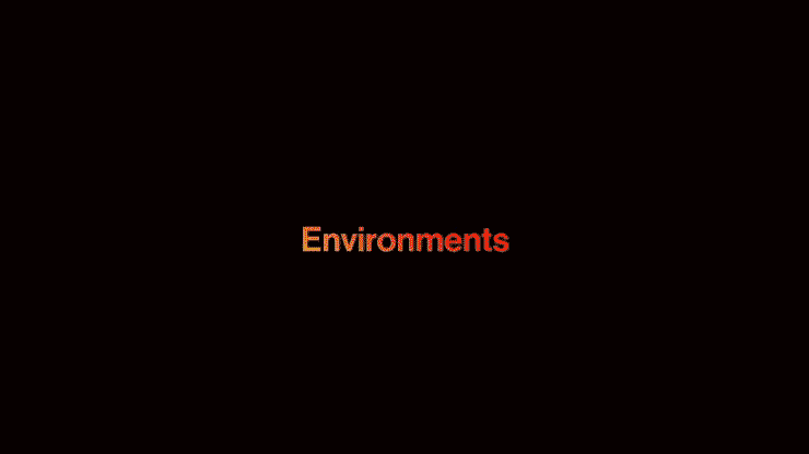
2. Dark Mode
Dark mode is all the rage, especially with tech start-ups and Web3 services. Having a website with a dark background throughout the entire website saves energy. Also, a dark background website can make a business look like it’s run by young cool peeps, yo!!
Why is that a problem?
You may want your website to look cool, however here are a few reasons why having a ‘Dark Mode’ website will negatively impact your conversions…
Dark backgrounds with white (or light fonts) are much harder to read than a high-contrast black font on a white background.
It can hurt accessibility. A website with a dark background and white text means visually impaired people cannot read your website very well. You also risk being sued if your website does not pass ADA requirements.
It’s hard to read in dark mode outdoors, especially in full sunlight even if it’s high contrast, like white text on a black background.
How to use dark backgrounds to boost your conversions:
At least 70%-80% of your pages should have a white or light background, then add the occasional dark background section to highlight important sections that you would like the visitor to focus on.
There is a whole spectrum of dark colors to add depth to your design and create an elegant look when used sparingly throughout your website pages.
3. 3D Animations
Websites feel more like an interactive experience than a flat page these days. 3D elements and animation can be mesmerizing to look at and can be activated simply by moving your cursor around the screen or scrolling down the page.
Why is that a problem?
Just because you can, doesn’t mean you should! Overly complex 3D experiences can be slow to load and disorienting for users. Again, they can be beautiful to look at, but they are super distracting, and take your eyes away from the messaging.
3D animation can take time to load, especially when triggered by Parallax scrolling or a cursor hover, so use sparingly, and work with a web developer who understands speed optimization.
If your website loads slowly, it will annoy people, which annoys the all-mighty Google too!
How to use 3D animations to boost your conversions:
For e-commerce websites, using 3D product images lets your customers explore your products from every angle, almost like they’re in a real-life store.
Explainer 3D animations can be used effectively, especially when paired with messaging that needs an extra boost to visually explain something clearly.
3D animation can be interactive with gamification to help explain complex topics in an engaging fun way.
4. Experimental Color
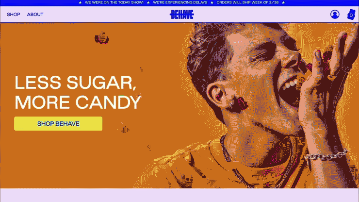
Think of unexpected color combinations and even color clashes created in a way you didn’t think possible. The color combos seem quite random, but apparently, they are all about demanding attention and evoking emotion! Wow!!
Why is that a problem?
Well… sometimes I feel like designers are taking things too far! (Taking the piss!) I mean, seriously… using colors that aren’t cohesive, and break all the rules of using color combos that traditional designers would say to avoid at all costs.
Of course, you want to stand out and be memorable, however, the only reason you would contemplate using crazy experimental color combinations is if you’re a trend-setting designer to show that you’re bold and progressive!
Let’s get real though… If you’re a business that wants to attract your ideal audience then you would be far better off using a professional designer who can create a cohesive color palette that’s more likely to appeal to your audience.
How to use color to boost your conversions:
Use a simplified color palette unique to your brand and use it consistently throughout your entire website and marketing collateral.
Be careful about using too many colors, too many colors can compete cause eye fatigue, and overwhelm your customers. Too many colors at once is a recipe for visual chaos!
Always use a contrast color for your Call-To-Action (CTA) buttons, so they stand out. Only use one CTA color throughout your entire website so that your visitors are familiar with it and know where to click one each page. This will boost conversions.
Color influences how people feel. Read our full article to discover more on How Important Color is in Website Design.
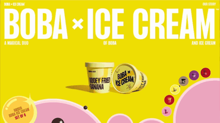
5. Vibrant Gradients
Vibrant gradients are quite pleasing to look at. They feel modern and are an eye-catching versatile visual, that works well as a background, with images, without images. They also work incredibly well within imagery, fonts, or CTA buttons.
Why is that a problem?
The only problem with vibrant gradients is when they are overused, especially when used as a full-screen background. They can also compete with and overpower your CTA buttons if they are too vibrant.
How to use color to boost your conversions:
Vibrant gradient accents are great attention-grabbers, however, make sure the gradients are complimentary and in contrast to the CTA buttons.
Pair vibrant gradients with mostly neutral backgrounds. Keep most sections of each web page neutral or white.
Use gradients within CTA buttons, headlines, and impact metrics to draw the eye toward them.
Overusing gradients is the enemy of conversions. So be strategic with them, and don’t overuse them!
6. Ultra Minimalism
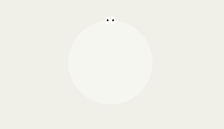
Ultra-minimalist design strips away all distractions and leaves only the core essentials. The other benefit is that a clean website without many elements should load quickly.
Why is that a problem?
Using clear space and simplifying a web page by removing all distractions does put more focus on what is remaining on the page, however, if it also strips away ‘clarity’, then you will have a problem.
The problem with having an ultra-minimalist design is that it often leaves your visitors confused because there isn’t enough information to understand clearly what you offer, how they will benefit from your offer, and why they should choose your solution.
How to use minimalist design to boost your conversions:
Clarity is king, so don’t try to be too clever and too minimalistic. Sure it will look clean, and you will feel like you have a high-end brand, however, have enough text and images on each page to clearly explain your offer.
Use bold, beautiful typography with a lot of clear space around it to draw attention within a minimalist design.
Use mostly neutral backgrounds, with a few carefully chosen accent colors. Don’t go overboard with color.
Having a minimalist website usually loads fast, which is crucial for rankings and usability, especially on mobile devices.
Trends come and go, but having a clean, minimalist design, will save you from frequent redesigns if it’s done well, and is doing a good enough job with conversions.
7. Dynamic Layouts
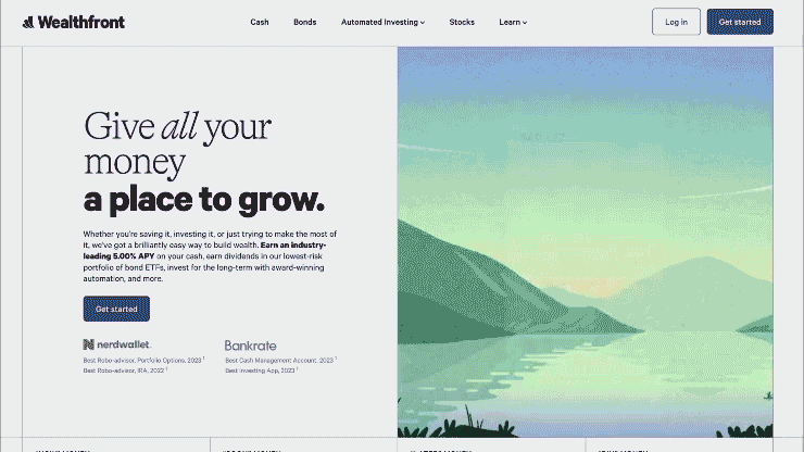
Grid-based web design has dominated for years, and it’s time for something more exciting! Dynamic layouts are here, and they help you break free from boring boxy layouts.
Dynamic layouts instantly make your website feel fresh. When designed well, they can strategically lead your visitors toward important offers, and actions you ultimately want them to take on your website.
Why is that a problem?
There’s no problem with this ‘Dynamic Layout’ design trend, unless it is overused, and makes the website feel messy. Every new trend needs to be balanced with usability. Make sure your dynamic layout is still intuitive for your target audience.
How to use dynamic layouts to boost your conversions:
Have an underlying grid framework to make it easier to understand the content in each section. Then have overlapping sections that protrude into the sections above and below to create depth and interest. This creates a visual bridge between the sections which encourages people to scroll.
Use left-right split screens with content on each side, and use white space, which is the negative space between elements. That creates visual breathing room to draw attention to key design elements and messaging.
You can also use diagonal section dividers to make it obvious that there is more to discover below each section they are currently viewing.
Use large-scale headlines, complimentary fonts, color, and a visual hierarchy to create a professional design that helps people quickly understand your offer, and make it easy for them to take action.
By utilizing everything mentioned above, you can create a visually appealing design that’s unique to your business, that’s user-friendly to boost your conversion rate.
8. AI Imagery
Okay, some of the new AI art tools are mind-blowing! Simply type a prompt for any type of image that you desire for your website in tools like Mid Journey, Stable Difusion, or CHAT GPT4, and boom… the results are amazing. It’s fast, versatile, and opens up creative possibilities we never had before.
Why is that a problem?
Unfortunately, the images created from these AI tools tend to look very similar unless you get creative with your prompts. Also, once you find a suitable image for one part of your website, it’s hard to find another image in the same styling for other parts of your website, so it starts to look very messy, and not cohesive at all, which could confuse your website visitors, especially if the imagery isn’t cohesive with your brand aesthetics.
AI isn’t perfect. You might get weird results, so be prepared to edit and refine what it creates.
Don’t expect magic. AI needs guidance and a good starting point. It won’t replace the need for your creative vision.
How to use AI imagery to boost your conversions:
The biggest benefit of using these AI image creators is the time it saves you!
You can create an image in minutes, and apply it to your website to test how your website visitors respond to it. Keep it if it helps boost your conversions, or quickly replace it if your conversions are negatively impacted!
Things to keep in mind…
- The Ethics Debate: Where do AI-generated images fit in the world of copyright and crediting artists? This is an ongoing discussion.
- Human Touch Still Matters: AI is a tool, not a replacement for designers. Discernment and editing skills are key.
- Weird Results: Sometimes AI outputs slightly off and weird images so look closely at them before you use them.
While AI tech is impressive, sometimes you need a more human touch. Originality is key. Use AI as one tool in your toolbox, not your only source of images.
9. Innovative Typefaces
Gone are the days of using boring fonts. These days, it’s limitless how you can get super creative with fonts for your website. Think of typography as another way to express your brand’s personality. Go bold, go quirky, go custom – whatever aligns with your brand’s vibe.
Why is that a problem?
Too much emphasis on bold eye-catching fonts, can overwhelm visitors and make your website look cluttered. Be selective about what you emphasize, and make sure it still creates a balanced visual hierarchy that focuses on your CTA and other important elements and messaging.
How to use innovative typefaces to boost your conversions:
- Hero Headlines: You can replace hero images with powerful statements in a large, custom font/logo. Make sure the message is crystal clear, as this is the first impression for many visitors.
- Animate slightly: Make your text come alive! Use subtle animations where letters gently shift or change color. The trick is to enhance the message, not distract from it.
- The Sticker Look: Remember collecting stickers as a kid? Get ready for a blast from the past, as playful, mismatched sticker-style fonts. This works best for brands with a fun, youthful target audience.
Pro Tips:
- Readability is Imperative: A cool font is worthless if people struggle to read it. Test on multiple screens and ask for honest feedback.
- Brand Match: The best fonts embody your brand personality. A playful font for a serious financial company? Probably not a good fit.
- Go Beyond the Ordinary: There’s a world of amazing fonts out there. Don’t be afraid to ditch the default options and find something truly unique.
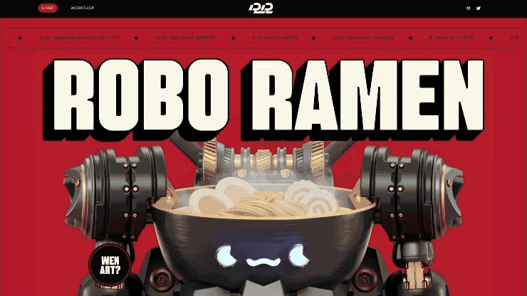
10. Techno and Sci-Fi
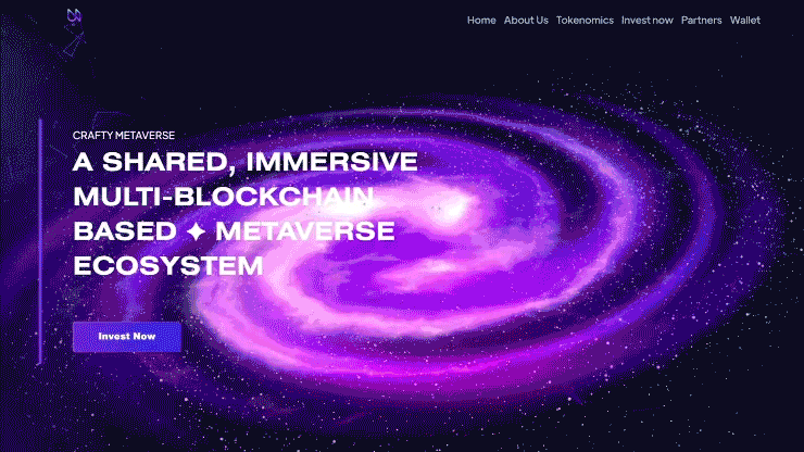
With AI, VR, and Web3 on the rise, we’re seeing a lot of futuristic & sci-fi-inspired graphics. This isn’t just for tech startups in tech – we’re also seeing tech-inspired in other industries from finance to healthcare to portray innovation in their niche.
Why is that a problem?
Don’t let futuristic design compromise usability, and only use this trend if it aligns with your brand. Overly complex distracting visuals can alienate visitors. Strike a balance between cutting-edge flair and a user-friendly experience.
How to use techno & sci-fi trends to boost your conversions:
Using a futuristic techno vibe signals to customers that you’re forward-thinking and on top of the latest tech trends. That builds trust, especially in sectors where innovation is key.
Here are some themes to consider for this Techno and Sci-Fi theme:
- Space vibes: Starry backgrounds, planet-inspired textures
- Bold & Modern: Geometric shapes, custom fonts, dynamic typography
- Slight Movement: Micro-interactions, smooth 3D animations, gamified elements
11. Modern Retro
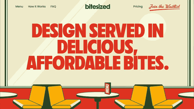
Depending on your brand, sometimes it’s good to go against the tech trend. (As long as it resonates with your target audience) Mix a dash of nostalgia, pixelated fonts, blocky layouts, and even classic 8-bit graphics – all used playfully and sparingly amidst modern layouts.
Why is that a problem?
If the retro isn’t done intentionally and has a modern take on retro, it can backfire by making your website look dated, instead of it looking intentionally nostalgic and cool.
How to use a modern retro design to boost your conversions:
A Retro website design can trigger positive memories for your target audience, and as long as you tie the theme of the graphics into your offer, they can feel more comfortable taking the next action.
Here are some retro design themes to consider:
- Subtle is Best: Your website shouldn’t look tacky and like it was designed in the eighties. A few well-placed retro images, elements, and fonts can go a long way.
- Humor Helps: Don’t be afraid to poke a little fun at outdated retro concepts but do it in a way that’s not cringey.
- Contrast is King: Juxtaposing old-school elements with a sleek layout design will make your website feel fresh and intriguing.
12. Design for Accessibility
Designing your website for inclusivity means more people will be able to interact with your business. The Americans with Disabilities Act (ADA) says it’s the law to make sure every visitor deserves a great experience, regardless of their physical limitations.
Why is that a problem?
There are a lot of ADA guidelines that can be expensive because they take a lot of time to implement. The other issue is that some of the guidelines can make websites look visually boring.
Here are the main guidelines for designing your website for accessibility:
- Use high-contrast fonts at an easy-to-read size on light backgrounds.
- Do not use dark backgrounds or low-contrast fonts.
- Create a consistent, organized layout.
- Create alt tags for all images, videos, and audio files.
- Create text transcripts for video and audio content.
- Identify the site’s language in the header code.
- Offer alternatives and suggestions when users encounter input errors.
- Menus, links, and buttons should be organized so that they are clearly delineated, and easily navigated throughout the entire website by using a keyboard only.
Create your website keeping accessibility in mind because it is important, however, don’t lose sight of the goal of your website – to attract and convert leads.
How to boost your website’s conversions, and not get left behind?
I know it’s tempting to chase every shiny new trend! But trends come and go.
Next year there will be new trends emerging, so if you use the latest trends this year, next year they may be obsolete.
Jumping on the bandwagon can backfire. Here are a few essential tips for staying ahead of your competitors with your website…
Strong Branding – Work on positioning your brand as the trusted authority in your niche. This means being consistent with your brand voice across all your marketing, and constantly looking at ways to level up your perceived value.
Visual Storytelling – Use your website to tell your story, and your client’s stories, and to visually explain how you can solve your ideal customer’s pain points.
UX is King – A trendy but confusing website won’t get results. Before adding that eye-catching animation, ask yourself: does this make it easier for people to find what they need? User testing is a great way to make sure your design choices are working in the real world.
Fast load times – A mobile-friendly responsive design is essential. Invest in a skilled website designer and developer who understands conversions and optimization. Frustrating tech issues can undo beautiful design work in an instant and can tank your search engine results.
Summary: Be Trend-Savvy, Not Trend-Driven!
Don’t blindly follow the crowd! – Take some time to think about why certain trends are gaining traction, and whether they align with your business goals and your brand.
Inspiration is everywhere – look at what your competitors are doing (zig where they are zagging), browse Pinterest, and even check out other industries for fresh ideas.
Here’s the key – Every trend you implement should have a purpose. Does it strengthen your brand message? Make your website easier to use? Or will it just look cool for about five minutes?
Your website should be as unique as your business! – Use trends to enhance your core identity, not overshadow it. The goal is to create a space that keeps those visitors clicking and coming back for more.
Need a Second Opinion? – That’s What We’re Here For!
Book a free consultation, and let’s talk strategy. Sometimes, it’s hard to be objective about your own website.
We’ll pinpoint which trends could take your website to the next level and explore ways to boost your results.
No sales pitch, just a chance to see if we’re the right fit to help you achieve your website goals.
When designed the right way, your website can be a powerful tool for growing your business!