Imagine walking into a department store, searching for a specific product. You scan the aisles, but there’s no staff in sight to answer your questions. You’re left making a decision based solely on the packaging. The design, colors, and messaging on that box suddenly become the most important factors influencing your choice.
Now, think about your website. Just like product packaging in a self-serve retail environment, your website needs to do the heavy lifting when visitors land on your page. It must instantly capture attention, communicate value, and guide users toward making a decision. One of the most powerful tools to achieve this is Color.

The right colors on your website play a vital role in shaping first impressions, influencing emotions, and driving conversions.
Your website also needs a color scheme that aligns with your brand, resonates with your audience, and subtly persuades visitors to take action.
Poorly chosen colors, on the other hand, can confuse users, reduce readability, and create an unprofessional look.
Is your website’s color palette working for you—or against you? Let’s dive into how color impacts user experience, decision-making, and ultimately, your website’s success.
Why is Color Important in Website Design?
The color scheme of your website is one of the most influential factors in how visitors perceive your brand. When used strategically, the right color choices can attract attention, enhance readability, strengthen brand identity, and encourage visitors to take action.
Studies show that people form opinions about a website within seconds, and much of that judgment is based on color.
Selecting the right color palette requires careful planning. It involves understanding color psychology, contrast, accessibility, and branding principles.
The right color scheme helps visitors process and retain information more effectively, increasing brand recognition and guiding them toward action.
Since visitors often subconsciously judge a brand based on its color scheme, ensuring your palette aligns with your business identity and message is essential.
What if you choose the wrong color palette?
This initial, almost instant judgment can significantly shape whether visitors stay on your page—or hit the back button and disappear forever.
If their eyes interpret colors before they read a single word. In those first few seconds, colors quietly convey emotions, establish credibility, and set the stage for everything that follows.
In an increasingly competitive online landscape, harnessing the power of color can give you a decisive edge. The colors you choose act as an unspoken language, reaching deep into visitors’ emotions to set the tone for their experience with your brand.
Let’s break down the essential aspects of how to use color effectively…
Understanding Harmonious Color Theory in Website Design
Color theory is essential when designing a visually appealing website. Knowing the basics of color relationships will help you create a balanced and effective palette.
The color wheel is a useful tool for selecting color combinations and applying the principles of analogous, complementary, monochromatic, and triad color harmonies.
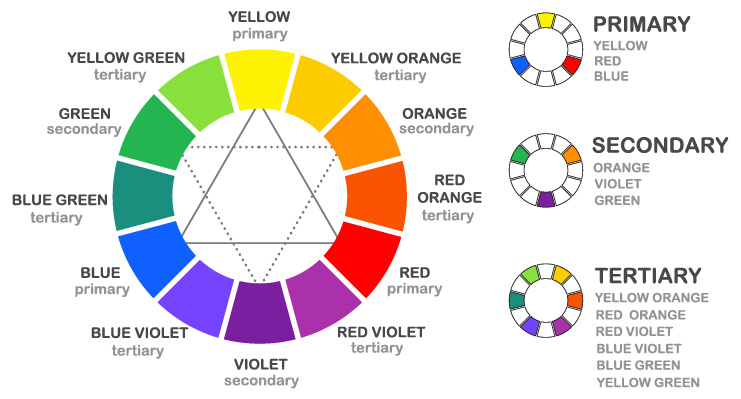
Some of the most common color harmonies used in design include:
- Analogous colors, sit next to each other on the wheel and create a cohesive, harmonious look.
- Complementary colors, are opposite each other and create strong contrast for high visual impact.
- Monochromatic color schemes, use different shades of a single color for a modern, minimalist look.
- Triadic color schemes, use three evenly spaced colors for a vibrant and balanced palette.
Applying these principles ensures consistency and improves the user experience.
Here is a helpful formula for balancing your palette:
The Color Balance Tool helps create a visually appealing and user-friendly website by strategically distributing colors.
Using too many colors can overwhelm visitors and make your website feel chaotic. A well-balanced palette usually consists of…
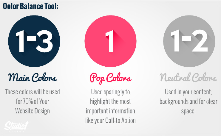
Your main colors (1-3 colors) should dominate about 70% of the design, establishing brand identity and consistency.
A pop color (1 color) is used sparingly to highlight key elements, such as Call-to-Action buttons ensuring they stand out.
Lastly, neutral colors (1-2 colors) provide clarity and balance by being used in backgrounds, body text, and whitespace. By following this formula, you can achieve a cohesive, professional look that enhances readability and guides user attention effectively.
Be careful about using too many colors, too many colors can compete and cause eye fatigue, and overwhelm your customers. Introduce new experimental colors in small quantities to reduce risk.
Choosing colors for a website is not about selecting your favorite shades. Your palette should appeal to your ideal customers and feel cohesive, legible, and supportive of your brand.
Prioritize Readability with Contrast and Accessibility in Mind
Readability should always be a top priority when choosing a website color scheme. If text blends into the background or lacks contrast, visitors may struggle to read it, leading to frustration and high bounce rates.
Dark text on a light background is the most readable, while light text on a dark background can be difficult to read in large amounts. Low-contrast color pairings might look stylish, but they can frustrate users, especially those with visual impairments.
Testing your website’s color contrast on multiple devices ensures that it remains legible and accessible to all users.
Using Color to Guide User Actions and Drive Conversions
Your website’s colors should direct visitors toward key actions. Calls-to-action, such as “Buy Now” or “Join Now” buttons, should stand out from the rest of the design to grab attention and encourage clicks. This can usually be achieved by using a contrasting color.
A common mistake is making everything bright and bold, which can make important elements blend into the background. Instead, choose a contrasting color for your CTA buttons and surround them with whitespace to make them more prominent.
For example, if your website features cool tones like blues and grays, using a warm color like orange or red for your CTA buttons can naturally draw attention.
Color Models:
We describe colors using color models. There are millions of colors and naming them all and remembering the names is impossible, that is why color models or standards were invented to help us describe colors.
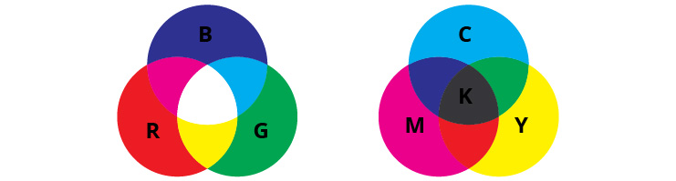
The RGB Model:
The RGB model is used when working with screen-based designs. A value between 0 and 255 is assigned to each of the light colors, Red, Green, and Blue.
The CMYK Model:
The CMYK model is used for print work and it describes colors based on their percentage of Cyan, Magenta, Yellow, and Black. CMYK is known as a “subtractive” color model
The LAB Model:
The Lab color model is a slightly more complex beast. It is made up of three components – the lightness component (L) ranging from 0 to 100, the “a” component comes from the green-red axis in the Adobe Color Picker, and the “b” component which comes from the blue-yellow axis in the Adobe Color Picker.
What Do Colors Mean?
Colors often resonate on both logical and emotional levels. Think about iconic brands and the colors you automatically associate with them—Coca-Cola’s vibrant red, Starbucks’ deep green, McDonald’s golden arches. Over time, these hues have become visual shortcuts for recognition, creating almost an emotional fingerprint for each brand.
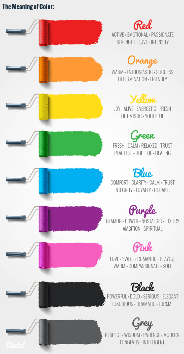
As human beings, we’ve evolved to associate specific colors with certain moods or environments—like linking deep greens to nature and growth, or bright yellows to energy and optimism. Even slight variations in hue or tone can evoke different feelings:
- Red: Conveys energy, excitement, and passion. It’s eye-catching, but overuse can suggest aggression.
- Blue: Reflects stability, trust, and calmness. Financial institutions often leverage blue to imply reliability.
- Green: Symbolizes renewal and natural growth, making it popular among eco-friendly and health-focused brands.
- Orange: Evokes enthusiasm, creativity, and warmth, but demands a balanced approach to avoid seeming garish.
- Yellow: Radiates cheerfulness and optimism, though too much can feel jarring or overwhelming.
- Purple: Represents sophistication, royalty, and sometimes mystery, often used for more luxurious brands.
- Black: Conveys power, mystery, and elegance, representing both authority and the unknown, evoking bold sophistication.
- Gray: Embodies neutrality, sophistication, and practicality, with a subtle calmness. Gray is a common choice to offset stronger colors.
- White: Symbolizes purity and simplicity, evoking fresh starts, clarity, professionalism, and a blank canvas of possibility.
These emotional triggers aren’t one-size-fits-all—cultural differences, and people’s past experiences, play a role in how they react to color. Nevertheless, color psychology provides strong guidance for choosing your palette.
Cultural Nuances and Accessibility
In a global marketplace, color choices can resonate differently depending on cultural contexts. For example, white, which is often linked to purity in some Western cultures, can symbolize mourning in parts of East Asia. Recognizing these nuances is important if your audience spans diverse regions or demographics.
Color accessibility also plays a significant role
Many people live with color vision deficiencies—often referred to as color blindness. A palette that relies exclusively on subtle color differences might alienate or confuse them. So choose colors that ensure sufficient contrast to help as many users as possible.
Choosing the Right Color Palette for Your Brand
Understanding the theory behind colors is one thing. Choosing a successful color palette for your brand is another. If you haven’t defined a brand palette yet, this is an ideal moment to do so.
Pick colors and hues that align with your brand’s character and speak directly to your audience’s sensibilities. Start with what you know…
Branding: If you have an established business, start with colors that are on brand and then introduce new colors.
Your Audience: The chosen colors must also represent the emotions that your brand intends to convey. Know your target demographics and research what they respond to.
Trend: Understanding color trends gives you great insight into what’s coming down the pipe, helping you create a website that is new & progressive.
Emotional: Also consider what kind of emotional response you want people to have or what story you are telling.
Balance: Think about the color harmonies, usually when deciding on a color palette you’ll begin with the dominant color. Then start to layer your palette. Darker colors tend to be seen first and carry more visual weight, then work your way back to lighter colors.
By selecting a palette that aligns with your brand’s personality, and supports your conversion goals, you ensure that those first few seconds of user perception translate into lasting impressions—and, ultimately, into lasting customers.

Important note: Before choosing your color palette, research your competitors. If your choices are too similar, you risk confusing visitors and blending into the crowd. Selecting a distinctly different color scheme helps ensure your brand stands out and remains memorable.
Color, then, isn’t just an afterthought; it’s a powerful language that can influence behavior, evoke trust, and encourage conversions. From bright, energetic colors used in sporting brands, junk food packaging & energy drinks, to calming blues and neutral grays employed by financial services, legal firms, or uniforms. The right (or wrong) color strategy can make a profound difference in your website’s effectiveness.
This is why your designer should truly understand your target audience. They need to design more than just a visually appealing website; they should create one that resonates with the psychology of your audience, speaking directly to their needs.
Where do you find color inspiration?
Inspiration is everywhere, it can be found in the outdoors, by studying different design fields, understanding your customers and competitive market, and staying informed with forecasted color and web/ branding trends. To help you on your color journey here are some of the trusted resources used at Studio1Design.
Pantone:
Pantone is the design industry leader when it comes to color. Pantone provides the latest in color trends across all forms of graphic arts, fashion, and Interiors, paint & plastics. Pantone is a physical color index and the perfect tool for any designer or business crafting products that are printed. Using physical color swatches allows you to know exactly how your color will look on paper or fabric saving you time and guesswork.
Pinterest:
Pinterest holds an impressive number of color palettes created by designers and creatives all around the globe. Simply search by color, season, or theme for instant color inspiration.
Color Resource Websites:
From bright Pantone swatches to colorful idea boards, dedicated color websites and blogs can be a great way to experience unique color combinations you might not have thought to try otherwise. Try sites such as Design Seeds, Color Collective, COLOURlovers, Color Wheel by Adobe, or Colrd for instant color palette inspiration.
Summary & Conclusion
Color plays a critical role in website design, shaping how visitors perceive and interact with your brand. A well-thought-out color scheme enhances brand recognition, improves readability, and guides users toward desired actions.
By understanding color psychology, contrast, and accessibility, you can create a visually appealing and effective website that not only looks good but also drives engagement and conversions.
If you’re looking to create a professionally designed brand and website, having a strategic approach to color selection is essential.
Need Help Perfecting Your Website’s Color Palette?
Your website’s color scheme is a reflection of your brand. If you need expert guidance in creating a visually compelling and conversion-driven website, our team at Studio1 Design can help.
Explore Our Branding & Logo Design Services to ensure your brand stands out and resonates with your audience.