Below is a snapshot of some key design trends emerging this year that you should take note of if you want better results from your website, even if you updated your website last year!
There are over 1.3 billion websites online today. That’s twice as much in 2013. So it’s extremely important to be more memorable in a very noisy on-line world.
The design trends in this blog post all contribute to building trust with your website visitors and focus on influencing them to take action.
These design trends won’t kill conversions if designed professionally, unlike some other design trends out there right now!
1. Have a Unique Brand Personality
This year, established businesses are steering further away from stock imagery, website templates, and boring generic content that even artificial intelligence algorithms (AI) can create these days.
Unique & creative use of color, typography, photography, texture, illustration, video, animation, and branding design elements all play an important role to create a custom look that’s unique to your business.
The goal is to make a visual impact and to engage your prospects with your brand. Get that right and you can build a tribe of raving fans.
Use Minimalistic Page Layouts
Website design is becoming even more minimalistic. Simple website design layouts usually mean a faster load time, so it’s more likely that you will rank higher in search engines when your website loads faster.
Clean page layouts provide a clutter-free, aesthetically pleasing, easy read & uncomplicated experience for your visitors.
Look at each page of your website and ask yourself, what you can remove from the page that won’t affect conversions. Leave the social proof and trust-building elements. Everything else can be removed.
On mobile views of your web pages, the goal is to have the load speed as fast as possible, so go one step further and replace images with flat color backgrounds instead.
3. Sticky ‘Call To Actions’ is HOT!!
We know that having a stick top navigation is helpful for your website visitors to save them having to scroll to the top of the page to get to the top nav. ‘Sticky’ just means that it remains ‘static’, even when scrolling.
Now we are taking the sticky nav one step further and embedding the ‘Call To Action’ (CTA) into the top nav to make it even easier for people to take action.
Traditionally, your website visitors would scroll down your page, and if your CTA isn’t in the exact position at the exact moment that they are ready to take action, then there’s a good chance they won’t take action.
Having a sticky CTA means that no matter where they are on your page the CTA is always displayed at the top of the page or in the footer of the page. This increased the likelihood of them taking action.
Sticky CTAs are especially effective when your website is viewed on a mobile device. This is because the viewable area is smaller so the CTA stands out more and is always in view.
Personalise Your Content with AI
Recent advancements in ‘artificial Intelligence’ (AI) can give your visitors a more relevant way to interact with your website.
For example, if you segment your visitors into buckets (categories, challenges, experience level, What they have consumed previously, etc.) then from that moment your site can display content and call-to-actions that are relevant to only the bucket that they have been segmented in.
You are already experiencing the benefits of AI on websites like Amazon, YouTube, NetFlix, Facebook, Google, Etc.
If somebody has registered their details on your site, the next time they visit, you can customize what they see. You can even welcome them with a personalized message with their name in it.
This personalized experience is based on AI algorithms & cookies, that essentially make your visitors feel like your website speaks directly to them. This approach is a huge conversion booster.
Using Depth & Drop-Shadows Properly
As flat vector design elements become a dying trend, digital design elements are given a new life by giving them depth and dimension using new soft large drop-shadows, to help create the right hierarchy to emphasize and draw attention to certain elements like CTA buttons.
Although drop-shadows are not a new concept, they haven’t been used for a few years now on websites, even though a drop-shadow on a button converts better than if it didn’t have one.
Without a shadow, the button looks flat resulting in it not looking like a button, hence fewer people would click it.
Get the balance right and you can have a good looking web page that also entices people to take action, based on the visual hierarchy, plus you will look cool by using this latest design trend =)
6. Using Sexy Curves & Organic Shapes
For years website developers have dictated how a website should be designed sticking to a grid layout. As website technology has evolved, developers are pushing the boundaries and website designers are bored with the usual grid layout, we are now seeing designers thinking outside of the box.
We are now seeing more of an organic and fluid approach to design elements on some leading websites.
Curves and organic shapes are seen in image containers, CTA buttons, branding elements, and animations. Background colors are also using organic, soft, flowing shapes that carry your eye down the page effortlessly.
This trend won’t suit all websites, especially if it doesn’t match your brand’s identity or won’t appeal to your target audience and clients.
7. Using Scalable Vector Graphics Can Speed Up Your Site
Scalable Vector Graphics (SVG) is a fancy way of saying an image that is resolution-free. They are usually logos and icons. They are not bitmap/pixel-based images at all. They are made up of vector paths, so no matter how large they appear on your website they will look crisp and are incredibly small in file size.
Not only do SVG images look sharp and crisp regardless of the visual size, they can also speed up your website if you replace pixel-based images with SVG images.
8. Use a Single Background Color to Maintain Page Flow
A lot of sales pages use long scrolling pages to explain their offer. A lot of page designs are often broken up with different background colors for different sections throughout the page. The problem with that is that it can ruin the flow of the copywriting, or even worse sit may look like the end of the page when.
A single background color throughout the entire page keeps the focus on the copywriting and doesn’t ruin the flow, like it can when the background color changes.
Tip: The best background color to use is white with dark fonts. This is the most readable, especially when viewed on a mobile device.
With increased mobile browsing and changes in people’s reading habits like scanning headlines, a clean design with one background color, plus the use of clear space and images to enhance the copy will increase your conversions.
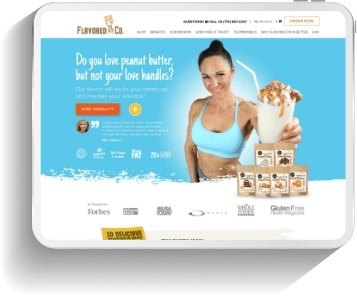
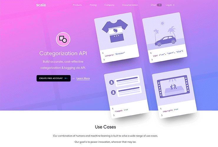
9. Use Brave Color To Stand Out (Only if it suits your brand)
With the world-wide-web becoming saturated in every niche, being bold and brave with strong color backgrounds can help you be more memorable and stand out in a noisy market.
From super saturated brights to soft pastels and monochromatic contrasts, it’s all about moving as far away from ‘web-safe and traditional palettes to more daring and creative combinations.
Only use brave colors as long as it reflects your brand’s identity and appeals to you’re the target audience.
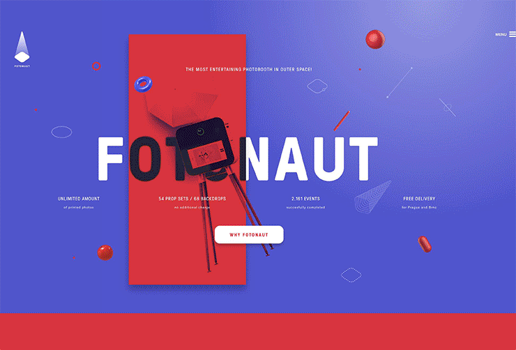
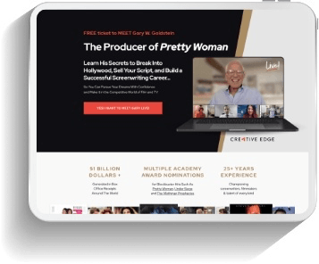
10. Use Large Typography with Photographic Elements
Typography is not only becoming more customized but it is getting bigger and bolder than ever before in website design.
Bold font styles help visitors focus on your content and can capture the attention of visitors with a single glance.
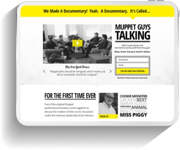
Another strengthening trend is the combination of large typography and photographic imagery. Large typography words are blended with photographs to create a single, seamless powerful image.
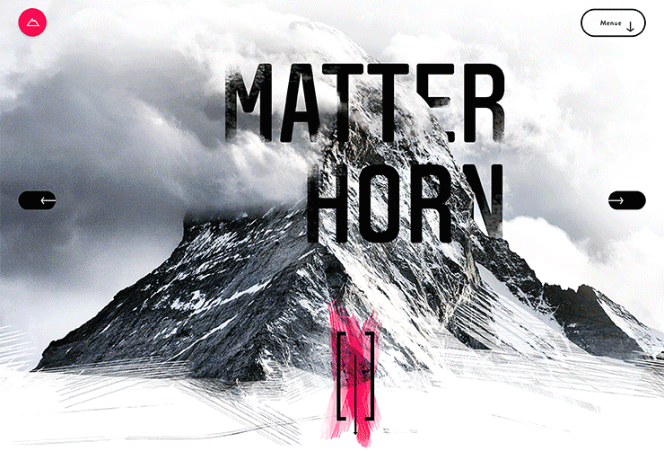
11. Be Creative with Inventive Typography
With website layouts becoming cleaner and simpler, using more creative uses with typography throughout website design can help make a powerful visual impact.
Typography serves as one the most crucial branding elements for many businesses. For years websites have been restricted to a small set of fonts. As screen resolutions increase and internet speeds are getting faster, brands can now craft their typography styles to stand.
In some cases large, well designed words can replace images all together, making websites load quicker, which can mean better search rankings.
12. Use Scroll Triggered Subtle Animation with Caution
If you want to draw attention to certain elements on your web page, a subtle animation will draw the eye to it. Having that animation only animate once you get to that section of the page is a powerful way to draw attention to an element at the exact time that it comes into view, triggered by the scrolling action.
Make sure the animation is only subtle and doesn’t overpower the main CTA on the page. You can even use a subtle animation on the CTA button. It’s also a good idea to use it on social proof elements, especially using it on numbers. The numbers can climb from a lower number and stop at the final higher number at the moment you scroll to that section of the page.
Scroll-triggered animations don’t require large amounts of data so they are worth testing to see if it increases your conversions.
Design Trends That We Predicted in 2017 That Are Still Working Well in 2018:
- Asymmetric / Broken Grid Layouts/ Overlapping Elements
- Custom Illustration and Iconography
- Color Gradients (Starting to become overused.)
- Big Bold Fonts
- Subtle Animations & Cinema-graphs
To see our 2017 predictions check out this blog post
Dying Website Design Trends in 2018:
- Full-screen welcome mats (User fatigue.)
- Flat vector design (Completely overused.)
- Parallax. (It’s about time. This trend is a proven conversion killer!)
- Video backgrounds (Another distraction that’s a proven conversion killer!)
- Stock images (Completely overused, especially cliche cheesy images.)
- Ghost Buttons (Overused and don’t convert as well as a solid button.)
Bonus Evergreen Website Design Trends:
Here are some bonus evergreen website design trends that boost conversions:
-
-
- Pop-up windows (These still work well with every type of ruling, like entry pop, exit pop, time on site, about of page views, etc.
- Social proof galore. (Especially on mobile. Just have an offer + social proof galore = conversion!)
- Floating ‘Call To Action’ widgets in the sidebar. (This keeps your CTA in view at all times, even when scrolling.)
- Videos. (Video is a great way to build trust. Face to camera, illustrations, animations. All work well.)
- Using comedy in your design. (Comedy can make people feel at ease, which can lead to them feeling less anxious to take action.)
-
Listen in to our 2 part podcast (part 1 & part 2) where we discuss these design trends in more detail.