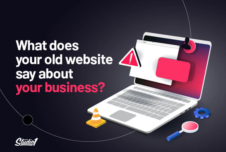
Are you proud to send people to your website because it looks fantastic, and makes your business look like the best solution to solve your prospect’s problems?
Are you happy with your website’s performance as a 24/7 marketing machine or do you wince when you look at your website because you know it could be so much better?
When I talk to people about their websites and how they feel, here are their most common complaints about their websites:
- “I’m embarrassed to give people my website link—I avoid it as much as possible”
- “I know I have to have a website — but it does nothing for driving sales in my business”
- “I don’t like my website — but I don’t know what to do about it.”
One that particularly sticks in my mind is:
“It’s the most expensive business brochure I’ve ever paid for!”
Why did this particular complaint stick?
This complaint really emphasizes the fact that their website designer doesn’t understand what it takes to convert your hard-earned traffic into hot leads and customers! Instead, their website is just like an online brochure.
Your website should be treated like a retail shop window, where it draws people inside your business, and then gives them a clear pathway to show that you are the perfect fit to solve their problem.
Ask yourself this…
“What would it mean for your business if your website demonstrated how much of a perfect fit your business is and it drove a lot more leads and sales than you’re currently getting?”
This article will help you navigate exactly what it takes to design your website with strong foundations to drive more leads & sales in your business, just like an effective shopfront does.
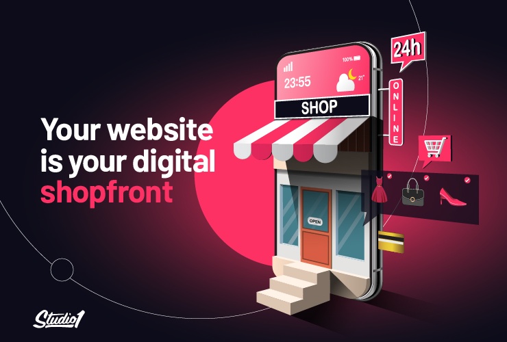
Your website is your digital shopfront
Think about what makes a really top retail shop window and how much careful planning and design goes into making it draw people in, and make the selling process much easier because the shopfront does a lot of the heavy lifting.
It starts with the basics. It’s well lit, it’s well styled–but there’s a lot more going on than good lighting, a cool color scheme, and some trendy fittings.
Good retail shopfronts are a selling process, not just a product display
A top retail shopfront has an enticing range of items on display.
The items in the display windows aren’t just dumped there individually; they’re carefully placed to make a complete offer, ATTRACT and ENGAGE visitors to help turn them into customers.
They may also have a ‘specials’ rack that leads into their store for passers-by to flick through.
Your website can be the same if it’s designed as a digital shopfront with a strategy to convert cold traffic into paying customers, instead of just being a brochure.
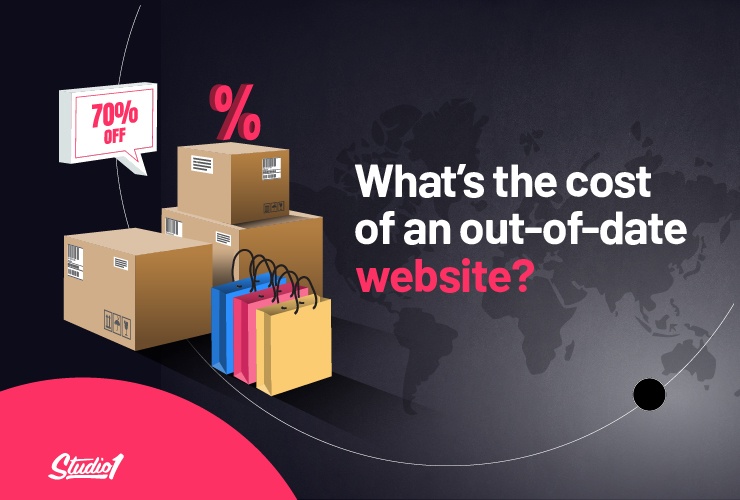
What’s the cost of an out-of-date website?
“If you think that good design is expensive, you should look at the cost of bad design.”
– Dr. Ralf Speth, ex-CEO of Jaguar.
If your website is out of date and isn’t selling the essence of what you do today, then what you have is an expensive brochure.
However, what you may not have realized is that an outdated website comes with less obvious costs.
You see, today when people first discover your business or offer via social, ads, or word of mouth, one of the first things that they do is visit your website.
If they are interested in what you have to offer, there’s a good chance they will also check out your competitors.
Appear more trustworthy than your competitors
If your competitor’s website looks newer and more appealing than yours, your visitors are more likely to gravitate to them. The older and more outdated your website is, the bigger the trust gap will become they may purchase from your competitors instead of you. if they have a great experience then you miss out on future leads too.
That’s why your website needs to look current and be designed as a 24/7 marketing machine. If not then you will also have the following problems…
You lose relevance
Businesses are dynamic; they change every day. If you’re a successful business, you’re unlikely to be doing things exactly the same as when you started; that logic should also be applied to your website.
If nothing else, you’ve continued to serve and grow your customer base, and most likely a whole lot of innovation has happened over recent years.
If none of this shows up on your website, then you won’t look current and they may decide that you’re not relevant anymore, and they are more likely to press the <BACK> button.
You lose security
Out-dated websites run on outdated platforms—and outdated platforms are a risk to your security. They’re also seen as risky by search engines and browsers, so they get downgraded and even blocked by virus defense programs. In a world where cybercrime is a global industry funded by rogue governments, this matters A LOT.
You lose rankings
One of the factors that search engines evaluate is the currency and performance of your website. So if nothing’s changed on your website for years, it’s a good bet that something has changed in your ranking.
Your return on PPC, social media, and content marketing is reduced
Most of your visitors WILL check out your website, so if your presentation is not consistent, you will lose trust and engagement. So the return on your awesome content won’t be what it could be.
Your repeat customers can get bored
If you’re running a good business, be kind to your repeat customers. Give them something new to look at. It could be something as simple as new background images, a new offer, or a lead magnet.
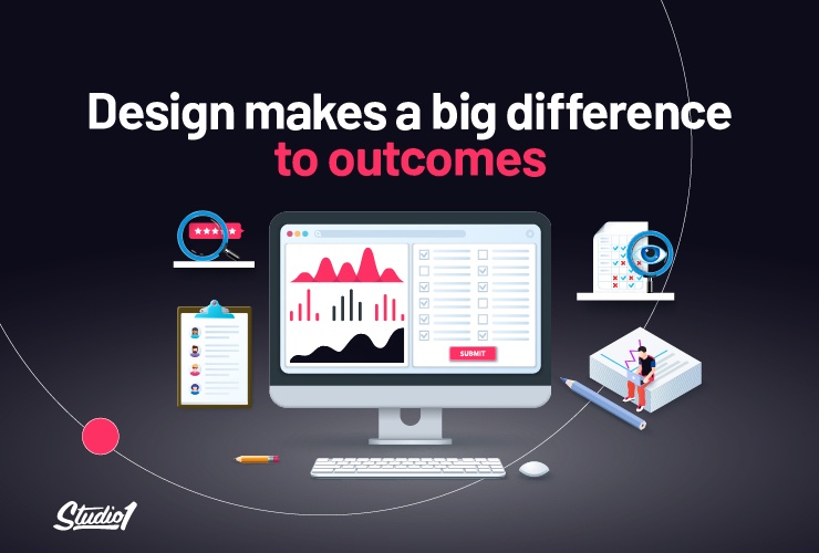
Your Design Matters – & makes a big difference to outcomes
There are around 1.2 BILLION websites in the world today, but a surprisingly small number are designed properly to maximize conversion.
Some are beautiful graphic designs but are not designed for conversion. Others are older and less beautiful. They may have performed okay in their day but are not performing these days.
If you fall into one of those two categories, whatever industry you’re in, you have a lot more global competition these days, so it’s easy to get left behind.
Great design builds on strong foundations
To design a high-converting website that operates as a 24/7 marketing machine you need good foundations:
- A strong understanding of your audience and their desires
- An explicit and comprehensive brand position—your purpose, your values, your USP, and your value proposition
- Clarity on psychological drivers, the science of influencing, and how to use them in marketing to your audience
- A defined marketing strategy that takes your online customer through a process from visitor to prospect to customer
With those good foundations, we can design you a high-converting website; a website specifically designed to persuade your visitors to take action because they trust that you can help them meet their needs.
Strong foundations boost your website to the next level
A next-level website design must include the following:
- Position your customers as the hero and your business as their guide.
- Make sure you lead with value, have helpful content, and showcase your authority.
- Have copywriting that’s persuasive, hooks people emotionally, explains clearly how you solve your prospect’s problems, and what the implications are if they don’t choose you.
- Your ‘conversion-focused design has social proof and credibility-boosting elements throughout the site using psychological persuasive drivers that help build trust.
- Use a color palette and images to appeal to your target market, with a modern design layout that is clear & easy to navigate.
- Make sure the design has the right visual hierarchy to entice your visitors to take action. (Opt-in &/or buy, get started, etc.)
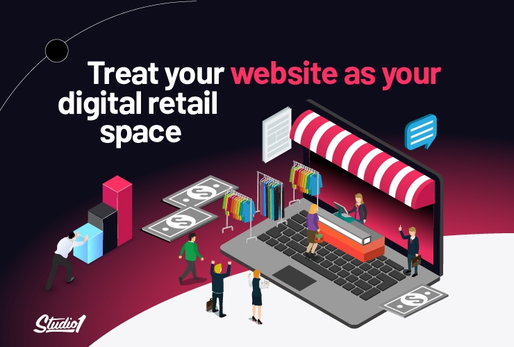
Treat your website as your digital retail space
Make sure you’re market-aware
Regularly review and update your marketing foundations—your target audience description, your brand position, your influencing process, and your marketing strategy.
We’ve been through some challenging times and many businesses have made major pivots but make sure your foundations are still relevant.
Keep your “premises” awesome
Always be cleaning and freshening your website and your online presence:
- Have a structured process to keep your website content fresh—things such as image changes, copy updates, new customer logos for your trust builders, ongoing testimonials; as well as your latest media presence and achievements
- Check your social platforms and content are aligned with your website and your brand
- Keep creating helpful content that’s relevant to your current market
- Check your past content for relevance and correctness in today’s world
- Keep your website platform, security and maintenance up-to-date
Refurbish regularly and strategically
Plan and budget for a regular and complete website rebuild. We recommend around every 3-4 years (sometimes more often, if your website hasn’t been built on proven psychological principles and high-converting design practices)
Business always evolves. The world changes and your business will change with it. The customers you serve and the way you serve them aren’t what they were just two years ago.
Technology changes, and the platform your website is built on will date even more rapidly than your website. So whatever it’s developed in— whether it be WordPress, Kajabi or Shopify—if your website is more than 2 years old it may well need a rebuild.
A substantive website update will demonstrate to your customers how your business is evolving; and that’s a trust-builder in itself.
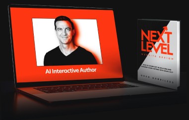
Case Study – Small Business Big Marketing
We redesigned the website for Small Business Big Marketing to take its performance to the next level. The overhauled website went live at the start of 2022.
The before look
The old version looked good for its day, but websites have changed a lot since then. Play the video below…
After our design update
After our overhaul, where we applied our next level website design principles, it now looks like this: (Play video)
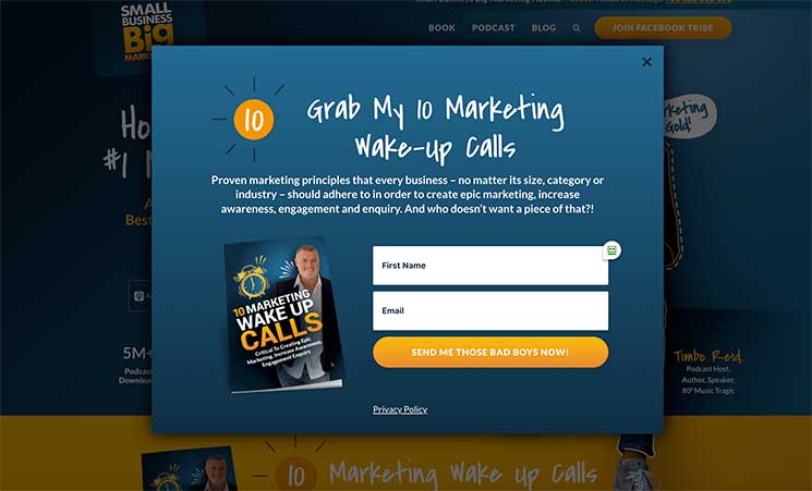
The pop-up below has driven thousands of opt-ins:
Within 2 weeks, Small Business Big Marketing saw a boost in traffic AND an increase in people ‘joining their Facebook tribe’ and becoming warm leads moving down their sales funnel.
If we detailed everything that we did for SBBM then we’d have a book, not a blog post. However, here are some key highlights…
We designed a home page that clearly displayed what the show is all about
The blocks flow down the page so all visitors need to do is scroll. They’re super-optimised for mobile, so visitors just keep scrolling. The blocks are sequenced purposefully to build trust and flow. It starts with:
- A header that answers his visitor’s key question: “who are you and are you offering a solution to my problem”
- A free high-value offer (access to Timbo’s 10 Marketing Wakeup Calls)
- A video intro to his podcast by Timbo, explaining “what’s in it for you” to his visitors–great for people who prefer listening to reading
- A written introduction to Timbo, featuring a great, character-full photo of him
- An introduction to Timbo’s award-winning podcast
- Listener reviews from the podcast
- Timbo’s best-selling marketing book (people trust authors)
- … and several more blocks…
Written out this way, it sounds like a lot – but if you go to the website and scroll down through it and you’ll find a simple, easy, and engaging user experience on mobile & desktop.
Here are some other key changes we made…
We restructured the navigation for simplicity and action
The primary menu is down from nine key options to four key options which makes it much easier for visitors to take action.
We gave the podcast its own space
Instead of having the episodes on the home page, we built a modern, uncluttered and stylish page just for the podcast.
The home page still has podcast blocks–but after a whole lot of trust building. And the blocks are relevant and changing selections:
- 5 of the most recent episodes
- 10 most downloaded episode
We built trust into the design
We TOLD and DISPLAYED Timbo Reid’s expertise and audience reach with stats and awards.
We put “the real Timbo Reid” front and center
People do business with people–especially when they’re choosing an expert advisor. So we featured Timbo as a person, replacing the dated headshot with his personable presence.
We made the important actions clear
What Timbo wants is more members in his Facebook tribe, so we made that action button super clear and kept it front and center in a sticky header that stayed visible as visitors scrolled down the page.
Timbo also wants more podcast followers, so we made his podcast accessible in several places, including the header above the fold.
We made the value-packed download super clear
We re-designed Timbo’s high-value ’10 Marketing Wakeup Calls’ download for maximum clarity
It changed from this cramped, cluttered, hard-to-read block:
To this cleaner, much less confusing design:
There’s a whole lot more that we did
I could write a book on next level website design and how we applied it to Small Business Big Marketing
But now, feel free to check out all the pages on Timbo’s website here > SmallBusinessBigMarketing.com
Case Study – Effortless Swimming
Back in 2017, we started working with Brenton Ford on the website for his business Effortless Swimming.
Brenton is an awesome, inspiring person who has been helping swimmers go faster for decades. He’s taught thousands of people how to improve their swimming by developing better technique, not just expending endless effort.
If you viewed his website up until 2017, it looked like this, which was great for the time: (Play video)
Then we supercharged Effortless Swimming – with a next-level website design
Brendan was an awesome client to work with—he’d done a lot of work over the years on his marketing foundations. He knew what his offer was, what his USP was, and what his clients wanted.
That made it easy to design a website for Brenton that sells his training and coaching 24/7 EFFORTLESSLY!
It’s a website designed to connect, build trust, show value, and CONVERT. It’s a website that makes his offer something that very few serious swimmers can refuse. It’s a website that’s not just visually stunning—it’s also carefully designed to appeal to and convert his target audience.
Here’s how we did it:
- We worked with Brenton to understand his business and what makes him unique.
- We worked with our copywriting partner to get a clear understanding of what the value of his offer meant to his audience.
- We applied our tested, proven design process—to showcase his unique brand and awesome content.
Brenton loved the design and the way his opt-ins increased. He became more confident in creating even more free content which has further boosted his traffic! His choice to invest in his website, brand and online presence has paid off big time.
AND in the first year after the website went live (in 2018), they increased their membership sales by nearly 50% more than their previous average!
This was the result – and it was a game changer for Effortless Swimming. The results went up, and up. Here’s what their website looked like after a spruce-up: (Play video)
Every business evolves over time—and it pays to show it
That’s an investment being made by Effortless Swimming, with a major makeover we can give you a sneak preview of some key differences between the 2018 and 2022 Effortless Swimming website:
- An edgier, high-contrast look and feel—one that is still consistent with his visual branding
- A whole new opening offer to join the ‘Become A Faster Swimmer’ challenge
- Trust indicators that reflect his business longevity and his online popularity
- An ‘As Featured In’ section showing the trusted sports media who report on his work
A complete overhaul tells your customers that you’re relevant
A complete overhaul says something powerful to your existing customers and to the leads moving through your marketing funnel. It tells them that you’re doing well—and that you can help them do well. See the entire website here: EffortlessSwimming.com
So what DOES your current website say about your business?
Do you have an active digital retail space that presents your business at its best?
Or do you have a dated, clunky, costly brochure?
Does your website tell the story of your business as it delivers today—or as it was years ago?
Is your website costing your business a whole lot more than you get billed for hosting and content?
If the honest truth is that you have a dated, passive, expensive brochure, then it might be time to invest in a next-level design that drives growth for your business.
Book a Free Strategy Call to discuss your website goals. We’ll identify what specifically is holding your website back.
This won’t be a hard sell; just a friendly, informative chat to help you identify what is most important to turn your business into a high-class digital retail space.