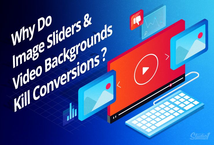
When image sliders first hit the interwebs, I used to think they were cool.
Everybody who saw them for the first time got really excited by the fact that they could have something moving on the page that shows everything they offer one slide after another. How cool!!
So the internet started getting flooded with image sliders. And as videos go really easy to make, autoplay background videos joined them, until…
Until conversion rate experts like Tim Ash from SiteTuners and Peep Laja from ConversionXL did thousands of split tests across many industries.
What they discovered was that all that bling didn’t move the needle when it came to increasing sales.
Instead – almost all sites that used images sliders and video backgrounds actually lost sales because of them!
When you understand WHY it will help you avoid a wider range of conversion-killing website design “fails”
What do we mean by image sliders and video backgrounds?
What are image sliders?
Image sliders, carousels, slide shows — they’re a series of fixed images put together in a sequence.
Regardless of what you choose to call them, if you use them at the top of your web page or as a background in a section of your web page then they will lower your conversion rate.
It was a trend years ago – to have a rolling slideshow at the top of your home page and other website pages that changed automatically. Many people put key messages on them as well as images.
They were thought to add interest – but they don’t.
When the problems with them became obvious, many people just “made them manual”, turning them into visuals you had to click through.
That reduced one irritation factor – but only one!
What are video backgrounds?
‘Video backgrounds’ refer to when a website or a section of a website uses a video clip as its background. It’s often used to make a page look more dynamic. The video clip plays automatically as visitors enter the page.
So what are the issues?
Where to begin??????
They’re annoying, they’re confusing AND they’re often invisible – for a whole lot of reasons to do with the human brain.
Some numbers on image sliders
Yoast has an article that actively advocates against sliders, citing the following data.
- Only 1% of people actually click on a slider (and it’s almost always only the first slide).
- Sliders confuse website users because they feature multiple offers at one time.
- Users often ignore the slider because of “banner blindness”, so your slider is essentially a waste of space.
- Users often skip the messages in your slider as they think of it as an ad.
- Sliders slow down your site loading speed, which negatively impacts your search engine optimization (SEO).
- Sliders don’t always work well on mobile devices.
Sliders aren’t irredeemable. They’re just not recommended.
If you really want to use a slider, then opt for one that DOESN’T have auto-scrolling. That way, your viewers have control over the slider. It gives them a choice and doesn’t irritate them by changing too quickly.
Why we don’t recommend video backgrounds
They kill conversions:
- Video backgrounds slow down page loading.
- Video backgrounds send away mobile users because the video eats up mobile data.
- Video backgrounds distract from your call-to-action (CTA) as a moving video clip draws attention to itself instead of your CTA.
Unlike image sliders, there’s not much room for compromise with a video background. If you want to maximize your conversion – don’t use one.
If your heart is really set on a video background, try opting for one that’s really short, so it doesn’t take too long to load or eat up too much data.
But watch your analytics – and expect your bounce rate to increase.
More reasons why image sliders and video backgrounds are conversion killers
The human brain is jumpy, selfish, and lazy…
There’s been a lot of research into how people REALLY use web pages, and some of the key findings include:
- Unexpected movement is a distraction…
- The movement that people can’t control is an irritant…
- Text that moves when they’re trying to read is irritating…
People “scan read” a website the way they flip through a newspaper or magazine, so:
-
- Text that’s hard to scan and understand quickly is an irritant…
- Things that INTERRUPT their ability to scan are an irritant…
- If they can’t scan it, they don’t see it (why only your first slide gets read)
- Text that’s hard to scan and understand quickly is an irritant…
Your visitors are there to meet THEIR needs… FAST
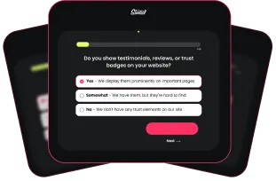
When visitors come to your website, they’re hunters on the prowl, scanning for something. They have a need they want to be filled and they want to know if you can fill it – and they want to know NOW!!
Their questions are:
-
-
- Do you have a SOLUTION to my problem? (Do you even understand it?)
- How will I BENEFIT from your offer? (What’s in it for me?)
- Do you have PROOF that your solution works?
- Who am I buying from and do I like you and TRUST you?
- HOW MUCH is your offer and how do I purchase it?
- Do you have a SOLUTION to my problem? (Do you even understand it?)
-
And they want FAST answers that are EASY to understand…
Image sliders and video backgrounds, because of their prominence on a web page, appear to make a strong impression. They can be visually striking – but they don’t convert well.
The reality for both practices is:
-
-
- Video and slider backgrounds both slow down your website.
- If your website is slow to load, Google doesn’t like you any more than your visitors.
- Both video and slider backgrounds send away mobile users because they eat through mobile data.
- Video and slider backgrounds distract from your call-to-action (CTA).
- Video and slider backgrounds both slow down your website.
-
So, what are alternatives to these two that boost conversion but still make a big splash?
Alternatives to image sliders and video backgrounds
1. The Hero Image
What: A hero image is a large, static image displayed prominently at the top of a page, often featuring, emphasizing, or complementing the page’s call to action.
Unlike image sliders and video backgrounds, hero images emphasize the CTA and are much quicker to load. Let’s take a look at this example from the Apple website:
For this page, the hero image is the product image of the iPhone X and the CTAs are ‘Learn more’ and ‘Buy.’ The use of a hero image is effective here because (1) it draws focus to the product and (2) it immediately shows the product.
Here’s another hero image sample, this time from Unsplash, a repository of free-to-use photos. Their hero image is used as a background image to the CTA: the search button. It’s effective because it doesn’t distract from the CTA, but it immediately demonstrates the services being offered by the website.
2. Dynamic Image Refreshing
What: This uses the same principle as the hero image, except the image itself changes every time the page is refreshed.
With dynamic image refreshing, your hero image changes whenever your visitor refreshes or returns to the page from elsewhere. This is an ideal alternative to an image slider.
It lets you feature different images, CTAs, sales, or promos without having to use a slider.
3. Animated Banner
What: Text or certain design elements on a page’s banner is animated to (a) highlight the website’s offers or (b) make the banner design more dynamic.
(WARNING: This needs to be done carefully and selectively in order to be interesting without being annoying.)
Turning a simple banner into an animated one makes for a more fun web design. See the homepage of MuckRack
The text on the banner has the last word changing every few seconds, so that website viewers are asked different questions: ‘Are your public relations measurable?’ ‘Is your public relations successful?’ ‘Is your public relations working?’
Slack also has an animated banner, but its animations are subtler:
Some of the moving icons belong to other services that have Slack integration, such as Google Drive, Asana, and Dropbox. The animation emphasizes Slack’s relationship with these services and immediately draws in potential customers who require the use of many such integrations.
Key Takeaways
Good design is not just about making a good impression; it’s also about communicating your message, being helpful, and achieving your goal (i.e. conversion).
And if you want to do all four, image sliders and video backgrounds are a big “fail”.
Instead, seek design solutions that offer the benefits of image sliders and video backgrounds, but without their downsides.
Hero images, dynamic image refreshing, focused landing pages, and animation are good techniques to utilize to keep your design fresh, fun, AND conversion-optimized.