Each new year presents exciting opportunities to craft exceptional website experiences that blend design, customer interaction, and technology.
Keeping up with the latest trends helps your website stay fresh and relevant, which can improve your visitors’ confidence in your business. If people think your website isn’t current, they may be thinking that your business isn’t current either.
To get your website visitors to pay attention you will have an edge if you keep your site looking updated and better than your competitors. Your copywriting on your website is also critically important, and your design needs to enhance your messaging.
Retaining information from a website can be a challenge for visitors, but adding eye-catching visuals can boost their chances of remembering your site. In 2023, daring and impactful visual choices are becoming increasingly popular.
To stand out from your competitors in a highly visual online landscape, it’s essential to use fewer stock images and templates and focus more on custom-designed visuals.
A lot of design trends are simply trends, and unfortunately, they can negatively impact your conversions. There is a list at the end of the post to show you these trends that you shouldn’t use anymore.
All of the trends mentioned below will not hurt your conversions, instead, they will give you a much greater chance of boosting your conversions if designed with the correct visual hierarchy and psychological drivers throughout. Discover more on how to get your website to convert here.
Here are our top website design trends for 2023 to make sure your website design stands out in a competitive market, while still focusing on an optimized user experience while making sure your conversions are NOT affected negatively…
Website Design Trends to Look Out For In 2023
As 2023 continues, we can expect to see these trends take the spotlight. Click a trend below to find out more information.
- AI-Generated Graphics
- Creative Color
- 3D Realism Design
- Open Compositions & Asymmetric Layouts
- Fluid Design
- Super Sized Typography
- Broken Typography
- Custom Illustrations
- Isometric Design
- Micro Animations
- Real Life with Flat Form
- Creative Portrait Design
- AR & VR
- Responsive Design 2.0
BONUS: Website Design Trends to Leave Behind
1. AI-Generated Graphics
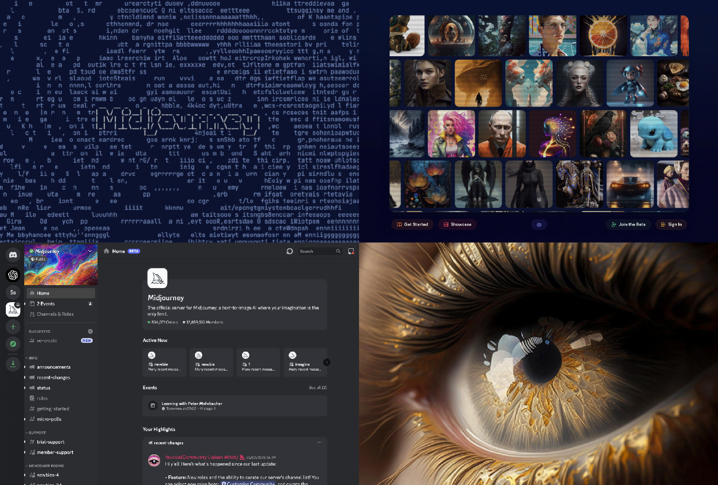
Artificial Intelligence (AI) is the hot topic of 2023 and we’re certain to see its popularity explode this year. With rapid growth and an ever-expanding array of AI technologies, we are absolutely going to see AI-generated graphics take center stage.
AI can generate a vast amount of images based on a single prompt by the user, combining existing ideas, images, and patterns that it’s been trained on. And best of all, this process is FAST and available 24/7.
The ability to generate images on demand with efficiency and ease makes AI-generated images ideal for creating a personalized experience for your website’s audience, resulting in higher conversions, brand loyalty and engagement.
Though this technology is quickly mobilizing, it’s important to consider that there are still some limitations and kinks in its technology. We covered this topic in greater detail here.
2. Creative Color
In 2023, the trend of using bold and vivid colors will continue to evolve with more unconventional color combinations aimed at grabbing attention. Expect to see a mix of highly saturated bright hues mixed with mid-tones and soft pastels, as well as some daring palettes that break color wheel rules with striking and clashing combinations.
Some designs will incorporate futuristic colors to create otherworldly visuals, while others will update traditional color combinations by intensifying hues or adding new elements. Color will be included in flat design by using powerful gradients, patterns, and textures.
While there is a sense of freedom in terms of color choices for websites and branding in 2023, success will be determined by two crucial factors. Firstly, high contrast combinations for impact and hierarchy, and secondly carefully selected colors that have specific meaning for the product or service for authenticity.
With this trend, web designers can have fun creating websites that hit visitors right between the eyes.
3. 3D Realism Design
If the bright color trend is the answer to moving away from color minimalism, then the 3D design is likely a response to flat material design.
Clean and minimal design will still be a popular trend in website design in 2023, but advancements in 3D technology are making it easier to incorporate into designs. Designers are now taking advantage of 3D elements to add dimension, depth, and a tangible feel to their websites (particularly in the eCommerce industry).
These 3D design elements not only make websites more visually appealing but also provide a unique depth that creates instant visual interest and an immersive experience, breaking away from the limitations of traditional 2D graphic design.
It’s important to note that when applying this trend, you should do so sparingly, as 3D design elements will slow down the speed of your website.
4. Open Compositions & Asymmetric Layouts
After years of confining boxes and frames encasing elements in a strict order, designers are starting to embrace more open compositions. Open compositions and asymmetric layouts push designers away from rigid, grid-based layouts of websites toward a more free-flowing and organic feel.
Open compositions in website design allow viewers to use their imagination and wonder what else might be beyond the visible elements. These designs utilize white space and often feature an open style, broken and fragmented elements, and a seemingly chaotic arrangement. Despite this appearance, the placement of each element is carefully planned.
When executed well, these layouts can create a harmonious balance and hierarchy throughout the design, guiding conversions by creatively using typography, brand elements, photography, and copy. The result is a unique and captivating design outcome.
As with all design trends, of course, open compositions and asymmetric layouts shouldn’t be incorporated into your brand just because it looks cool.
Your website should still reflect your brand and be focused on layouts that are carefully designed for conversions.
5. Fluid Design
In contrast to the evergreen and popular geometric shapes with their strictly fixed sharp edges and straight lines, 2023 will see more liquidity in shapes and compositions in web design. This style suggests creativity, agility and movement. This evolution of natural shapes is a great compliment to the open composition layouts just discussed.
Fluid shapes in compositions are a great way to break up sections of a website, they create freedom and a natural organic flow from one section to the next. The imperfect and asymmetrical nature of organic shapes makes them a great candidate for providing the depth help that web pages need to stand out from the rest, and ultimately help conversion through the hierarchy of copy and call to actions.
These natural lines and shapes not only work for composition layouts but can be incorporated into design elements like text boxes, image frames, buttons, and even abstract shapes in the background. You can crop the shapes of your images into rounded frames, add in an array of brightly colored organic shapes often combined with other effects, such as semi-transparency, and color gradients, etc.
Fluid design is a great way to alter how web visitors perceive your brand if your brand voice needs to communicate comfort and accessibility.
6. Super Sized Typography
Big, bold, and oversized typography is becoming more important in website design. When it comes to making your message stand out, you’ll find that the bigger and bolder, the more impact.
Super-sized typography has functional benefits as well as aesthetic appeal. For one, you can draw attention to your brand’s unique selling point and call to action by putting it in a big type on the main page of your website.
Visitors will remember what was written in bold and are more likely to come back to your website. Large impactful types can also communicate strength, confidence, and individuality.
As with minimal design, the use of supersized typography needs to be carefully designed and used in moderation, otherwise, you risk overwhelming your visitors.
When utilizing large typography, it’s crucial to select a font style that aligns with your brand voice as well as being easy to read.
7. Broken Typography
The more visually interesting your website is, the more likely a visitor will stay and explore, which results in a higher conversion rate. Using custom typography demonstrates a sense of creativity, creating interest for the viewer of your website, and can be a unique way to add impact.
Cropped and broken custom typography has been an emerging trend for the past couple of years and is still going strong. Letters are chopped, cropped, broken apart, placed at different levels, and explore combinations between vertical, diagonal, and horizontal orientations, while still keeping the letters recognizable. Think of it as a broken grid for typography.
This technique gives the design a feeling of unpredictability, making it more attention-grabbing in the process, and works best when used as headlines or with key banner imagery.
8. Custom Illustrations
Custom illustrations are a great way to bring personality and uniqueness to your web design, making your brand stand out from the competition. By incorporating custom illustrations into your design, you can express your brand’s individuality and create a memorable experience for your visitors.
This type of illustration can help your brand stay top of mind, as users will associate the illustrations with your business whenever they see them in the future. This, in turn, can help drive conversions and boost your brand’s success.
The use of custom illustrations doesn’t have to be limited to just the web design. It can also be incorporated into other brand elements such as custom icons, hand-drawn typography, freestyle doodles, unique brush strokes, and organic textures.
These elements can work seamlessly with photography, custom typography, and flat graphics, creating a harmonious and cohesive brand identity. By using a mix of different elements, you can create a unique and captivating design that captures the attention of visitors and leaves a lasting impression.
9. Isometric Design
Isometric illustration is a technique that involves representing a three-dimensional object on a two-dimensional plane. This illustration style has undergone significant development over the years and started primarily as a method for creating infographics.
Its intricate design makes isometric illustrations ideal for explaining information in a fun and engaging way. These illustrations bring an entire world to life in a compact and manageable space, making them ideal for visually communicating how a product or service operates or serving as an explainer graphic.
Compared to flat designs, isometric illustrations offer a clean and polished look with an added sense of depth. They provide a simple way to incorporate three-dimensional elements into your website design, enhancing its visual appeal.
In 2023, isometric illustrations are expected to be a key illustration style, particularly in the realm of iconography, with their tactile qualities and ability to draw users in. They’re also a great alternative to 3D design if you’re worried about slow website speeds.
10. Micro Animations
Micro animations are subtle, yet captivating movements that show up when your website’s user completes a specific action while browsing your page.
The essence of this trend is to surprise and delight its audience. Micro animations are a great way to add energy and engaging motion to your website designs without being distracting and affecting loading time like videos and larger background animations can.
In addition to functioning as lively interactions, micro animations catch the eye and are extremely helpful when it comes to guiding users through their interactions with your website, which can help conversions.
Think about them as road signs that help signal a visitor about where to go. They can also be used to create a more engaging user experience with products on e-commerce websites, by demonstrating details of a product or how something works.
11. Real Life with Flat Form
Innovation is a keyword when it comes to web design trends in 2023. When it comes to creating something innovative and unexpected, consider the trend of combining real-life objects with completely flat visual elements to please the viewer’s eye and create unique and memorable visuals.
This unconventional mixture of real-life objects and flat objects is changing the way we see design. These opposites interact to give dimension and depth. It’s a great way to introduce brand personality to photographs in web design, but can also easily carry over to so many other branded touchpoints, especially social media where standing out is a must.
Moreover, typography will be actively involved in the design trend. In pursuit of more impactful graphic designs, expect to see more photographic images where the typography is an active part of the design interacting with real-life objects and people. Take a key headline and blend it with a captivating image.
12. Creative Portrait Design
In 2023, it’s time to break away from conventional standards in portrait photography and embrace a fresh approach. This can help set your business apart and create a memorable impression on customers.
Instead of sticking to traditional portrait photography techniques, consider exploring more creative options that align with your brand image. This could include incorporating fun elements into photoshoots or working with a design team to add personality to your images.
Think outside the box when it comes to showcasing your team or “about” pages, and consider how color can enhance the visual appeal of your images. While there may be limitations for a more corporate brand, you can still put your own spin on traditional portrait photography to make a lasting impact.
13. AR & VR
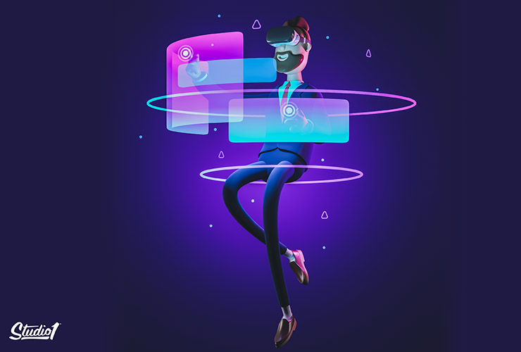
Design in today’s world must be able to create a seamless, almost real-life experience. This is what brands and companies are currently developing through augmented reality (AR) and virtual reality (VR) technology.
These new realities will be constantly changing the way design functions.
AR and VR fill the gap between physical and online shopping. This trend ties closely with 3D design, as brands use 3D models of their products to demonstrate how that product would look in real life.
AR and VR also allow businesses to customize their visitors’ website experience, which results in conversions.
14. Responsive Design 2.0
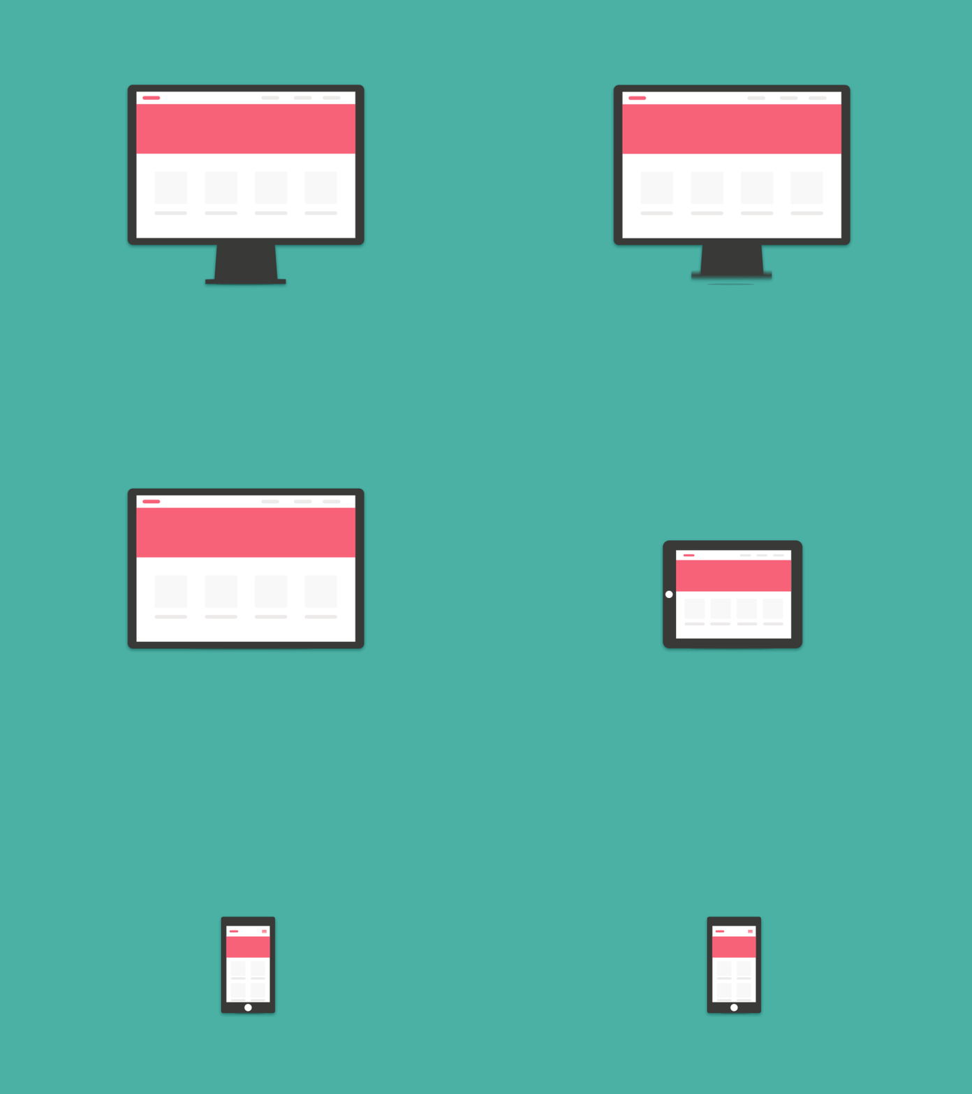
In 2023, having a responsive website design is a must. With Google’s shift towards mobile-first indexing, it’s imperative that your website is optimized for mobile devices. This requires a fast and lightweight design, with a focus on simplicity and speed.
To achieve this, use a solid color background for images on mobile devices and consider simplifying page elements. Consider reducing the number of sections, images, or elements to make the page load faster. Have a sticky top nav and call-to-action (CTA) button that remains visible when scrolling.
For forms on mobile, limit the number of fields to a maximum of 2 or 3 per screen and make use of multi-step forms for longer forms. eCommerce sites with multiple categories should use a non-expanded accordion, which expands to show the products within each category when clicked.
Here are a few more tips for mobile…
- ‘Click to Call’ CTAs work very well
- ‘Text Us ‘ is an amazing (and underused) CTA
- Dark background/s are not ideal on mobile as it’s hard to read white fonts outdoors
Website Design Trends to Leave Behind
While we welcome the above trends in 2023, there are some that we’d rather part way with now. Here are a few web design trends to say goodbye to:
- Parallax: We’ve said it before, and we’ll say it again…parallax effects should only be used, if at all, minimally. Overused parallax effects kill conversions because they are so damn distracting!
- Video backgrounds: I know, they feel exciting right?!? Yes, they are dynamic, however, video backgrounds slow down your website and they are very annoying for your visitors, which is bad news for your conversions. Don’t let video backgrounds drive your visitors away!
- Distracting entry pop-ups: Nothing’s more annoying on a website than having a pop-up offer appear as soon as the page loads! Instead, give your visitors time to figure out what your site is all about. If you really want a pop-up to convert without annoying your visitors, try having it pop up from any of these triggers: when somebody goes to leave your site; when somebody scrolls to the bottom of a page; when somebody views multiple pages; or when somebody spends a lot of time on your site.
- Stock images: I get it. You don’t have the budget to hire a photographer so you use stock images. The problem with stock images is that your competitors are using them too. Drag one of your stock images from your website into the ‘Google Images’ search bar and you will see all the other websites using the EXACT same stock image! If you want to stand out, either invest in unique images or at least customize stock images to make them unique to your business.
- Image sliders: You think you need them, especially if you have multiple offers. 90% of split tests prove that a static image converts better than a moving image or carousel image slider.
Here’s why…
- Rotating banners are counterproductive and they are a lazy way of displaying content
- They don’t “add variety” – they take control away from your website visitors and add frustration
- They are distracting, especially when trying to read something else on the page
- The eye reacts to the movement (and will miss the important stuff, the words on each banner)
- They decrease readability and there are too many choices above the fold
- You are taking away control from your visitors
- Your visitors may be reading the words on the first image and when it changes to the next image, they get annoyed
- They take much longer to load the web page as opposed to having a single image
- They increase your bounce rate due to the longer load time
- Google favors a fast-loading website so it will decrease your organic search engine results
We suggest showcasing your top-performing offer as the main focus of your website, along with adding credibility by incorporating elements like social proof and “as seen in” sections.
When it comes to choosing the featured image on your homepage, instead of having multiple images in a rotating banner, it’s better to display a single static image that can randomly change each time the page is visited or refreshed.
Does Your Website Stack Up in 2023?
2023 website design trends are diverse and impressive, however, website design isn’t just about making a site look pretty. It’s about designing a website with your visitors’ needs in mind and driving conversions.
Research your competitors’ websites and compare them to yours. If your site is falling behind and needs an update, we would love to help you.
Book a Free Strategy Call with us and we’ll help you figure out how to make your website work even harder for you. We promise it won’t be a sales pitch – just a casual, friendly conversation where we’ll share some tips on how to turn your online store into a marketing powerhouse.
