We’ve all had the experience of the conversation hog – that guy at the networking event who never stops talking about himself. It’s painful to be around.
You can see his victims backing off and scanning the room to find an escape route. They’ll suddenly need a bathroom break, or they will spot someone across the room they just have to talk to!
Nobody wants to be around ‘that guy’, however without knowing it, your website may be giving off the same vibes as that annoying guy.
Most websites today are still trying to “push a sale” – they’re not building trust with their visitors first. Instead, they talk all about their business, and how awesome their products or services are. – that’s so boring in your visitor’s eyes.
Your website could be turning your visitors off without you ever knowing about it, especially if you have used a website template.
People will just hit the <BACK> button and are gone forever!
Imagine if YOUR website visitors stayed, decided to work with you, and loved your product or service so much that they referred you to others – who in turn referred even more people your way! Imagine what THAT would do for your business.
So it’s never even “just one person” hitting that <BACK> button and leaving for good – it’s the entire flow-on effect!
As online marketing expert, Neil Patel says: “They’re gone for good, not just for today”.
Having a DIY website or a website template can seem cheap in terms of initial setup and running costs, however, if it’s nothing more than an online brochure, it’s costing you a whole lot more if it’s not converting your visitors into action-takers, which means investing in content, SEO, social media, and PPC advertising are also wasted money.
How do you know if your website is just an online brochure?
People who come to your website are there for a reason – usually, it’s to get information on how you can solve their problem.
So if your website is all about what you do and how you do it, then it’s like you’re the guy at the networking event who can’t stop talking about himself. – You know how that ends! – and that’s not the results you want from your website!
At Studio1Design.com we have designed over 2,000 websites and landing pages focused on conversions, so we have a very good understanding of what works and what doesn’t.
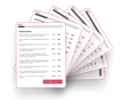
We have created a handy infographic below with a 10-point checklist to help you identify the most common flaws that hold brochure websites back from conversions and how to fix them…
10-POINT CHECKLIST:
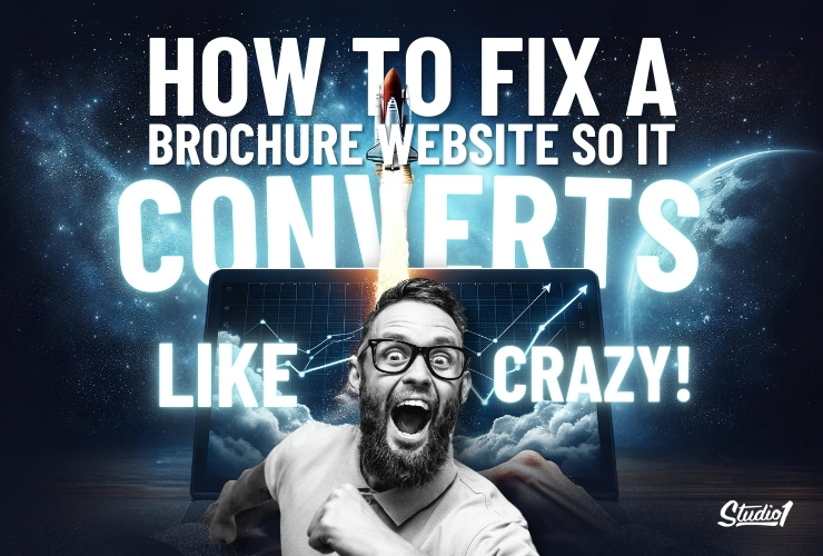
How To Fix a Brochure Website So it Converts Like Crazy!
Take an honest look at your website and answer these 10 questions that determine if you have a brochure website. Let’s take a close look to explain what may be costing you leads and sales…
1. Is your website designed around your ideal customers’ needs?
- If your website is focused solely on your business, your products/services & their features, then your visitors will think you don’t care about their needs.
- Instead, your website needs to be structured around what your visitors want to achieve and the problems they want to solve.
- Your website needs to position your customer as the hero and your business as their guide.
TIP: PUT YOURSELF IN YOUR VISITOR’S SHOES & REVIEW YOUR WEBSITE
2. Has your copywriting been professionally written?
- If you wrote the words on your website yourself, it’s likely you haven’t used the psychological drivers that entice your website visitors to take action.
- If your website uses industry jargon, but it says very little about the benefits your customers feel and experience as a result of getting your help then you will have a problem with conversions.
- The copy on your website needs to be ‘conversion-focused’ copy that clarifies how your offer can help solve their problem.
TIP: INVESTING IN PROFESSIONAL COPY TO MAKE A SUBSTANTIAL DIFFERENCE
3. Have you displayed how you are different from your competitors?
- You have a great business, and you do what you do really well, however, your competitors may be equally as good, so if your website does not communicate that clearly – both in copy and through design – then you aren’t giving them a reason to choose your solution.
- Let people know what’s unique about your solution – What is the X-Factor that makes your solution a great fit for them?
- If you display your uniqueness clearly in your USP (Unique Selling Proposition), you will be far more likely to pull your visitors towards taking action.
TIP: BE REPETITIVE WITH COMMUNICATING YOUR CORE UNIQUENESS THROUGHOUT ALL OF YOUR MARKETING TOUCH-POINTS
4. Does your website display your authority and expertise?
- Don’t be scared to share your knowledge because you are worried about your competitors stealing it. Sharing your knowledge positions you as the expert in your niche which attracts more prospects your way.
- Put helpful content on your website in the form of free blog posts, podcasts, videos, etc.
- Also display your impact metrics to give people a quick visual reference of your authority, including how many: customers you have helped, years in business, Members, Podcast Downloads, and Social Media followers, as well as displaying your awards, As Seen In, publications, etc.
TIP: ADD YOUR IMPACT METRICS ON ALL OF YOUR SALES PAGES
5. Does your website lead with value?
- Don’t try to push your products and services to cold visitors because most of them aren’t ready to buy yet because they won’t trust you initially. The best way to build trust in your brand is to lead with value. So offer a free lead magnet in return for an email address.
- The lead magnet needs to help bridge the gap to solving your visitor’s problem. It could be a: Checklist, Quiz, PDF Guide, white paper, webinar, infographic, free event, video series, challenge, free trial, VIP club, etc.
- You can have multiple lead magnets on your website to see which one resonates the most with your visitors, and which one leads to sales the quickest.
TIP: HAVE AN EXIT-POP ON YOUR WEBSITE TO OFFER YOUR LEAD MAGNET
6. Does your website have a marketing funnel?
- After somebody opts in for your free offer, most websites stop there. That’s a wasted opportunity to build more trust with you. Instead, you want to have a thank you page that offers something else of value.
- On your thank you page have a face-to-camera video to thank them for opting in for the free thing, then talk about the benefits of your next offer, then ask them to press the CTA button to take the next step that could be a free audit, free strategy call, free demo, an up-sell, or a limited time discount offer, etc.
- To keep your prospects warm, nurture them by sending them helpful relevant content so that you are top of mind when they are ready to purchase from you.
TIP: THINK ABOUT HOW LONG IT TAKES FOR A COLD LEAD TO BUY FROM YOU AND HAVE A NURTURE CAMPAIGN FOR THAT DURATION
7. Do you utilize your sales pages effectively?
- Your home page is essentially a gateway to guide people on a path to help solve their problems, which may lead to a sales page, so you want to make sure your sales pages are effective.
- Think about segmenting your audience so that when they go to a sales page, you have an offer that is more likely going to suit their needs. You can segment by service offering, product type/category, persona archetype, level, etc.
- On each sales page, talk in detail about how you understand their situation, their pain points, and challenges, and how your product or service can help solve their problem.
- Show them what their life could look like if they purchase your offer, and what they are missing out on if they don’t make the purchase.
TIP: HAVE TESTIMONIALS OR CASE STUDIES WITH PEOPLE WHO ARE SIMILAR TO CUSTOMERS THAT YOU WANT MORE OF
8. Is your website designed to visually appeal to your visitors?
- Your color palette, images, graphics, and design layout may not be designed to appeal to your target audience or it may be overpowering which will distract from your offer.
- Your design does matter. It needs to accurately reflect your offer & price-point, and position your brand as the right solution for your ideal customer.
- The visual design elements throughout your website need to support and enhance the copywriting and guide your visitors into taking action.
TIP: YOU’RE NOT APPLE SO MINIMALIST DESIGN WON’T WORK. YOU NEED A BALANCE OF WORDING AND IMAGES THAT CLARIFY YOUR OFFER
9. Does your website have powerful case studies & social proof?
- Your visitors are skeptical so one of the best ways to have them believe in your offer is to have your customers say how awesome you are.
- Display case studies, written testimonials, video testimonials, before and after examples, client results, etc.
- The most powerful form of social proof is a case study video of your ideal customer talking about what their situation was like before they purchased from you, and what their results are after purchasing your solution.
TIP: HAVE SOCIAL PROOF ON EVERY PAGE OF YOUR WEBSITE & POTENTIALLY ON A DEDICATED ‘RESULTS’ PAGE TO SHOW ALL SOCIAL PROOF ON ONE PAGE
10. Does your website have real photos of you/your team?
- People do business with people and they want to know who is behind your brand. Don’t hide behind your website and use stock images instead of real photos of you and your team.
- Using professional photos, plus authentic videos of you and your team will help build trust in your brand and will boost your authority and credibility.
- If you don’t have real photos, use stock images sparingly for visual story-telling to showcase your target audience where needed to demonstrate how you can help solve their problems.
TIP: UPDATE PROFESSIONAL PHOTOS OF YOURSELF AT LEAST EVERY 3-4 YEARS
Scroll below the infographic if you want to print out the 10 questions…
If you answered ‘NO’ more than 4 times out of the 10 questions above, then you have a brochure website, so you’re most likely not converting your website visitors into hot leads or sales.
Your website needs to be MUCH more than an online brochure
You can either work on your website yourself by addressing all the problems you identify, or you can hire a website designer who understands how to fix a brochure website so it converts like crazy!
At Studio1Design.com we have designed literally over 25000 web pages for our clients. They all look awesome AND they are designed to be 24/7 marketing machines – The 10 questions above are the first step towards transforming your website’s performance.
If you have any questions specifically about your website, then we’re happy to answer them – in person. Schedule a free strategy call here to discuss your website goals and challenges. We will help you identify what’s holding your website back. No pressure, no obligation. Just a friendly chat to see if we can help you =)
