Key Takeaways
- Visitors form an opinion of your website in about 50 milliseconds, and your hero section is what they are judging.
- A high-converting hero needs five things working together: a clear headline, a supporting subheadline, one primary call to action, a trust signal, and a supporting visual.
- The fastest way to lose a visitor is to crowd the hero with competing messages and buttons, because confusion kills conversions.
Picture this. Someone clicks through to your home page. Before they read a single word, before they understand what you sell, they have already decided how they feel about you.
That decision happens in roughly 50 milliseconds. Faster than a blink.
At Studio1 Design, we have designed over 2,000 websites and landing pages, including work for Sylvester Stallone, Frank Oz (the voice of Yoda), and GRIT BXNG. The pattern is always the same. The hero section, that first screen visitors see, does more to win or lose the sale than anything else on the page.
This guide breaks down the psychology behind those first few seconds, what visitors actually notice first, and the five elements every high-converting hero section needs. By the end, you will know exactly what belongs above the fold, and what is quietly costing you leads.
Why the First Few Seconds Decide Everything
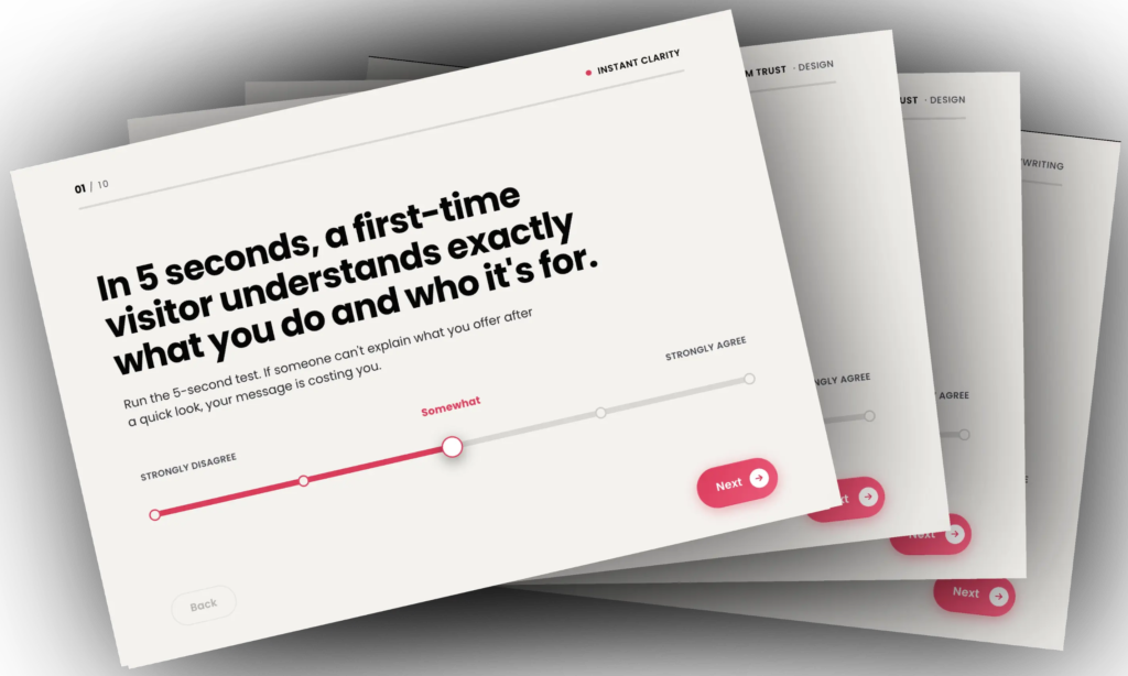
Research on first impressions is brutal for anyone running a website. Studies show visitors form an opinion of your site in around 50 milliseconds. Eye-tracking research from Missouri University of Science and Technology found it takes about 2.6 seconds for a visitor’s eyes to land on the area that shapes that impression most.
Two and a half seconds. That is your window.
Here is why this matters. In those first moments, people are not reading. They are scanning and feeling. The fast, emotional part of the brain is making a snap call: do I trust this, and is this for me?
This is psychology-driven web design in its purest form. You are not persuading with logic yet. You are passing or failing a gut check. When people cannot quickly tell what you do and why it should matter to them, the brain’s default is simple. Leave.
That is the real reason so many home pages bleed visitors. It is rarely the traffic, the offer, or the price. It is a hero section that fails the gut check before the visitor ever gives you a fair hearing.
What Visitors Actually Notice First
If visitors decide in seconds, the obvious question is: what are they actually looking at?
Eye-tracking studies give us a clear answer. People scan pages in predictable patterns. On text-heavy pages, they tend to follow an F-pattern, reading across the top, then down the left side. On more visual pages, they follow a Z-pattern, sweeping from top left to top right, then diagonally down.
In both cases, the same elements grab attention first: your main headline, your primary visual, and your navigation.
Everything else competes for the leftovers.
That is where visual hierarchy comes in. You guide the eye using size, color, contrast, spacing, and directional cues like lines and arrows. Bigger elements get seen first. Contrasting colors pull focus. Clear space makes important things stand out.
Your job is to make the most important thing the most obvious thing. If a visitor’s eye lands where you want it to in those first 2.6 seconds, you have a chance. If it lands on a stock photo or a cluttered menu, you have wasted your best moment.
The 5 Elements Every High-Converting Hero Needs
A hero section is the large area at the top of your page that visitors see before scrolling. It is your digital first handshake. After designing thousands of them, we have found that the ones that convert almost always contain the same five elements working together.
1. A headline built on your unique value proposition
This is the single most important piece of copy on your website. It should speak directly to your ideal visitor’s main problem and your unique solution to it.
Lead with the benefit, not a clever turn of phrase. “Welcome to our website” tells a visitor nothing. A headline that names their problem and your promise tells them they are in the right place.
2. A supporting subheadline
Your headline does the heavy lifting. The subheadline, or two to three short bullets, expands on it.
This is where you briefly explain how you solve the problem, who you help, or why your approach is different. It lets you keep the headline short and punchy without losing the detail that builds interest.
3. One primary call to action
Notice the word “one.” Your hero should ask the visitor to take a single, clear next step.
Book a call. View case studies. Get the guide. When you give people one obvious action, more of them take it. When you give them five, they often take none. Here’s how to boost conversions with effective CTA buttons.
4. A trust signal
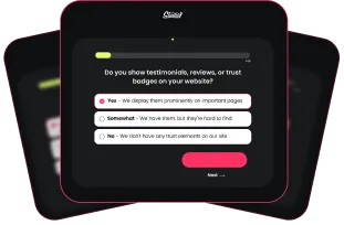
Trust is what turns interest into action, and it needs to start early. Add an impact metric, a star rating, recognizable client logos, or an “as seen in” bar near the hero.
Years in business, number of clients served, or a strong result all work. You are answering the silent question every visitor asks: can I believe you?
5. A supporting visual
The right image or short video reinforces your message instead of decorating the page. Show the outcome your customer wants, or your ideal customer enjoying the result of working with you.
Avoid generic stock photos that could sit on any website in any industry. The visual should make your specific promise feel real.
Get these five elements right, in this order of priority, and your hero does its job. It tells the visitor what you do, who you do it for, why you are credible, and what to do next, all within that narrow window.
The #1 Hero Mistake That Loses Visitors
If five elements is the recipe, here is the mistake that ruins it: trying to do too much.
The most common hero we see is overcrowded. A vague headline. Three or four buttons competing for the click. An oversized logo or image pushing the real content below the fold. A wall of options with no clear priority.
There is a name for why this fails. Hick’s Law says the more choices you give someone, the longer they take to decide, and the more likely they freeze. The conversion specialists at LeadFlask put it bluntly, calling an overloaded hero the number one mistake companies make in this part of their site.
Their advice lines up with ours: keep the hero to a small number of clickable items at most, and ideally point everyone toward one action.
Confusion is the silent conversion killer. Every extra choice you add to the hero is a small tax on the visitor’s attention, and attention is the one thing you cannot afford to waste in the first three seconds.
Above the Fold Is a Promise, Not a Rule
For years, the rule was simple: cram everything important above the fold, because nobody scrolls.
That is outdated. People scroll all the time. But here is the nuance that changes everything, summed up well by usability research from the Nielsen Norman Group: people only scroll if what they see first is promising enough to make it worth their while.
So the job of your hero is not to close the sale on first sight. Its job is to earn the scroll.
This matters most for considered purchases and professional services, where visitors need education and trust before they commit. One of the biggest mistakes service businesses make is trying to sell on hello. Most visitors are not ready to buy the moment they land.
Think of your hero as the opening of a story, not the ending. It creates enough clarity and confidence that scrolling down feels like the natural next move. Do that, and the rest of your page gets the chance to do its work.
Designing Your Hero for Mobile
Most of your visitors will see your hero on a phone first, so it has to hold up on a small screen.
The mistake here is shrinking everything down equally. Instead, design your hero to be mobile-optimized: keep your strongest headline, your clearest call to action, and one trust signal visible without scrolling. Cut the secondary details that do not directly support the next step. Here’s how to boost results with mobile optimization.
Make your buttons big and thumb-friendly. Fitts’ Law tells us that the larger and closer a tappable target is, the easier it is to use, and on mobile that is the difference between a tap and a bounce.
The goal is the same as on desktop. In the first screen, a visitor should know what you do, who it is for, and what to do next.
Real-World Examples: Hero Teardowns
Let me show you the difference in practice.
Before. A typical home page hero opens with a vague headline like a company slogan, or “Welcome.” There are three buttons fighting for attention. The image is a generic stock photo. There is no trust signal in sight. A visitor lands, cannot tell what the business does or what to do next, and leaves within seconds.
After. We redesign with the five elements. A headline that names the visitor’s problem and the outcome. A subheadline that explains how it works. One primary call to action. A trust bar with a real metric or recognizable logos. A visual that shows the result. Suddenly, the visitor knows exactly where they are, why they should care, and what to do next.
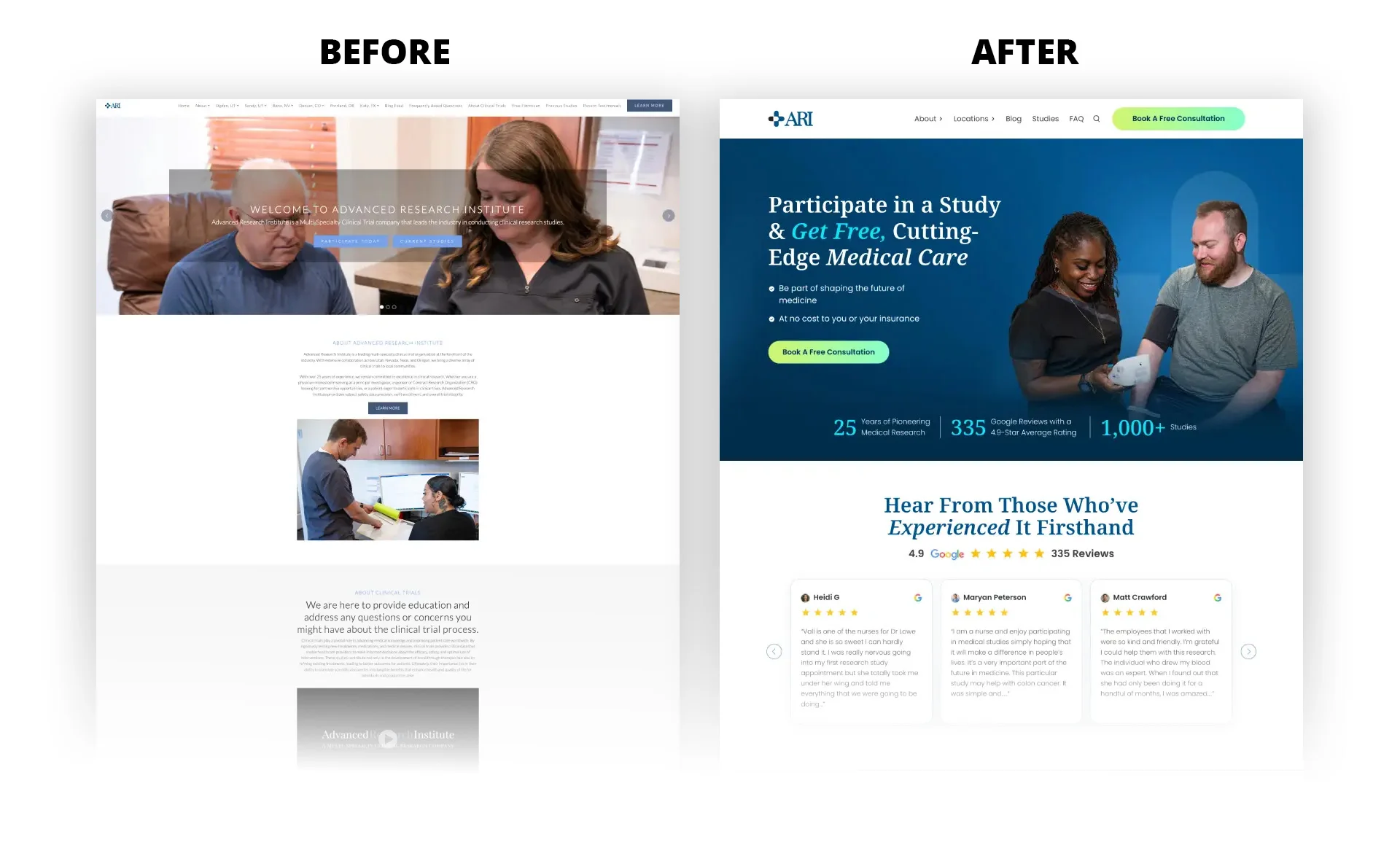
Visit the home page here AdvResearch.org
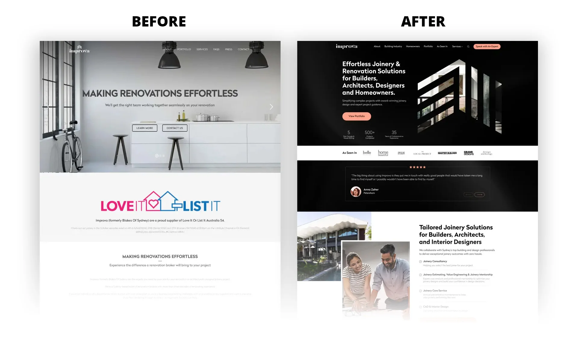
Visit the home page here Improva.com.au
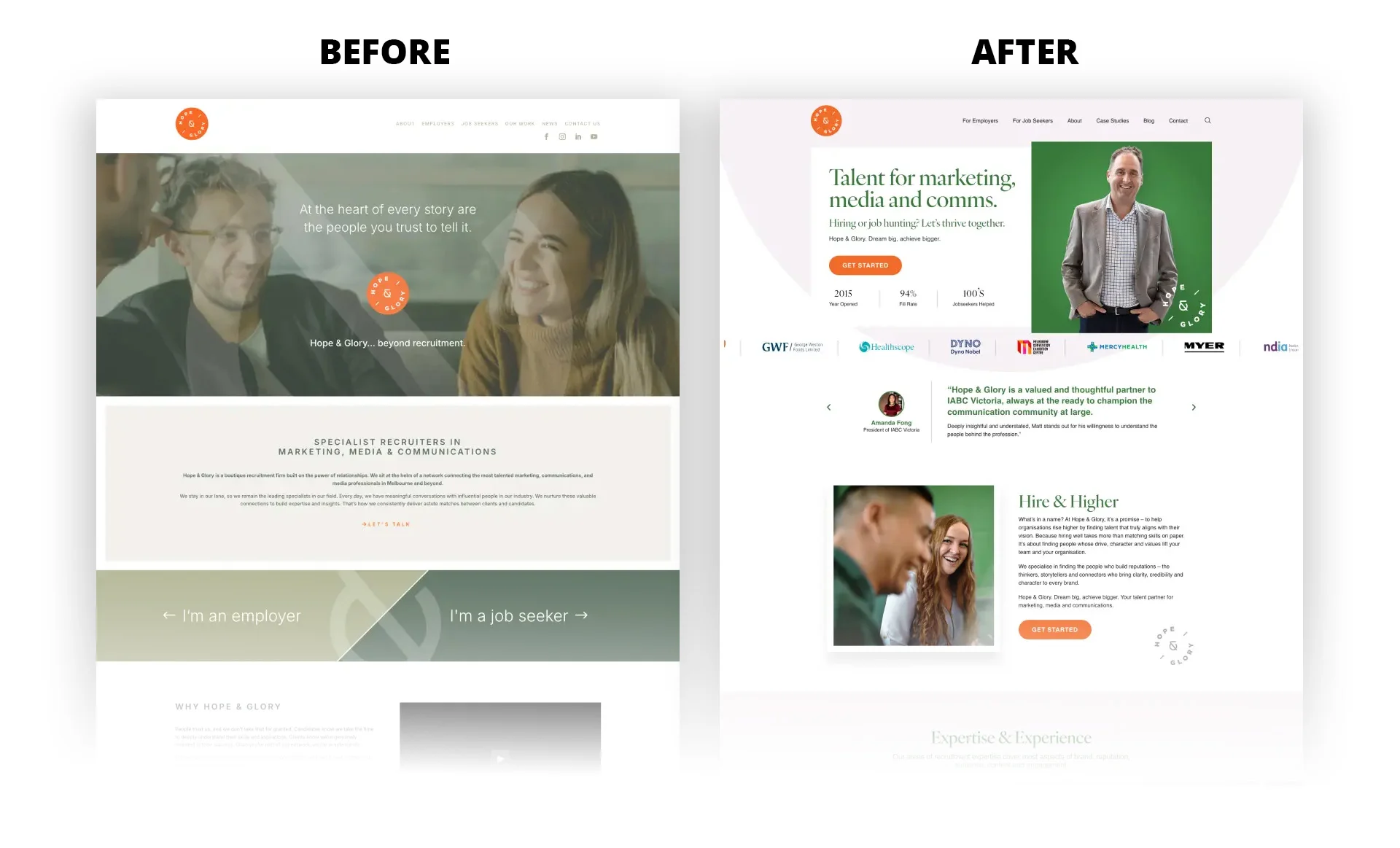
Visit the home page here HopeAndGlory.com.au
The differences are not decoration. It is clarity. The after version passes the gut check in those first few seconds, which is the whole job of the hero.
If you want the full picture beyond the hero, our guide on how to optimize your entire home page for conversions and AI ranking walks through the sections that come next.
Frequently Asked Questions
What should go above the fold on my home page?
Five things: a headline built on your unique value proposition, a supporting subheadline, one primary call to action, a trust signal such as a metric or client logos, and a visual that supports your message. Together they tell visitors what you do, who it is for, why you are credible, and what to do next.
What do visitors actually notice first on a website?
Eye-tracking studies show people notice your main headline, your primary visual, and your navigation first, usually following an F-pattern on text-heavy pages or a Z-pattern on visual ones. Visual hierarchy, using size, color, and contrast, decides which of those they see first.
How many calls to action should a hero section have?
Ideally one primary call to action. A single, clear next step reduces decision fatigue and tends to lift conversions, while multiple competing buttons often lead to choice paralysis and no action at all.
How long do I have to make a first impression?
Research suggests visitors form an opinion of your site in around 50 milliseconds, with their eyes settling on the most influential area in about 2.6 seconds. Your hero section is what they are judging in that window.
Do I need a full redesign, or just a new hero section?
It depends on the rest of your site, but the hero is often the highest-leverage place to start. A sharper hero can improve results on its own, and it sets the tone for every section below it. The best way to know is a conversion-focused review of your current page.
Your Hero Is Doing a Job, Whether You Designed It To or Not
In the first few seconds, your home page either earns attention or loses it. Visitors decide fast, they notice your headline and visual first, and they reward clarity while punishing confusion.
The fix is not more. It is sharper. A clear headline, a supporting subheadline, one call to action, a trust signal, and a visual that proves your promise. That is a hero section built on psychology, not guesswork.
Want to know what your hero is really costing you?
If your home page is getting traffic but not generating leads, the first few seconds are often where the leak begins. Studio1’s team can review your site and show you where visitors drop off and why.