When was the last time you answered the phone and actually listened to what a telemarketer had to tell – or rather – sell you? Probably never. Unfortunately, a lot of businesses approach their websites the same way telemarketers approach their phone calls. They act as if it’s a one-sided conversation.
Spoiler alert – it doesn’t really work (and it pisses off a whole lot of people in the process!). So that begs the question, what’s a better approach?
Well, it’s not a secret, but so many brands fail to focus on it.
If you want people to convert, you need to build trust.
When reviewing your website, try to look at it in the eyes of your prospects. They don’t care about you initially, they only care about ‘what’s in it for them!’
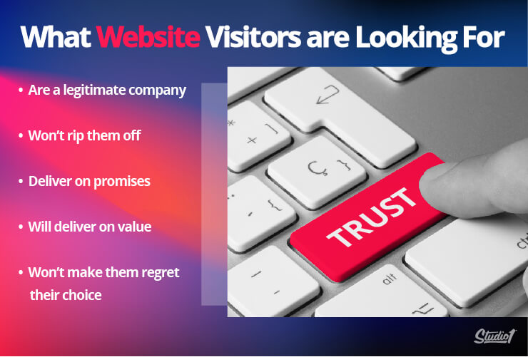
Customers won’t stick around on your website for long unless they feel like they trust you. Before they click that contact or buy button, they need to first feel confident that you:
- Are a legitimate company
- Won’t rip them off
- Can do what you say you can do
- Will deliver value
- Won’t make them regret their choice
Without building enough trust, you can bet they’ll take their clicks and money elsewhere. But if you can give them enough reasons to trust you, your website visitors might just take the next step…
Trust is essential and will go a long way in helping to boost conversions. But it isn’t the full picture – you can sound trustworthy and still lose clients if all your focus is on you.
Building trust and relationships on your website is key to conversion.
You want clients who visit your site to feel comfortable and confident in choosing you, which means establishing a relationship with them right from the very first visit.
Nowadays, many company websites tend to talk a lot about themselves. They boast of great achievements and capabilities, hoping that you’ll see that they’re the best.
But is that any way to start a relationship?
Ever been on a bad date, where the person only ever talked about themselves? That’s a surefire way to never get a second date.
And yet so many people make this mistake on their website.
You want to talk about the other person more than you talk about yourself. To put the spotlight on them and make them feel important, seen, and heard.
Only two decades ago, businesses depended on their receptionist to prime the customers during these “first dates” before directing them to a salesperson. With the rise of the internet, we now have websites that can do the same thing – perhaps even better.
You need to put your clients first on your website – in other words, be customer-centric.
Before you talk too much about yourself, acknowledge their needs and show how you can help them reach their goals. Create content that’s both relationship-focused and trust-building, and you’ve got a winning combination that’ll convert.
What can happen if you don’t build trust and relationships?
Statistics from American Express Survey show that someone will tell 9 people about a good customer experience, but if they have a bad experience they’ll tell an average of 16 people. And on social media, where content can go viral in minutes, a dissatisfied customer can tell millions about a poor customer experience.
That said, despite your best efforts to minimise bad experiences, they will happen from time to time.
The key to ensuring you don’t lose a client or customer is building strong relationships. When customers feel connected to your brand, they’re more likely to trust you to fix a problem or deliver a better experience next time. On the flip side, if all your customer touchpoints (including your website) fail to establish trust and build relationships, you’ll find it much harder to win back customers (and protect your reputation) if something goes wrong.
So, now that we know how critical it is to build trust and relationships on your website, how do you actually do it?
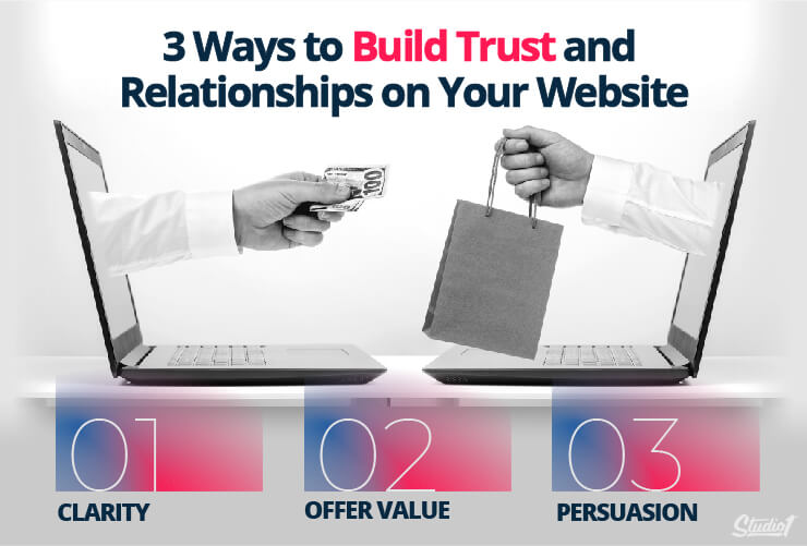
3 ways to build trust and relationships on your website
1. Be Clear with your website’s messaging and imagery
A common saying in marketing is that confusion kills conversions, so clarity is crucial. You also need to ensure you are grabbing the attention of your website visitors immediately.
A study from the Technical University of Denmark shows that our average attention span is 12 seconds… And that was 15 years ago when the internet wasn’t as overflowing with information as it is today.
Nowadays, our attention span is 8 seconds.
That gives you a very short window to convince website visitors of your value. If your website is confusing and hard to understand, then they will bounce off the page like a trampoline within seconds and move on to one of your competitors.
Here’s what they’ll subconsciously think when landing on your website:
- How can your services solve my problem?
- Do you have proof that it actually works?
- How will I benefit from your offer/services?
- Why should I choose you over your competitors/other services?
- What steps should I take to receive the promised solution and benefits?
All of these instantly happen before visitors decide if they like you or not.
At the same time, your prospects are also judging your design, message, and tone. They use all this information to decide if your brand is credible and trustworthy. Know that they’ll be asking themselves:
- Are you a legitimate business?
- If I have a question, can I depend on you for help?
- Will my concerns be answered immediately?
- Can I trust you?
So, how do you make the most of those precious 8 seconds? How can you make sure your site is set up to build trust and connection quickly? Clarity.
A straightforward website is a trustworthy website and the secret lies in clear copywriting and content.
Avoid generic welcomes or brand-centric messages. Succinctly say who you are, who you help, what you do and how you can help them. Then focus on how you can solve their problems, before addressing any barriers and objections to the sale.
If you can do that, they will trust you to fulfill their needs and own up to your promise. And you’ll open the pathway to building a strong brand connection and – if they’re the right fit – sales.
2. Lead with value on your website
What better way to show your audience you can help them than by actually helping them?! Providing up-front value is a great way to build trust, to show your clients and customers that you truly care about getting them great results.
Because the bottom line is, when your audience lands on your website, they don’t really care about you (harsh I know!). They care about what you can help them do.
Many websites fall into the trap of positioning themselves as the ‘hero’, ready to swoop in and save the client in distress!
That’s rarely empowering, and does more to break down trust than it does to build it.
Instead, we like to recommend positioning your clients as the hero, and yourself as simply a guide to show them the way to success. By leading with value, you’re simply directing them on the right path.
Here are some ways you can lead with value on your site:
- Create Valuable Content: Have blogs, podcasts, or videos (embedded from a paid YouTube account, so viewers don’t get distracted by ads) that position your brand as an authority. Throw in your brand’s personality, showcase your opinions, and build rapport with potential customers – this will help you attract the kind of clients you want.
- Give Lead Magnets: Offer helpful and relevant lead magnets, like ebooks and simple PDFs, that they can download and immediately use in exchange for entering their email address.
- Show Appreciation: Thank them for any action they take. Build a relationship with them by being human – reciprocating and showing appreciation. Psychologically speaking, this is referred to as “Reciprocal Liking,” which is the tendency for people to like people who like them.
- Clear Next Steps: Have a strong call to action and next steps, such as scheduling a call or demo with your team. If you think the customer might have objections in following the action, add statements to deflect them (e.g., it only takes 5 mins to sign up!)
3. Use the Power of Persuasion on Your Website
There is nothing more heartbreaking than when your ideal client or customer can’t see or believe in the value you have to offer.
Especially if you’ve spent so much time and energy building the products and services you know can help people.
The truth is though, closing sales doesn’t simply come down to your ability to “hard-sell”, and you’ll rarely have success from forcing someone to buy from you (okay, you’ll never have success that way).
We can’t tie people up and brainwash them into thinking that our offer is amazing. …and there’s no leverage in tying up one person at a time!
However, it is possible to persuade your ideal clients from the heart, and drive them to take action in a totally ethical, and authentic way.
By harnessing and mastering the power of proven psychological drivers in your website design and copy, you can change the belief systems of your audience so that they know it’d be crazy not to buy from you!
Robert Cialdini explains these drivers in his book “Influence: The Psychology of Persuasion,” where he emphasised the importance of being able to influence customers at the root of their decision-making minds.
Here are Cialdini’s Principles of Persuasion and how you can use them to create better-converting website content:
Reciprocity – People trust credible, knowledgeable experts. so we need to show your authority and position you as the expert.
You can do that by sharing your expert knowledge, having professional photos, awards, even having a pro-level custom website design
Social Proof – You can say that your offer works, however people are sceptical and they may not believe you!
So people usually turn to others to see if your offer really works! So you need to display things like: testimonials, case studies, before & afters, logos, impact metrics
Consistency – People are far more likely to remember you if you are consistent. So have a consistent branding look and feel across your entire website, and all of your social media and marketing campaigns, release content consistently. Be consistent with your marketing messages and make sure they are consistent with your values.
Liking – People buy from people that they know, like and trust! So don’t hide!! Put yourself on video. Come across as helpful & approachable. Show you care about solving their problems. People buy from people that are similar to them and from people who pay them compliments!
Reciprocity – When you give something of value away for free, people are far more likely to want to give back to you. So share your knowledge and hot tips, quotes, trends, short-cuts, educational blogs, videos, audio, pdf downloads, and offer even more value in return for contact details.
Scarcity / Urgency – It’s human nature to desire something more if there is a limited supply or limited time! So if you are running a ‘live event’ with limited seats, or have a limited amount of stock, or you have an offer that ends by a certain time, you should emphasise that urgency on your website. Don’t use FAKE scarcity, or you will lose people’s trust forever!
Unity – The Unity Principle is all about having shared identities. When people feel they are similar to you like being of the same race, nationality, political or religious beliefs, or even liking similar sporting teams, then they are more likely to be influenced by you.
So on your website, it can be powerful to share your story to let people know that you were in their shoes and faced the same problem they have now, and that’s why you created the perfect solution for them.
Do you want to see these 3 trust-builders in action?
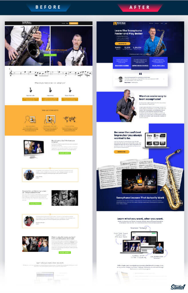
Let me introduce you to SaxSchoolOnline.com, an incredible client who hired Studio1Design to redesign their website:
As you can see in the before design it talked a lot about them and didn’t put much of the spotlight on their clients. Plus, it was heavy on features and didn’t offer a lot of value upfront.
- The hero banner had two photos side-by-side and hard to read copy that was hard to read because it was competing with the photos.
- The headline says that their training is the best, but there’s no proof of that.
- There’s not a lot of social proof, testimonials, impact metrics, clarity, benefits or reasons to think that their Sax lessons are the best in the world. (And they are =)
- At the time, they had about 9,000 students and millions of YouTube views, so they were an authority in their niche, but the website didn’t reflect that at all.
- They have a great offer and the business is doing well, but the owner was reluctant to invest in a new website design, as he was quite proud of the fact that he designed and built his website himself!
- I have seen worse homemade websites, but it still looked average in my opinion, plus it was missing all the key psychological drivers and conversion elements that influence people to take action.
As you can see in the after design the key differences are:
- The first obvious difference is the design. It now looks professional and makes him look like a rock star. The colour palette and layout put focus on the yellow CTAs.
- The headline and sub-headline are benefit-driven and explains clearly how easy and effective their courses are while appealing to their audiences, emotions and explains how they help their audience get results.
- Also in the hero section, we added some impact metrics to instantly display their authority, by displaying the number of students helped, and social media followers they have, pus we scattered social proof throughout the entire website.
- The copywriting throughout the entire website uses the SPIN Selling method, puts the focus on the audience, and positions the website as the guide to help people. And, instead of highlighting the many features of the program, we put the focus on the benefits the course would have for the students, like learning to play with confidence, learning to improvise, and learning at their own pace.
- It has a section about the business owner, and chief instructor Nigel, and briefly explain his history to showcase his authority.
- It has a section that shows a comparison between private lessons, and Sax School Online!
- They now have a free 14-day trial, which is a great strategy because it gives people a chance to try before they buy!
- Not only is he offering a 14-day free trial, but he also has a 90-day money-back guarantee, so it really is completely risk-free! By boasting about their money-back guarantee, and offering a 14-day free trial, they were able to build trust with a cold audience and remove any barriers holding them back.
As a result – The client said: “Investing in my website was the best decision I made for my business because Studio1 did so much better than I could have imagined, and it allowed me to focus on building my business instead of tinkering with the website. Over the past 12 months, since the new website design & copywriting went live, we added over 1000 new students to our paid membership, and the rate of uptake on our free introductory offer has boosted our mailing list by over 25,000 people!”
If you’re looking to do the same on your own website, try offering a free trial, solid guarantee, or risk-free return policy.
Now it’s time to put your website to the test!
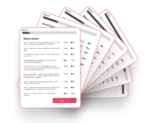
I’ve made a quick test to help you evaluate your website in less than 5 minutes.
Look at this as a temperature check to see how your website cultivates trust and relationships with your website visitors. The higher you score, the closer you are to a strong and captivating website.
Based on the principles mentioned above, these are the top questions your website needs to answer to improve its performance.
I’ve made a quick test to help you evaluate your website in less than 5 minutes.
Download our proprietary 10-point conversion checklist here to discover how your website cultivates trust and relationships with your website visitors.
The higher you score, the closer you are to a strong and captivating website.
Give yourself 1 point for every yes, then add up your results.
Score 1-3: It’s probably time for a full refresh, with more customer-focused content.
Score 4-7: You’re doing okay! But there are definitely some areas where you can improve.
Score 8-10: Well done! Keep up the good work. Customer feedback will be key to finding new ways to optimize your website experience.
If you scored lower than you expected, don’t fret!
Building trust and relationships via good website design is a never-ending journey! And the more room you have to improve, the better your results will be when you refresh your website content and design with the above principles in mind.
Want to get your money’s worth and save time?
You can hire a professional service to optimize your website design on your behalf. At Studio1 Design, we understand your business needs and can customize your website content and design so that it ticks all the boxes (clarity, strategy, and persuasion) to help convert visitors into loyal customers.
We’ve helped countless brands go from bare minimum websites to powerful, impactful websites that get results. Together, let’s position your brand to reach a larger audience and efficiently use your resources to scale and market your business.
Ready to transform your brand and website? Press the GET A QUOTE NOW button below…
