A great website starts with a thorough, well-considered design brief that makes sure your designer understands your needs. There’s nothing worse than spending big bucks on a website design, then finding it doesn’t improve your business performance.
There are lots of “website designers” in the market – but many of them are graphic designers. They can be great graphic designers – but if they don’t understand how to design a website that converts visits into engagement, you’ll get great graphics – and disappointing business results.
If you’re about to update your website, how do you find a designer who can deliver a high-converting website?
Here are some tips for finding a great website designer.
Do they have an updated, quality folio that you love?
Great web designers have great folios of their work and it should be the first thing you look at to see if their style is what you had in mind. If they only have one style or use website templates, then there’s a good chance they are not flexible enough to cater to your unique business.
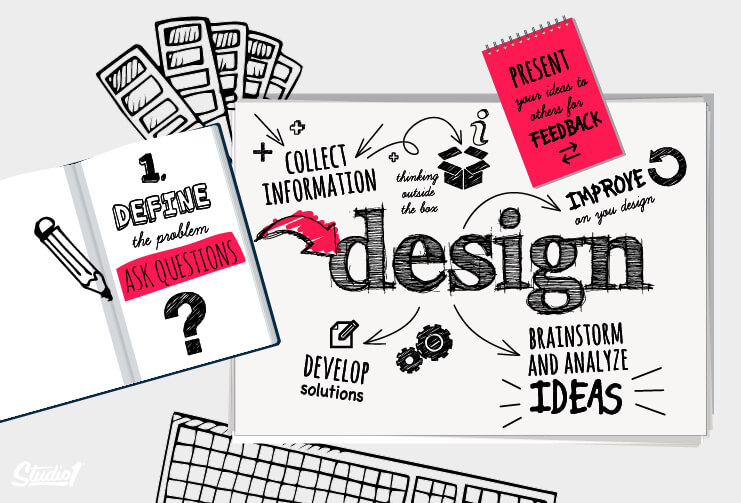
Do they have a thorough design questionnaire?
A good designer wants to know a lot about your business, and will usually start with a detailed design questionnaire. Look for a design questionnaire that at least asks:
1. Who is your target audience?
2. What does your brand stand for?
3. What are your offers, and what’s currently working in your business?
4. What do you like and dislike in a design?
5. What feelings do you want the design to evoke?
6. What results are you aiming for?
7. Who are your competitors?
(Studio 1 Design’s questionnaire includes all these – and about 20 other questions too.)
The briefing process shouldn’t stop there, either. The option for a follow-up conference call is a good indicator that the designer is committed to a quality outcome that will stand the test of time.
How do they position you as the authority to build trust?
For your website to work, your visitor has to trust that you deliver what you promise. That’s the fundamental, underlying purpose of your website – to build TRUST.
Find out what design elements are used to assist in building trust and increasing conversion rates, such as free material, surveys, etc.
Do they understand the power of lead magnets and marketing funnels?
Explore their portfolios and look for designs that lead visitors to a FREE LEAD MAGNET to capture at least an email address.
Your lead magnet (for example, a free report) can be placed in blog posts, or on a sidebar, in the footer, in the header. It may even be triggered to appear in a pop-up by a scrolling action or by people exiting the page.
The design detail will vary, but if it’s not included in the design, you haven’t chosen the right designer. A good conversion-based designer knows that 97% of your first-time visitors are not ready to buy yet, so you need to provide value first, usually in the form of a lead magnet.
Businesses that take on a structured approach towards taking a cold lead to are hot lead are twice as likely to see a large increase in sales.
Your next offer should be on your Thank you page. This is where your prospects are already in the hot zone and will be easier to influence to take the next step in your funnel. The thank-you page is often overlooked by most designers.
Then every time you provide more relevant content that’s of value to your prospect, email your list with a link for them to come back to your site.
How do they use social proof?
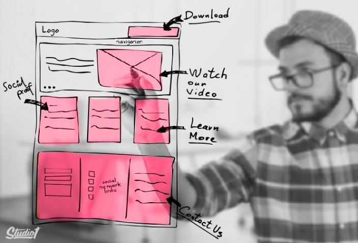
Do they design in social proof? As much as possible, and on every page? People do business with people they trust. The more social proof you can provide, the better. Examples of social proof are;
• Quality, purposeful videos or images.
• Case studies and customer stories.
• Testimonials (video if possible).
• Using numbers, like the number of customers, amount of jobs completed this month, etc.
• Icons of clients’ business logs, places you have been featured, etc (greyed out).
How do they position credibility elements on the page? Is it above the fold for the greatest impact?
Do they understand how to design for conversions?
The purpose of a website is to engage your visitors and convert them into action takers. Whether the action that you want people to take is to: download an ebook, take a quiz, receive a coupon code, attend an event, purchase a product, fill out an application form, etc, then your designer needs to understand how to display each element on the page that has a visual hierarchy that uses images and colors to enhance the copywriting and not ruin the flow of the copy, to ultimately influence people to take that desired action.
How do they use hierarchy to entice people to take action?
Throughout the page, they use the following elements in the right order and hierarchy:
• Clean design – it’s been around for a few years now, it won’t be going away because its’ easy on the eye, it’s simple, and therefore is a good user experience.
• Navigation – up-to-date styling with appropriate use of hamburger bars rather than lots of dropdown options.
• Authority building elements.
• Social proof elements.
• Large images above the fold.
• Large fonts for headlines.
• No paragraphs above the fold.
• Hover effects – these give users feedback information and keep them engaged.
Do they study what’s working currently on your live website and what’s not?
For your website to work, your visitor has to trust that you deliver what you promise. That’s the fundamental, underlying purpose of your website – to build TRUST.
Before hiring a website designer, try to work out what’s working first by studying your quantitative data – your analytics. Also, study your qualitative data – what is the user doing when they arrive on your site? Use heatmaps and similar tools to gather this information.
Check out your competitors’ websites, so you’re well informed on what they’re doing and how they present. The more you know about your industry’s presence online, the better.
The more information and understanding you have, the better the design brief you can give your designer, and the better the results that you will get.
