A lasting impression begins with a powerful visual brand identity.
Your brand identity is a unified set of visual elements that affect the way people perceive your brand and what it means to them.
This is important because if your visual identity isn’t congruent and appealing, then your prospects may not take you seriously. Even worse they may purchase from your competitors instead of from you – just because your competitors LOOK more professional.
All the visual elements throughout your business should be designed to communicate your brand’s values and voice in a consistent way. This includes your logo, your color palette, your typography, your imagery, your packaging, your website, your social media, your print media, and all other visual communications across all of your marketing & product delivery touch-points.
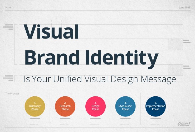
We have created this 5 step process to show you how to create a strong brand presence that will resonate with your target audience…
- The brand discovery phase
- The brand research phase
- The brand design phase
- The brand style guide phase
- The brand implementation phase
STEP 1: Brand Discovery Phase
Before you hire a designer, get clear on your brand values. Take the time to put into words, what your brand represents and how you want it to be remembered. Get clear on what the purpose of your brand is and what problems your brand solves.
Good designers ask about your brand. A great designer should have a process around this discovery phase. The right designer will have a design questionnaire that asks you a series of foundational questions about your brand so they can discover everything they need to know about your brand before they start designing.
Provide your designer with as much detailed information as possible about your brand’s target audience and purpose.
For example, when asked about your target audience, a one-word answer like ‘women’ is too broad. A better answer will include things like Gender, Age, Profession, Geographic location, Socioeconomic status, Frustrations, etc.
Describe the feeling you want to evoke from your target market with your brand. Remember that people buy with emotions and then justify later with “logic”. Visuals are a key part of hooking your audience emotionally to draw them closer to your brand.
You’re making a long-term investment, so think beyond today. Describe your objectives for your brand and where you see your brand 5 years from now.
Your designer will be able to create a better result if you provide as much clarity and information as you can.
The goal of the discovery phase is for your designer to truly understand what your brand represents and your vision. Once your designer has this knowledge they can move confidently to the research phase.
STEP 2: Brand Research Phase
Creating a new brand identity requires a similar approach to starting a new business. This means the research phase is a critical piece to making sure that your brand is unique and has a place in your niche.
Once your designer is clear on the brief, they should spend time researching your competitor’s websites and social media platforms. This will ensure your brand identity will be truly unique and NOT similar to your competitors.
Your designer should also study your target audience to see where they hang out on social platforms, what they like and dislike, who they follow, what else they are into, what type of music & films they like, etc.
Remember, the goal is to create a brand identity that resonates with your target audience, so the more your designer knows about your audience, the more they can create a visual identity that is likely to appeal to that audience.
While your designer is researching they should be collecting visuals along the way. This is all part of the creative process.
Your designer will also be drawing on other reference points and their talent. At Studio1Design, we start by researching the competitive landscape. We also explore branding trends relevant to your marketplace and brainstorm creative ideas as a team.
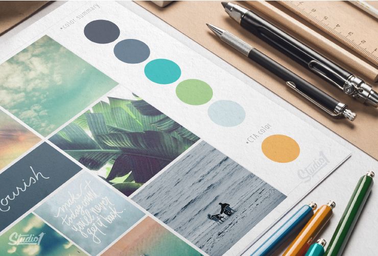
For this reason, there can be a huge amount of design ideas developed. So it’s vital to refine the process further and eliminate 90% of what’s collected and keep only the stuff that will make sure your brand identity direction is original and unique. Then we will provide you with conceptual ideas and direction of how your brand identity could look aesthetically with brand ‘mood boards’.
The brand mood boards take all the text-based information and conversations from the ‘discovery phase’ and translate it into visual concepts.
A mood board is essentially a collage of images, textures, patterns, colors compositions, design styles, elements, and fonts. An effective mood board will tell a story that defines your brand and communicates your brand’s new identity direction.
This may involve a couple of varied design style directions and color palettes presented to you to nail down what aesthetics you like the most out of the concepts provided.
Brand mood boards are a key design tool for defining the overall style, aesthetics, and visual language of your brand. They are a great way to establish the tone of your brand and allow you to see what you like and what you don’t like.
Once you decide which direction you like the most, you have a strong design foundation. You will be excited to see what your designer creates and you will be confident that it will be as per the direction you have agreed to.
Brand mood boards streamline the design phase process. They make sure that the look of the final graphics and design elements will be on track so that the designer doesn’t go off on a tangent.
STEP 3: Brand Design Phase
After your designer has determined your target audience, clarified your brand voice, conducted market research, and defined the various elements of your brand via mood boards, it’s time for the fun part, the design phase.
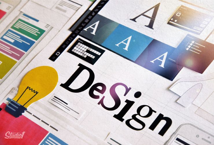
In this phase, key design assets are created – the building blocks for all your ongoing branding.
The aim here is to make sure that every element is designed to complement and visually succinctly enhance your brand.
These design assets are the building blocks of your visual brand identity and need to work harmoniously together to tell your story. They need to be flexible and need to work across all of your branding touch-points.
For a new brand
The design needs to stand out with your unique look so that your brand becomes memorable over time.
Rebranding
For an update to an existing brand, you need to be clear about where the brand has been where it is going.
You want to make sure that the new brand won’t confuse existing customers while enticing new customers at the same time. So if possible keep part of the previous visual identity as a design element within the new brand identity.
This could mean keeping the same colors or the same icon or the same supporting elements, etc. Don’t keep all of them – just use one, so that your existing customers will identify with the new look.
Brand design elements
Your visual brand identity can be expressed with any number of design elements, including:
– Logo
– Colors
– Typography
– Pattern & Texture
– Imagery & Photography
– Illustration & Iconography
– Layout & Composition
Pro tip: If your brand has too many colors, it won’t be as memorable as if it only has a few colors. Think: Coke or Ferrari and you associate those brands with red. Think: Cadbury or Hallmark and you associate those brands with purple. They almost own a single color!! We like to use 2-3 colors most of the time and the reason is so that when we’re designing a website, we have a contrast color to use on the ‘Call To Action’ buttons, so they stand out against the main color.
Your designer will need to know where you intend to use your branding elements, so they can make sure the designs will work across the different purposes, including;
– Website Design
– Social Media Banners
– Blog Post / Podcast Images
– Advertising Banner Ads
– Point Of Sale Displays
– Marketing Flyers
– Merchandise
– Stationery
– Billboards
– Signage
– Etc.
If you have signage made or shirts printed or embroidered, there may be limitations on how many colors you can use, so your logo needs to be adaptable to suit.
Color can be a huge part of your identity, however, don’t let it be the most memorable part of your logo. The best logos also work well as a one-color logo.
Pro tip: If your logo is too detailed or colorful, it will look like a mess when viewed at a small size or from a distance. Think about the world’s most iconic brand logos like McDonald’s, Shell, Apple, Playboy, Nike, WWF, Levi’s, Mercedes, etc. They all look great at a small size.
It’s much better to have a simple logo instead of a detailed logo because it’s easier for your audience to remember.
However, it’s much harder to create a simple logo, compared to creating a detailed logo. This is because the logo needs to represent your brand – so the more you take away, the less there is remaining to work with. It’s much harder to represent a brand with only a few lines or shapes.
Once you have your logo and brand elements finalized, from that point you will want to make sure that all of your marketing touch-points consistently represent your brand. This is why we recommend having a brand style guide.
STEP 4: Brand Style Guide Phase
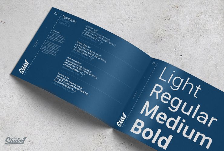
A brand style guide is the core of your brand identity. It’s a practical document that contains in-depth rules about your logo usage, typefaces, and color palette codes for use online and also for offline printing, layout guidelines, the image uses, and so much more.
The purpose of having a brand style guide is so that all of your design collateral and marketing materials will have a cohesive look.
This means you can give your brand style guide to all the creatives that work on your marketing, from website designers to social media designers, to stationery designers, to videographers, to signage designers, etc. They can all follow the same set of guides to make sure your assets are used professionally, to ensure you will have a consistent look across all of your marketing.
Without a style guide, you risk inconsistency across different marketing & advertising platforms. If you’re not consistent, your brand will end up appearing unprofessional and lose identity, making your brand less trustworthy. It’s a crucial control mechanism for your brand.
Brand style guides are as important for a small business as they are for a large business. They are a tool that will help you with consistency. Consistency is one of the key psychological drivers that influence people to take action, so be thorough when you start implementing the branding elements.
STEP 5: Brand Implementation Phase
This is where you get to see your visual brand identity take shape and where it gets really exciting.
Your brand identity design assets should be planned constructed specifically to engage your prospects and customers, to give them the best brand experience that’s consistent across all your marketing touch-points.
Your marketing touch-points are any point where your prospect or customer engages with your brand, before, during, or after they purchase something from you.
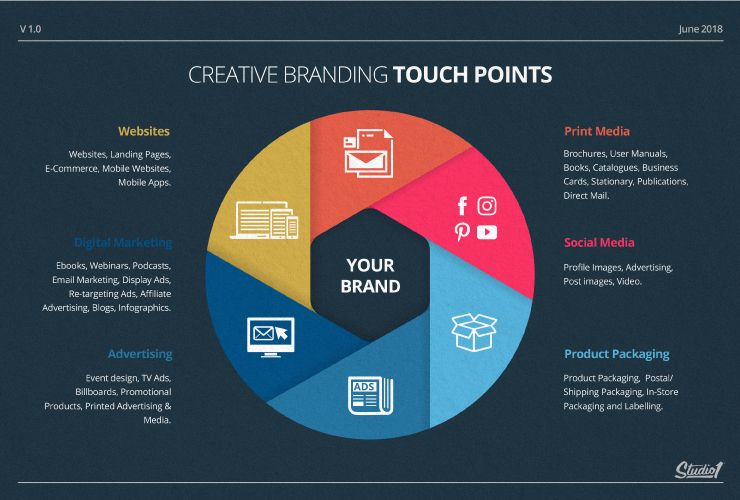
Here are a few examples of branding touch-points where you will benefit from having a strong consistent visual brand identity.
Website & Landing Pages:
Your website is where your brand identity should come through in full force. Your website is one of the most representative aspects of your brand identity.
Your website is the hub of your business and is where your prospects will go to check you out before deciding to do business with you.
You can’t afford to have a poorly designed website in a highly competitive market or you risk your prospects thinking that your delivery capability is no better than your website.
Digital Marketing:
Everything that you do online should be consistent: Ebooks, Webinars, Podcasts, Email Marketing, Display Ads, Retargeting Ads, Affiliates, Blog Posts, Podcasts, Videos, Slide Decks, Infographics, etc.
Advertising:
The more consistent you are, the more you will be trusted, so TV Ads, Billboards, Promotional Products, Printed Advertising, Point Of Sale, Events, etc. all need to match – and match your online presence.
Social Media Content:
Social media marketing is all about original visual content. Your brand must be instantly recognizable. You need to ensure your brand image is consistent on all your social media sites. This includes profile images, advertising, post images, video, etc.
Product Packaging:
Even your products should be part of your marketing. The products you sell and the packaging in which they come in, from product packaging, postal/shipping packaging, to in-store packaging and labeling, etc. will work smarter for you if they match.
Print Media:
Don’t forget what you put on paper. Brochures, User Manuals, Books, Catalogues, Business Cards, Stationary, Publications, Direct Mail, Flyers, etc. can all help spread trust through visual and message consistency.
Professionally designed brand identities are fluid, engaging, and translate seamlessly from one marketing touch-point to the next. It’s important to understand that any failure of a touch-point to deliver an on-brand experience can risk losing trust in your prospects, so use professional designers that follow your brand style guide to ensure you get a cohesive & impactful result.
Summary:
So think about the value of your visual brand and how best to invest in it.
Now that you understand the marketing magic it can make, also think about how you will approach designers in the future.
Imagine what you might be missing out on if you just went to a designer or developer you found through crowdsourcing and asked them to “design you a website”.
Would you have the confidence in hiring them to produce a design that’s going to appeal to your audience and align with your brand vision?
Brand identity design is a multi-step process where each step is based on the needs of your target audience and the goals of your brand.
Whether you’re totally overhauling your brand identity or you’re just starting, always strive for consistency and look for ways to apply great design at every touchpoint of your brand.
To have a consistent visual message that’s on brand, hire a professional designer or design team that understands what we have outlined in this 3 part series on branding.
To discover more about the importance of branding branding in a competitive world, we have put together this series:
A Mood Board is where the true magic happens
How to Create a Brand Style Guide
If you’re ready to take your brand to the next level, click on the Get A Quote Now button below…
