If you’ve been in a premium cosmetics store like Sephora or MECCA, their approach to helping a cold audience is extraordinary.
For people that walk into their store, regardless if they’re new or repeat customers, they’re welcomed by a host who is there purely to help educate them on how to achieve the beautiful-looking skin they desire.
Firstly the host asks questions to help understand the clients needs, then they determine the products that are best suited and show them how to apply them most effectively.
During this process, the host builds trust with the client and shows them the results they can expect, before they start discussing the price and closing the sale.
In this article, we will show you how to take the same approach that the premium cosmetics stores are taking, and how to apply that to your eCommerce website.
If you’ve been running Facebook ads for years, you will know that it’s becoming more expensive and more competitive so anything you can do to build trust with your audience will help get you better results.
The strategy is to warm up your cold audience by helping solve their problem, by leading them from your ads to a Pre-Sell page.
This is one of the most effective strategies for eCommerce websites that were taught to me by Ezra Firestone from SmartMarketer.com, for his brand BoomBeauty, where he sends paid traffic to a Pre-Sell page to warm up their cold audience before they offer any products.
At Studio1Design, we design at least 10 new websites every month. Many of which are 7, 8 or 9-figure eCommerce businesses that are already converting pretty well, however…
When we deep dive during the design brief – examining their funnel structure, their user experience, and their conversion strategy – we uncover a lot of opportunities to boost their results even further.
In many cases, they are using what I call…
The OLD way of selling
In the past, this is how most people would design their eCommerce website:
- Create an eCommerce website that displays the products they sell
- Buy Pay-Per-Click Advertising, and;
- Send the advertising traffic to a product page
It’s basically old-fashioned “push” selling, which is where you tell your customer how amazing your products are – then go straight for the sale.
The online user experience created by this approach is like walking into a retail store and not being able to find somebody to help you decide which product is best for you.
If you’re a repeat customer you may already know what you want, but if you’re a new customer you need help understanding what to choose, and how it will help you. If you don’t find somebody to help you, there’s a good chance you’ll walk out of the store empty-handed.
Retailers support the full “shopping” experience, not just “buying”. That’s why they have shopping malls, specialist stores, and salespeople on the floor. Most people like to browse before they buy – to understand the product and the story behind it, and to make sure the product will meet their needs.
The NEW way of selling
Instead of trying to sell on hello (for instance, sending people from paid traffic to your product pages), the new way of selling is to get more out of your eCommerce website, is to start by providing valuable content first, that educates visitors on how to solve their problem.
At Studio1, we have combined this strategy with the science of persuasion and conversion-focused website design. We help our clients build Pre-Sell pages that boost the success of their eCommerce websites and we call this…
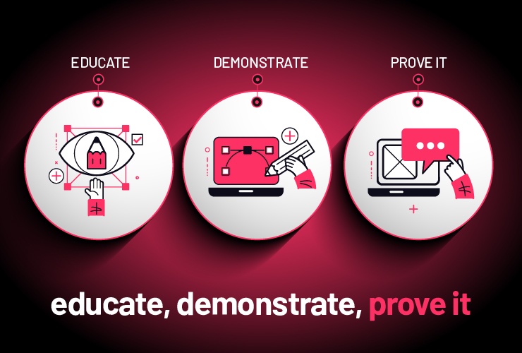
This strategy focused on three main pillars: educate, demonstrate, and prove it
The single most powerful thing you can do to supercharge your eCommerce website is to send your paid traffic to a Pre-Sell page instead of sending it directly to a product page.
Your Pre-Sell page then leads your customers to your product page – but first, it helps them to understand how to solve their problem, and if, your product is the best solution for their situation.
Educate first to build trust with your audience
A Pre-Sell page is an educational page that you send paid traffic to – instead of just sending them to a product page to “buy now”.
As proven by 35000 sales calls in Neil Rackham’s book SPIN Selling, the most effective approach for selling is to let your audience know you are empathetic to their situation and the problems they face.
Your Pre-Sell page supports your product page
Great design can improve the results of your product pages – which I’ll cover in a future post – but most product pages don’t do the heavy lifting of education, demonstration, and trust-building. The reason why is that trying to do this across all of your product range can be a lot more effort than it’s worth when instead you can design a Pre-Sell page that leads into your products.
A great Pre-Sell page educates your website, and visitors, demonstrates your products, and displays social proof about the value and benefits of your solution.
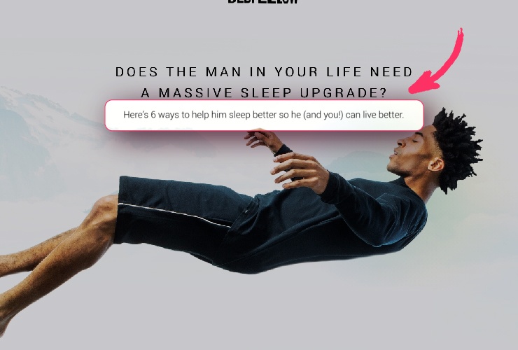
The Bedfellows Pre-Sell Page focuses on the problems that the products solve first, then introduces your products as part of the solution.
Pre-Sell pages educate your visitors
- Give first. Start by providing people with helpful content that helps them understand how your product will solve their problems.
- Construct a step-by-step guide displayed in a visually pleasing way that helps your visitors find a solution to their problems easily. This is an excellent way to build trust in your brand – by demonstrating that you are an expert that can help solve their problem.
- Then show your product as part of the solution. It’s a much softer sell AND it usually results in more product sales to cold audiences.
Demonstrate how your product solves their problem
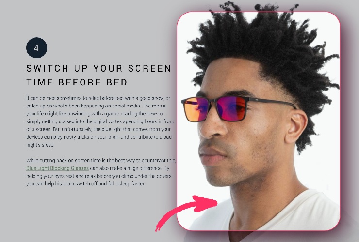
- They use images to show how your product is used to help solve your audiences’ problems. They don’t just “tell” them in copy – they use great design to create a visual representation of the solution.
- Real images of real people using real products are far more powerful than stock images. Don’t just use supplier images of products in isolation – you can get better results if you show people using the product.
Pre-Sell pages need to display social proof
People are skeptical and they will trust your customers over you, so there are two key things to your potential customers:
- That your product will solve their problem, and;
- They are not alone and it’s safe to purchase from you
Including social proof on the Pre-Sell page helps prove both of these things.
Examples of effective social proof are:
- Written Customer Testimonials – both about your product and your business.
- Customer Videos are powerful, especially when they are interacting with your product.
- Customer Reviews on Google or a third-party app on your website are very believable.
Pre-Sell pages generate leads as well as sales
Successful eCommerce strategies aim to build long-term relationships over a sale, and email marketing is still the most effective way of boosting your sales, so it’s important to capture an email address as soon as possible.
With an email address, you can continue to be helpful, to build more trust. One of the best ways is to offer a VIP club that provides exclusive offers and discounts, solely to your VIP members. it’s a great incentive for people who want to be informed when you are running a sale.
For that reason, we highly recommend having an exit-intent pop-up that invites people to join your VIP club, even if they aren’t ready to make a purchase yet.
Once people opt-in, then make sure you utilize your ‘Thank You’ page by offering a limited-time offer with a countdown timer, that has a high perceived value. That could be a bundle offer or your most popular products.
How is a powerful Pre-Sell page structured?
Here’s a handy framework for a super-effective Pre-Sell page:
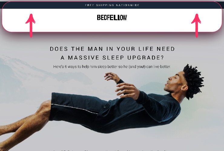
- Remove the top navigation from the page
- Create a hero banner that has:
- A headline with the problem that your product addresses
- A subheader or bullets that goes into more depth about the problems they are facing
- An image of your ideal customer who has benefited from your product
- Then have a section that briefly discusses their current situation and the problem they face
Here’s the Bedfellow page again – notice what’s NOT there (hint: the navigation)…
- Then have a section to explain that there is a solution to their problem and that’s why you’ve created the 6 tips below…then have the title of the 6 tips. (it could be 3, 4, 5, 6, 7, or 8 tips BUT no more than 9 tips)
- Then, have a section for each of the tips with the following: a benefit-driven headline, a paragraph or two that gives them instructions, a sentence that briefly explains how your product can help and a lifestyle image of your relevant product being used that relates to the tip
- Important: DO NOT have a CTA (call to action) to purchase your product here
- Then have a bridging section from the tips to your product(s) that lets them know that they now have the knowledge on the ‘how to’ and now you can introduce your products as the solution.
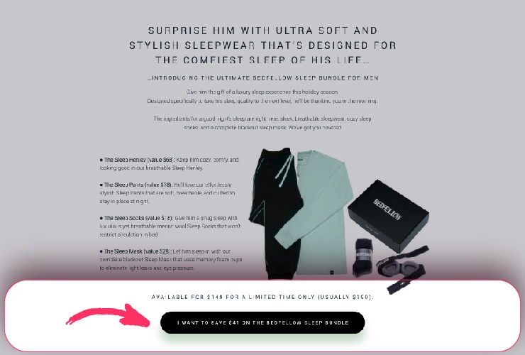
- Then have a CTA section that displays your product(s) and has a ‘SHOP NOW’ CTA button that will take them to the product page. – having a value bundle pack is a great strategy, or it can be just one product if you prefer.
- Then have a social proof section with written or video testimonials, or case studies that reinforce why your product is the right choice
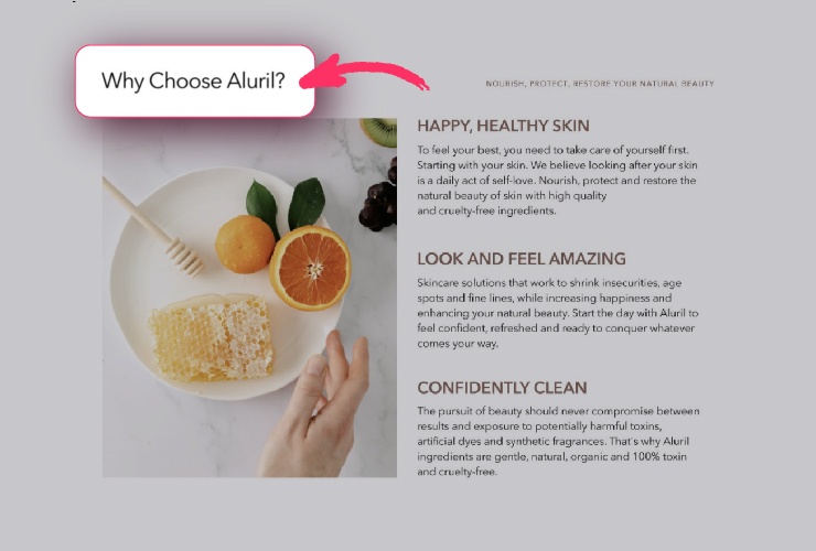
- Then have a ‘Why Choose Us?’ section with a brief story and/or a video that reinforces your brand’s USP and the benefits of choosing your products.
- Then have another CTA section, that displays your product(s)
- Finish with an informative, trust-building footer. Make sure the links to contact, privacy, terms etc, all open in pop-ups so that people don’t ‘leak off’ to the main website.
A poorly designed Pre-Sell page has flaws like these…
- Not targeted to a specific customer group
- All about the sale, not the customer’s problem
- Doesn’t use psychological drivers
- Design and images overpower the copy
A poorly designed Pre-Sell page isn’t helpful to your customers, it doesn’t create trust or build understanding, and it won’t create desire for your products.
A well-designed, high-performing Pre-Sell page will…
- Reduce your PPC spend because you’re not sending traffic to a product page
- Position you as a trusted authority in your niche
- Engage more of your ideal target audience
- Lead to more sales from cold traffic
- Build your email list
Pro Tip 1: Do not have any links to other pages from this page. Do not have any social media icons, YouTube videos, or other leakage points.
Pro Tip 2: Have an exit-intent pop-up that only appears if they don’t press any of the CTA buttons, and go to exit the page. The goal of the pop-up is to collect email addresses for people who don’t purchase your product. As mentioned above, you can invite them to join your VIP club for exclusive member-only offers.
Does your eCommerce website need a high-performance Pre-Sell page?
It’s surprising how many eCommerce businesses treat their online store like a fast food bar, not like a boutique retail location.
Well-designed Pre-Sell pages that form part of an intentional, relationship-building sales funnel help get you the best return on your PPC spend, and can help turn your website into a 24/7 marketing machine.
They educate your website visitors, showcase the value of your brand and your product, reinforce your value proposition, and offer your website visitors a buying choice.
To achieve optimal results make sure you have a pro-level design that incorporates psychological drivers, with a clear visual hierarchy to entice more of your visitors to click through to your product page.
When you invest in a great Pre-Sell page, you are far more likely to get a much better return on your PPC advertising spend – as well as create a great user experience that builds trust in your brand and collects leads, which will help your business stand out from your competitors.
A key benefit is that you can build presale pages WITHOUT having to rebuild your eCommerce website – they’re just an extra pathway into your existing website.
If you have an eCommerce website and spend a significant amount on PPC advertising but you don’t use Pre-Sell pages, then you’re almost certainly leaving money on the table.
Book a Free Strategy Call with us to talk about how to get more out of your website. This won’t be a hard sell; just a friendly, informative chat to help you identify how to turn your online store presence into a high-class digital marketing machine.
