A great About page is like a firm handshake – it builds confidence and rapport and shows respect for your visitors. It’s warm, friendly, and firm.
When a visitor is “meeting” your business online, your About page takes the place of that handshake.
It tells your visitors why you are perfect for helping solve their problems, while they get to know you and understand what’s unique about your business.
Your About page is a critical step in your conversion process
Your About page is usually one of the most visited pages on your website. When people land on your website, they will usually visit…
- Your Home page for an overview
- Your Offer page(s) to see if it solves their problem
- Your About page to see if they can trust you
- Your Results page to see if others are getting great results
- Your Content pages (Usually how they discovered you organically)
Your About page – with the right structure, copy, and design could be THE reason why people choose you over your competitors.
If you get it wrong, people will glaze over the page and miss out on understanding why you are the perfect fit for them.
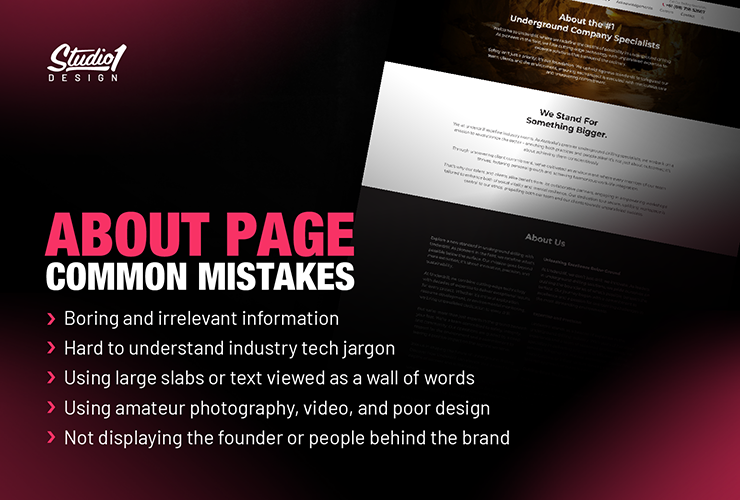
About Page – Common Mistakes
Visitors are deciding whether to trust you enough to do business with you. Here are some key things to avoid…
- Using boring and irrelevant information
- Using hard-to-understand industry tech jargon
- Using large slabs or text viewed as a wall of words
- Using amateur photography, video, and poor design
- Not displaying the founder or people behind the brand
- Wasted SEO opportunity using H1 headlines like “About Us”
Your ‘About’ page is NOT exactly about you!
Everything on your About page needs to be relevant to your visitor’s needs and demonstrate your expertise as the best solution to solve their problems.
Your About page must present you and your team as trustworthy, knowledgeable guides with experience, authenticity, and likability.
Apply the Science of Persuasion
Following Robert Cialdini’s Principles of Persuasion, an effective About page will:
- Position you as a unique, limited resource (scarcity)
- Demonstrate your expertise (authority)
- Be consistent with your overall brand (consistency)
- Create an understanding of your values (likeability)
- Provide social proof that your business is legitimate (consensus)
- Offer a logical free next step (reciprocation)
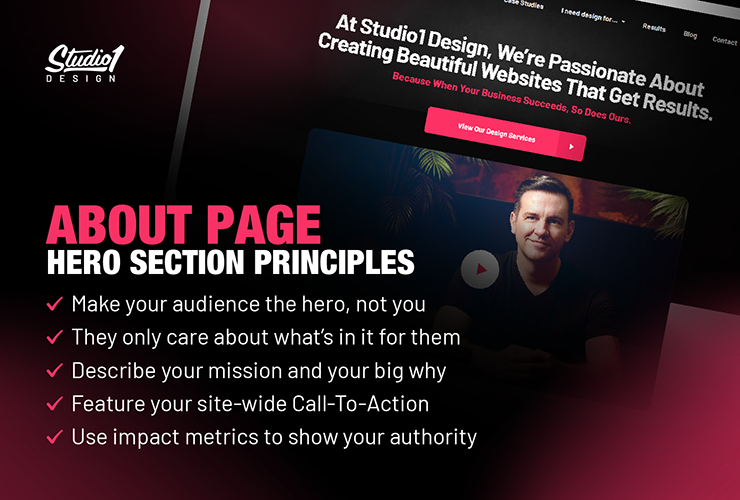
About Page – Hero Section Principles
The first section of any web page is super important and needs to:
- Make your audience the hero, not you
- They only care about what’s in it for them
- Describe your mission and your big why
- Feature your site-wide Call-To-Action
- Use impact metrics to show your authority
- Tell your story in a video with B-Roll
Be Intentional with the copywriting and every section of your About page.
Use good design, the science of persuasion, and readable copy to present the body engagingly. Whether you use a timeline format or a more traditional approach, your goal is to keep visitors scrolling.
Focus on how you help your customers and why you are an authority they can trust. Display your history, awards, qualifications, accreditations, books published, customer logos, and social proof like testimonials or before-and-after photos.
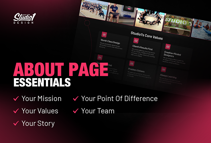
About Page – Essentials
Use short blocks of text about your business with images or photos to illustrate the following essential sections:
- Your Mission
- Your Values
- Your Story
- Your Point Of Difference
- Your Team
Use social proof like key testimonials, before and after shots, photos of awards and certifications, and photos of you speaking at events, in appropriate sections throughout.
Tell Your Story in a Timeline
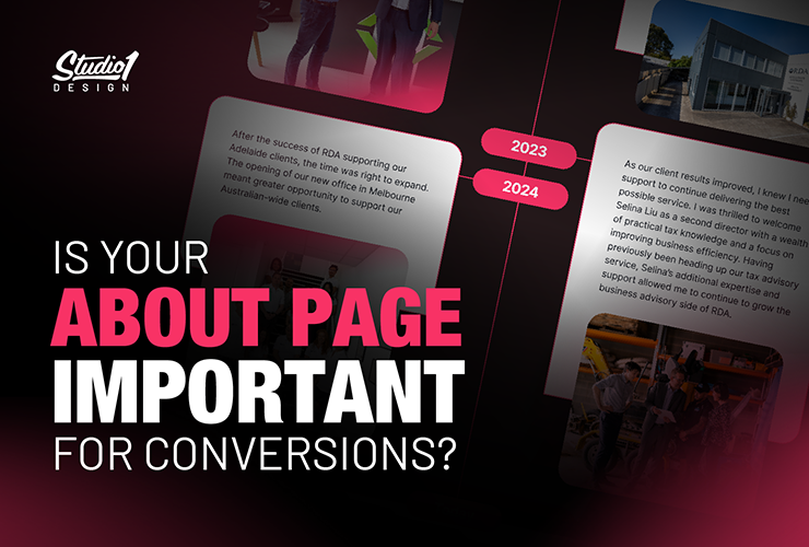
A timeline format applies the powerful storytelling magic of “once upon a time” to explain the journey of your business. It scrolls beautifully on mobile devices and can include trust-builders like customer logos, business awards, and achievements. Photos show you over time, adding authenticity.
Display your timeline with an image and a milestone for key steps in your journey that lead you to where you are today:
- First Milestone: The moment your passion began in your area of expertise.
- Following Milestones: Show your authority and credibility.
- Social proof and impact metrics
- Accreditations/achievements/awards
- Appearances in media and events
- Personal challenges overcome
- Final Milestone: Your new website release or subsequent achievement, followed by a Call-To-Action.
5 Awesome About Page Designs:
- WareLandscaping.com/about
- MaximumLawyer.com/about
- LearnJazzStandards.com/about
- DreamEngine.com.au/about
- TCBPodcast.com/about
… and check out our about page here > Studio1Design.com/about
Further Sections:
After your timeline, feel free to add the following sections if relevant:
- Team Overview
- More social proof
- Location information
End with a Call-To-Action
Finish with a Call-To-Action section to give people a ‘free’ next step that you want them to take.
Your Design Matters
Your About page design needs to have clearly defined sections for visitors to scan, so they can read a section that grabs their interest. To be engaging, the design will need to be professional, with visual elements throughout. Make sure it looks good on mobile and loads quickly.
People Do Business with People
People want to do business with experts they can trust to deliver the solutions they promise. Be sure your About page clearly portrays you and your values to your customers – in terms of their needs.
Make it Easy To Find
Make your About page easy to find on your website – put it first on your website’s top navigation, and have links to it on a section low down on your home page.
Evaluate Your About Page
Have an honest look at your current About page. If it’s bland and boring looking, consider following the advice in this article, including adding a timeline. It could be the missing piece to build trust in your brand, and boost your conversions.
If you need help improving your About page, we’d love to help. Feel free to book a no-obligation Zoom call here.
