Social media is about engaging potential customers and bringing them to your website. (Not the other way around). First, you put great content on your website then link your social media activity TO the content on your website. (And of course, only release the best content on your website.)
Once visitors arrive on your website, the quality of its design has a lot to do with turning hits into action. Your website must look good – but that’s not enough. An awesome look doesn’t guarantee that your visitors stay and engage.
Successful website design helps to CONVERT visitors into action-takers. Once you’ve got a visitor to your site, make sure the design will keep them there and invite them deeper.
Here are some design tips to make the most of the traffic that reaches your website.
Overall Design
Make sure your layout and hierarchy are top-notch, as well as your content. Investigate whether the color and images you’re using are stylish and purposeful. This way, when you send in traffic from a blog post or podcast, you’ll make the most of that traffic.
Keep your web pages clean and free of too many offers and clutter. Try to simplify each page and delete anything that’s not relevant to that page.
Make sure you have a lot of clear space around your offers. This draws more attention to your offer.
You want your visitors to be able to work out what your web page is all about within a few seconds, because if they can’t work it out there’s a high chance that they will leave your site and won’t return. So make it easy for them!!
Don’t burn your SEO investment
Not only have you lost visitors if they leave without browsing (bouncing) – your SEO rankings will suffer. Google measures your bounce rate, and if it’s high it will think that your site isn’t relevant.
If your bounce rate increases, your ranking will decrease as Google pushes your site further down the organic search list.
Screen Layout
Your visitors read their screens in an “F” pattern, so make the most of this basic of human physiology by:
• Putting your logo branding top left.
• Putting your best-converting offer above the fold (near the top navigation area or on a side bar that’s prominent at top-of-page).
• Put your best offer in a floating side-bar, so that as you scroll down a page it will stay static at the side of the page.
• Use a left hand side bar. Studies show that a left hand side bar converts higher than right hand side bar. (Personally I don’t like the look of a left side bar.)
• Make sure you have trust-building content including social proof and credibility elements.
What’s the color of your product or service?
Use the color that evokes the right emotion for your target audience – the emotion that they’ll experience as a result of what you deliver. Big brands choose colors because it’s a reflection of what their brand stands for. For example:
• Cadbury, Hallmark = Purple (Luxury, Sophistication).
• Coke, Ferrari = Red (Energy, courage, strength).
• Fanta, Nickelodeon = Orange (Fun, playful).
• Facebook, American Express = Blue (Trustworthy).
• Greenpeace, BP = Green (Natural, Earthy, Friendly).
• Apple, Mercedes, Rolex = Silver (Neutral, Calm, Classy).
Less is more – use a limited color palette
Keep it simple and stylish – a simple color palette is much more memorable than something full of noise.
Keep the focus on the call to action
Way too many websites make the mistake of having an obscure call to action. You want to make it VERY clear what you want visitors to do – by having the call to action in a contrast color to the rest of the site.
Make sure there’s plenty of clear space AROUND your call to action, so that it stands out.
Images
The images you use in your content and on your website are powerful. Make sure you’re tapping into that power.
Use images that are relevant to your target market.
Use large images where possible for maximum impact.
The name of the game is the difference, so try to avoid being like everybody else. Avoid cheesy stock images and visual clichés that don’t say much – like anonymous models pretending to be businesspeople shaking hands.
Invest in quality design for your blog posts images. These are the first contact you’ll make with many of your prospects – they have the potential to grab social media users and make them stop and look at your content. Bland, mass-produced images can make your best content almost invisible.
If you’re building a personal brand then invest in a professional photoshoot and get some photos of yourself that truly and positively represent you and your personality.
Your website needs to start a conversation with your visitors
Use live chat, put your phone number on your site, make it easy for them to contact you!
You should have a sales funnel on your website even if it’s as basic as this one…Example:
- Send traffic from social platforms or email to…
- Quality content on your site (Your blog posts.)
- That leads them to a FREE OFFER (LEAD MAGNET or SURVEY)
- That leads to a thank you page, with a video of you saying thanks and then lead people into the next step of your funnel
- That could be a free strategy session. Free trial, Free Webinar, Free event, etc.
The purpose is to take people from a cold lead to a warm lead, to a hot lead, and ultimately to a client!
Have as much social proof as possible on every page of your website
Social proof is your clients/customers letting people know how good your products and services are, instead of you saying how good you are!
Social proof can be in the form of videos or images, case studies. Use numbers, like the amount of customers, amount of fans, amount of projects completed this month, etc
Have credibility elements on the page above the fold, this could be icons of your client’s business logo or places you have been featured in or as seen in, etc. Keep them greyed out so they don’t compete with your ‘Call To Action’.
Use a professional copywriter
A professional ‘website copywriter’ will make your website’s words appeal to your prospects because they understand that your prospects only care about ‘what’s in it for them. it’s not about YOU!! Most business owners write their own words and they will often make it about themselves instead of what you can do for your prospects.
Your website visitors are skeptical and they subconsciously ask themselves things like…
- Do you have a SOLUTION to my problem?
- How will I BENEFIT from your offer?
- Do you have PROOF that your solution works?
- Are you CREDIBLE and TRUSTWORTHY?
- Who am I buying from and do I like you?
- Where are you based and how can I CONTACT you quickly?
- HOW MUCH is your offer?
Summary…
All of the elements above need to be designed in a way that has the right hierarchy and emphasis on the right things so that the elements don’t compete with each other. They need to work in harmony with each other and be designed around the main purpose of the website and to appeal to your target audience to psychologically influence your visitors to take action. If you leave it to an amateur designer, you risk your visitors not taking you seriously and not trusting you!
- Test everything!! A website is never complete and can always be improved and should evolve as your business evolves.
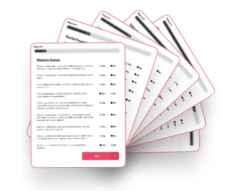
How well does your website design shape up?
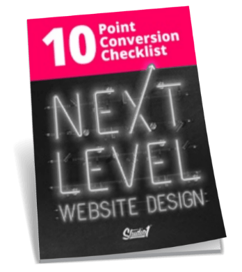
Have a look at it right now – be honest – are your visitors taking action? Are they engaged or enticed to take the next step? If not reach out to us here at Studio 1 Design. We’d love to help you =)
