Think of your website as an evolution just like your business is.
The human race, a country, an industry, a product or service, etc, and your business all need to keep evolving to survive. Your website is no different. It needs to evolve, improve, and be adjusted to meet your market’s needs, which also keep evolving.
There’s only one thing that’s guaranteed in business and that is ‘change’.
First impressions of a business are almost always design-related.
The look and feel of your website is usually the main driver of first impressions of your business because it’s the first place where people go to check you out. So it makes good business sense to keep it fresh in the eyes of your visitors.
Bad design or dated design can hurt your business because it can lower the perception of your brand in the eyes of your website visitors.
So if you regularly update your website design and content, you are far more likely to convert your visitors into new leads and sales because your visitors will be more likely to think that you’re at the forefront of your niche.
The beauty of a website is that it’s digital. It’s not set in stone. It’s not printed in ink. It can evolve over time as your business evolves and pivots, as most businesses do.
What to Test When Updating Your Website
If you have recently updated your website with a major redesign and you have noticed that your new leads & sales have dipped as a result. Relax. It can be quite normal for a dip to happen when you update your website.
Usually, it’s just because Google’s search algorithm has to crawl your entire site again and re-index every page. Therefore a dip in traffic could be the main reason for a dip in new leads or sales.
If that’s the case, first make sure that your webmaster adds all the SEO juice that was on the previous site.
If the traffic hasn’t dipped yet conversions have then it may be the design, the messaging, or both.
Remember that if you change your entire website to a brand new website design and new copywriting, then your audience needs to change the way they interact with your website.
Knowing what your audience thinks of that change can allow you to make necessary adjustments if your conversions are down.
There could be many reasons why conversions are down, but instead of guessing what those reasons could be, first, make sure you look at the following…
● Is the traffic still the same volume or has it dropped off?
● Is the traffic still the same volume on mobile?
● Is the site slower than the previous version due to slow hosting?
● Do you have heat maps that you can study for the main pages?
● Do you have videos of your visitors that you can study?
● Has the site been performing worse across all web browsers and devices or just a few?
● Do you have data on all of the above to compare the previous design to the new design?
We use a tool called HotJar.com to gather the user insights above. There’s a free version and a paid version). Just by watching a few videos of your website’s visitors, you can see how they are interacting with your website.
Pair that with studying your Google Analytics bounce rate for each page and you will start to form a hypothesis to work out what’s going on.
You can also use a service called: UserTesting.com to have real humans use your website and give you live feedback.
Keep monitoring the quantitative data and qualitative insights and tweak where needed and it will keep improving over time.
Pro tip: HotJar is also good for collecting qualitative insights by adding these two polls…
1. Put a poll on the success page after purchase and ask customers these two questions:
> How was your experience using our website?
> What nearly prevented you from purchasing from us?
2. Put a poll on the ‘checkout page before purchase and ask prospects this question:
> Is there anything stopping you from making a purchase?
Your website is never finished!
Your website has a purpose, whether that’s purchasing a product or service, registering for an event, or taking you up on your free offer, etc. If it’s not serving that purpose then something has to change.
Steve Krug, Author of “Don’t Make Me Think,” says that usability means “making sure that something works well: that a person of average (or even below average) ability and experience can use the thing.”
Everything needs to be obvious to your website user, including…
● Your messaging needs to be easy to understand and show how your target audience will benefit from your website.
● Your top navigation should be minimal and logical. Don’t reinvent the wheel here!
● Your forms should request just the right amount of info and nothing more.
● Your landing pages should be well-written and designed to appeal to your audience to show how you can solve their problems.
● Remove all distractions from each page that add to the confusion or add multiple choices unnecessarily.
● The look and feel should be consistent, including having only one ‘Call To Action’ color.
Websites need to be intuitive: if your visitors feel like they’re solving a puzzle then they are more likely to leave your site.\
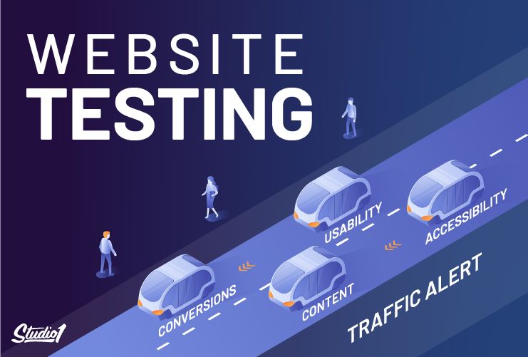
There are more kinds of testing that should also be considered, including:
1. Interface Testing
Your site design is the first thing that affects a visitor’s decision to stay or leave your website. Hopefully, your website is built responsively, however, it’s not always the case. Here are some questions to answer during interface testing:
● Does the website look good on different mobile devices?
● Does the website look good on different screen sizes?
● Does the website look good on different browsers?
● If the website has localized versions, are the translations accurate?
2. Speed Performance Testing
Speed Performance testing ensures that the website will still run fast in different situations. Here are some considerations during performance testing:
● What is the average page load speed on various screen sizes, browsers, and mobile devices?
● How does website application loading fare under different connection speeds? At different peak loads?
● Stress test the website under extreme loads to see what its breaking point is. See how the site recovers under this circumstance.
3. Security Testing
You and your customer’s data should always be secure. Security testing needs to be done periodically to ensure that your website is protected from third-party attacks.
● Ensure that no unauthorized access can be made to secure pages. Sensitive files should not be made downloadable.
● Sessions should be automatically killed after prolonged activity and/or inactivity.
● Your website and payment transactions should all be secured by using HTTPS. Using SSL helps to encrypt the information so that the card details and all other sensitive data are protected. Having a secure website also makes customers more willing to buy.
4. A/B Testing
A/B Testing (also known as split testing) compares two versions of a webpage against each other to see which one performs better in achieving a conversion goal.
In A/B Testing, half your traffic should randomly see the original version of a page while the other half sees the modified version.
A/B testing works best when testing one change at a time instead of many changes at once. This helps you pinpoint which changes affected the results.
Every time you make changes to your website, test the user’s behavior and your analytics…
Interface, performance, and security testing should be scheduled regularly so you’re sure they’re in tip-top shape.
Here are a few more testing tools you can use…
● GTmetrix is a free tool that analyzes your page’s speed performance. Using PageSpeed and YSlow, GTmetrix generates scores for your pages and offers and then suggests recommendations for better optimization.
● Dead Link Checker checks for broken links on your website with their free online tool. Keep your website fresh and boost your SEO.
● Mobile-Friendly Test by Google determines if your website is optimized for mobile devices, as well as provides suggestions for fixing any issues.
Your website will always change so make sure you keep testing it and monitoring the results
The more you test, then tweak, then test, and keep tweaking, the more it will become a well-oiled high-performance website.
If you need help turning your website into a high-performance machine, we’d love to help you. Just click on the GET A QUOTE NOW button below…
