The world of web design is fast-moving, new and exciting concepts, techniques, and tools are constantly being introduced. Trends in web design, like fashion trends, come and go and it can be hard to keep up to date in the face of ever-changing trends and developments and equally hard to understand which ones to implement.
It’s important to understand that more than ever before, everything in website design, from content to navigation, to imagery, first and foremost must serve a clear purpose and be driven by your desired end result. No design decision should be motivated by a statement like “because it looks cool”. Successful website design helps solve problems and influences people to take action.
When considering new trends to implement it must reflect your brand, suit your target demographics, and above all convert. Keeping your website design updated with the latest trends gives you the best chance of converting more traffic into new leads and paying customers.
Your prospects are more likely to take you seriously and will think your relevant if your website is up to date. We see too many websites that are outdated within a couple of years and if your website is outdated you risk your prospects not taking you seriously.
Below are some of the hottest website design trends to consider in 2017 which is shaping up to be the year of authenticity, creativity, and carefully considered user experience.
Full-Screen Video
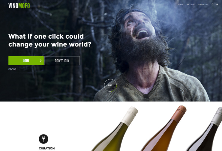
Video is already big, but in 2017 it will be huge. Large quality videos are a powerful way to create an engaging visual experience on your website. Video is a versatile, easy to consume medium, useful for story-telling, and provides a better sense of whatever the user is planning to use, buy or learn.
Consider how this works on your website and for your brand. If it is used in your main banner area make sure you have a compelling first frame and call to action. Animate play buttons to attract attention but avoid autoplay and video backgrounds as they can be conversion killers.
Authentic, Immersive Photography
Vision is the strongest human sense and one of the best ways to capture a user’s attention is with a large striking image. High-quality big visuals will dominate imagery used on websites in 2017 but the main trend will be towards authenticity.
Stock imagery can make websites look cheesy and just like everybody else’s. Customers and prospects seek authenticity from the brands they follow or purchase from.
To strike a connection with your audience, images need to be carefully considered and need to be tailored to resonate with your audience. Featuring HD original images with a compelling call to action will increase conversions.
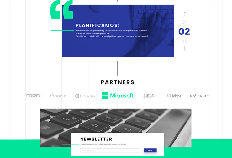
Subtle Animation
In 2017 there will be more focus on clever subtle animations as another way to capture attention. Implemented in the right way, you can bring your website to life by accenting important interactions and ultimately bringing your images and illustrations to the next level.
Animations techniques range from spinners, hover tools, loading bars, and larger-scale full-screen animations. Be original in your approach to communicating with animation and consider carefully whether it adds to the user experience or creates a conversion-killing distraction.
Custom Illustration and Iconography
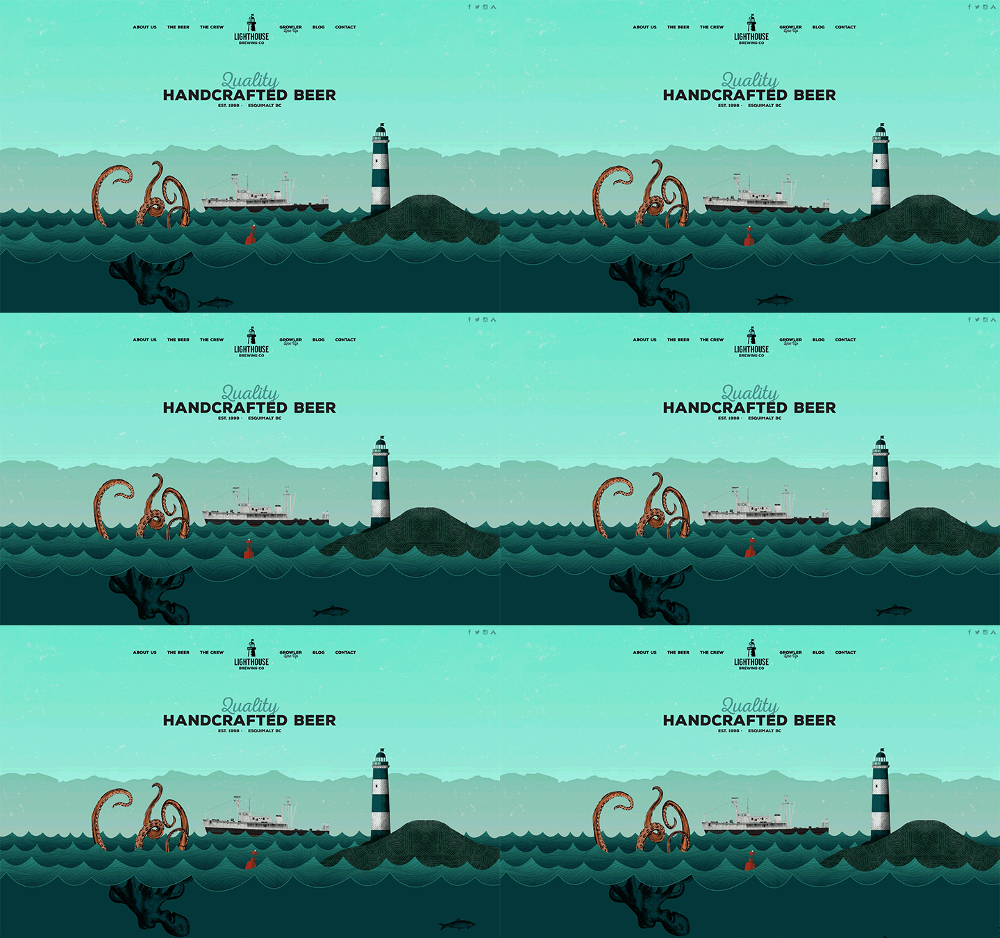
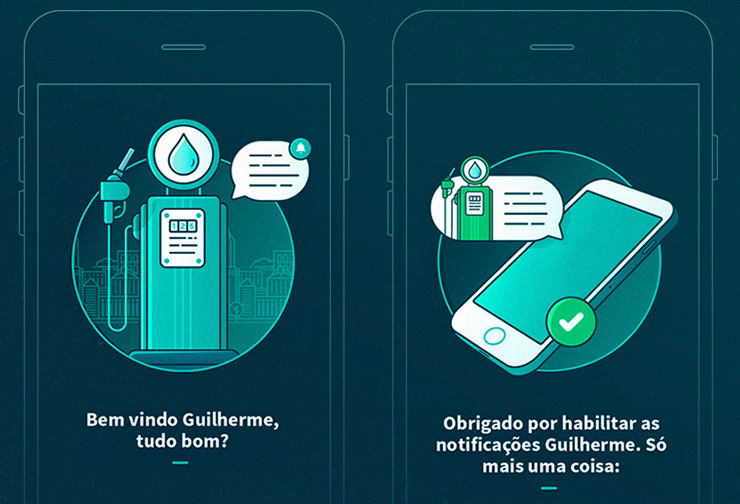
Illustrated images and icons are great for adding a more human element to website design and a unique way to tell your story.
As with photographic imagery, the focus in 2017 will be on creating bespoke custom illustrations. Website design will need to implement thoughtful and creative custom-made illustrations to differentiate themselves from their competition and enhance their brands’ identity.
Big, Bold & Creative Typography
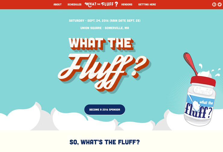
In 2017 expect to see an increase in oversized, beautiful, unique typography and lots of dynamic text and image layering working in tandem.
Combining font sizes can have a huge impact on the look and organization of content on a page and large, bold fonts emphasize the primary messaging of a page.
Custom typefaces are a clever way to set you apart from the competition and highlight your brands’ uniqueness. Play with colors, spacing, combining it with your images, and mixing different fonts. Be careful to not go overboard, too many typefaces can create a confusing message and affects readability.
Bold Color Combinations
In 2017 we are set to see more experimentation with attention-grabbing over-saturation, vibrant hues, and unexpected color combinations. The bright displays of monitors, tablets, and smartphone screens allow for richer vivid color palettes.
These eye-popping colors are used in full-screen imagery, backgrounds, and design elements. There’s is an art to using vibrant color schemes effectively, don’t go overboard, and make sure that your choices are in line with your brands’ visual identity.
Card Layouts
Cards or content containers are a super versatile and great way to organize and display large amounts of data in manageable, easy-to-consume chunks. Card design ties nicely with the mobile-first design and responsive design.
Designed well cards help the user to navigate to what they want to view first. In 2017 card container layouts with using more color to help elements like buttons and navigation jump out from a page, subtle animations, and video.
Angled Split Screens & Design Elements
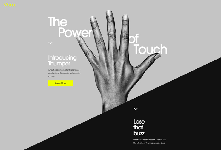
Websites are generally made up of a series of square blocks but in 2017 another creative way to break these traditional grids is with angled split screens and design elements.
This is a fresh way to design your website pages if you have two primary messages of equal importance and hierarchy. Diagonal lines are also eye-catching, leading the eye naturally to further content. For a cohesive design add diagonal lines to other design elements throughout your website.
Broken Grid Layouts/ Overlapping Elements
In 2017 website will start experimenting with thinking outside the grid. Symmetrical websites may be beautiful in their simplicity, but strict geometry can also be confining.
Broken grids are a way to loosen up the layout. In order not to interfere with the responsiveness and conversions of your website this can be introduced subtly with the simple overlapping of images, cards, and fonts. Broken grids can add depth and motion keeping the user engaged.
Full-Screen Opt-ins ‘Welcome Mats’
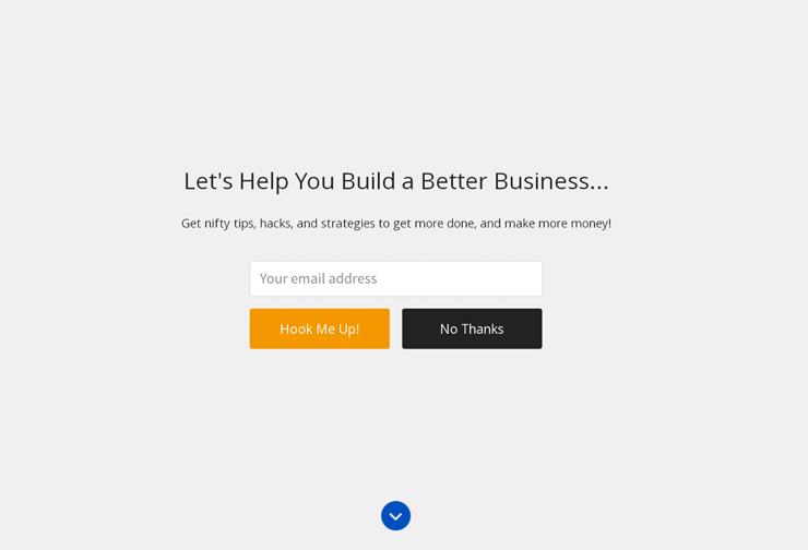
In 2017 traditional opt-in popups are fading out and being replaced with a much more user-friendly full-screen option.
Opt-in pop-ups can interrupt the flow of your prospects’ experience on your website. The new full-screen design fills the whole screen and moves the content down providing your prospect with the option to scroll on or fill out the form.

Cinemagraphs
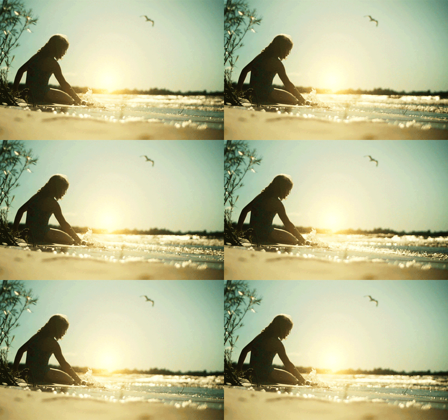
As mentioned earlier background videos can be conversion killers but there is an alternative way to add movement and capture user attention in a subtle way with cinemagraphs.
Cinemagraph is a technique of blending the effects of images and videos. The subtle repeated motion of a cinemagraph draws immediate attention to what may have first appeared to be a static image and will easily promote engagement with your prospects.
Microinteractions
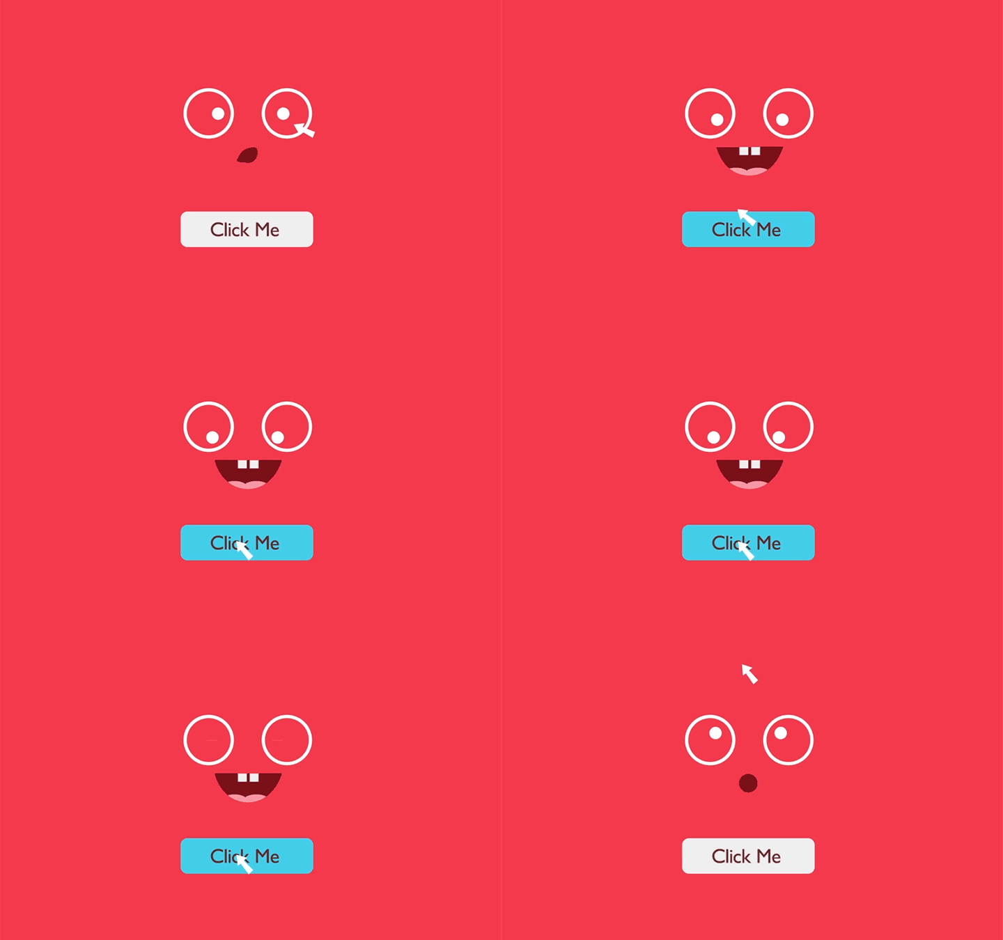
Motion design can effectively guide your prospects on your website in ways that both inform and promote action.
These simple moments of engagement are called micro-interactions and are single-action tasks. They enhance prospects’ experience, provide important feedback, explain functions and entertain.
Examples include adjusting the volume on a music player, turning a feature on or off, adjusting a setting, innovative hovering for zoom-in, or completing a task. Simple and easy-to-use micro-interactions are the key to success, keep human error in mind (and how you can prevent it).
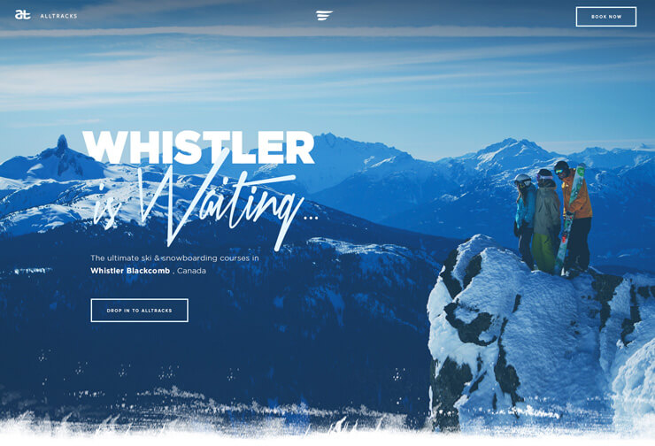
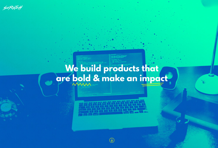
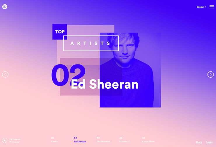
Duotone Images
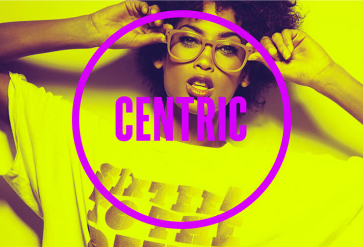
Duotone is an effect that uses 2 colors over a photo to create a striking, fun, and unique finish to imagery.
The aim of duotone is to create an image that demands attention with plenty of contrast for the image to show through. 2017 duotones will be brightly colored or using clashing color combinations.
Color Gradients
Website design has been dominated by flat colors for some time and gradient color has been slowly emerging as a design trend to provide more color impact to flat design.
In 2017 the rise of the gradient continues to grow. There aren’t any distinctive rules to the use of color gradients, from backgrounds to image overlays to subtle textures in elements and typography.
Some gradients are subtle, others are extremely vibrant; either way, gradients are a fun new way to spice up your designs.
Chat Bots
Conversation makes for a much easier experience. Prospects want quick responses and instant services, so in 2017 consumers will no longer have to trawl through websites and search engines to find the information they need with the rise of chatbots.
The chatbot’s goal is to make your prospect’s life easier and provide quality customer service.
VR (Virtual Reality) Websites
VR (Virtual Reality) websites VR (virtual reality) websites give a real-time experience of augmented and virtual reality to the consumers.
VR websites allow prospects to fully immerse themselves in a product or experience without leaving their home.
360-degree videos allow prospects to experience destinations and augmented reality can allow consumers to try products.
VR is in its early stages and is expensive, bulky, and sluggish at this time but as the rate of adoption rises, the hardware will get cheaper, smaller, and faster
Is your website feeling old after reading this post? If you’re looking for a website refresh to stay ahead of your competition in 2017, enquire here so we can learn more about your business.
