Have you ever noticed that when you’re about to purchase something online, you have an internal battle in your mind – should you or shouldn’t you purchase that product or service?
There are a lot of thoughts and questions that help you decide if you should make a purchase or not…
You wonder if the price is good value. Can you get it cheaper somewhere else? If you can get it cheaper somewhere else, will it be the quality be inferior? Do you trust the website you’re purchasing from? What if you don’t like the product or service when you do receive it? Is there a guarantee? Can you get a refund? What do previous customers say about the product or service? What if it doesn’t arrive when promised, or even worse, what if the product or service doesn’t solve your problem?
Your website visitors have the same internal battle in deciding if they should purchase from your website or not.
If you are selling products or services online, it’s important to know what truly influences and truly motivates website visitors to buy from you.
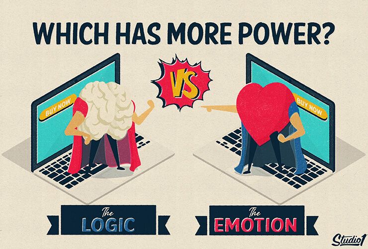
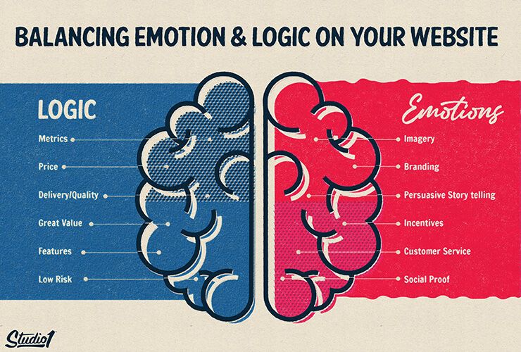
Which has more power – emotion or logic?
Emotions can be powerful. Emotions drive our decisions and actions.
They affect everything we do, including who we spend time with, what we eat, and what we purchase.
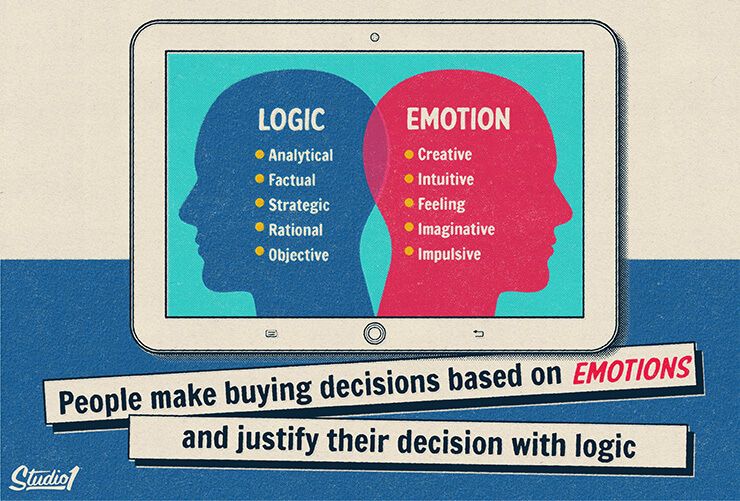
We justify our emotions with logic when making a purchasing decision. The question is when emotion and logic are face-to-face, which one has the final say?
A study by Harvard professor Gerlad Zaltman revealed that 95% of buying decisions are based on the customers’ subconscious.
The emotional part of the brain is so powerful that it often overrides our logical thinking.
In Australia, properties are usually sold via an auction, where multiple buyers compete for the highest bid. In a hot market, the highest bidder always pays more than they planned on paying because their emotions at the time were running high. They can see themselves living in the property. They will finally be settled if they get that property. They don’t want to start all over again searching for another perfect property.
At the time of bidding, they think there may not be another perfect property, and they have FOMO, so they bid again and again. Just one more bid and it’s theirs! However, they paid a lot more than what they wanted to pay!
Then after the purchase, they often justify it with logic. They say even if the market dips soon, the property value will still be worth more in a few years, so it was worth paying a bit more to secure the property. (And they are right =)
When selling products or services on websites, there isn’t usually an urgency or competitors like there is at an auction, so keep reading to discover how to tap into people’s emotions and logic.
When somebody is about to purchase from your website, their emotions significantly impact their purchasing decision and they often find a logical reason that convinces them to “Order Now”.
ThinkWithGoogle ran a study that shows 82% of customers research before purchasing physical products online. The same study shows that 30% of last-minute shoppers compared the delivery times of online stores before deciding on who to buy from.
This means that logical factors, like shipping information, the return policy, guarantees, terms & conditions, are just as crucial for conversions, as great design that uses psychological drivers and persuasive copywriting that taps into their emotions.
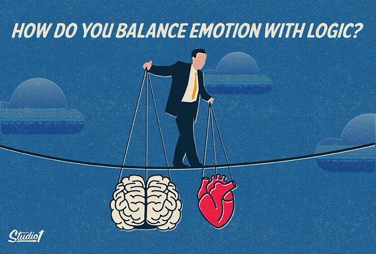
How do you balance emotion with logic?
When it comes to finding the perfect balance between emotion and logic on your website, there’s not a one-size-fits-all approach.
Knowing when and how to use logic and emotion on your website is like a recipe. You need to know the right ingredients and balance, to get the result you want.
From physical products, high-ticket services, events, memberships & courses – no matter what you are selling online, with the right ratio of logic and emotion for your brand, your offers can sell like hotcakes!
To achieve great results, first, you need to know what truly motivates and inspires your audience, so you can find your perfect combo and get the results you want.
Here is a guide to help you determine the right balance for your website…
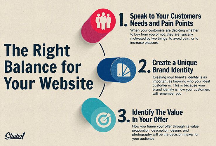
1. Speak to Your Customers’ Needs and Pain Points
When your customers are deciding whether to buy from you or not, they are typically motivated by two things: to avoid pain, or to increase pleasure. As a business owner, you have the choice to positively motivate them, or use the negative angle instead.
It can be tempting to focus only on positive emotions, however, it can be more effective to negatively incentivize people. Everyone wants to avoid pain, right? More people will spend money on painkillers vs. Vitamins.
Which of these headlines makes you want to read more?
- What you should never eat on a long flight
- What you should eat on a long flight
The first headline is more powerful because it taps into the emotion of avoiding pain and makes you curious as to which food you really should consider avoiding. Nobody wants to have pain on a long flight.
Avoiding pain is a feeling you get that’s derived from your previous schemas, circumstances, mood, or relationships with others.
What motivates your audience also depends partly on their age group.
For older audiences, having a positive approach can be more effective, while the younger whippersnappers can be more driven by negative influences.
Articles headlines that have negative superlatives (e.g. worst, slowest, most difficult) usually have a higher click-through rate (CTR) than those with positive superlatives (e.g. best, greatest, most amazing).
That doesn’t mean that your marketing messaging needs to be negative though. Website headlines usually perform better if they clearly describe the positive big promise, as the solution to a problem.
If you can understand who your ideal customer is, what they desire, and what they fear or are most threatened by right now, your website should effectively speak to those key motivators with the right tone that resonates with your audience to maximize your conversions.
The new website design of 3 Clicks reflects an understanding of their customer – someone who’d buy based primarily on logic first.
As a B2B company, they’re speaking to target buyers who have their company’s bottom line to consider, so their landing page focuses first and foremost on hard facts, like their traction and performance metrics to date.
Immediately below, they address the emotional side of their customers by speaking directly to their pain points in a bulleted list.
This shows they understand the problems their prospects face and sets the stage for explaining how 3 Clicks can provide a solution.
2. Create a Unique Brand Identity
Creating your brand’s identity is as important as knowing who your ideal customer is. This is because your brand identity is how your customers will remember you, and it will be a key reason why they’ll choose you over your competition.
Discover how to create your brand identity in our detailed article here.
By having a unique brand identity, you’ll be more memorable, which means you will be the first brand that your prospect will remember when they are ready to purchase what you offer.
You’ll also be able to build trust more easily because having a strong brand identity lets your audience feel as though you understand them.
So it’s important to use a color palette and images to appeal to your target market, and to have credibility-boosting elements throughout with psychological persuasive drivers with the right visual hierarchy to entice your visitors to take action. (Opt-in &/or buy, get started, etc.)
Want to see this in action?
Wonder Paws offers supplements for dogs, and they have a unique image of being an approachable, upbeat brand. Their branding is reflected in their website design with the use of cool but lively colors, a memorable image of a dog in a cape, and the use of fun words, such as “superpower,” which stick in visitors’ minds.
All of these elements appeal to the emotional aspect of a buyer’s decision-making process and are tailored specifically to appeal to pet owners who adore their furry friends – in other words, Wonder Paws’ ideal customer.
At the same time, they balance their website design with factual information by adding their NACS-certified accreditation and using terms like “clinically studied ingredients” to further develop the image that they’re a trustworthy brand. This appeals to the logical side of the purchasing decision.
Tip: Don’t copy your competitors, even if you think they are very successful. It’s tempting to be safe and be just like your competitors, however, if you’re just like your competitors, then you won’t be memorable. You must have a point of difference to give people a reason to buy from your business on an emotional level and logical level.
3. Identify The Value In Your Offer
Now that you’ve worked on your ideal customer and your brand, it’s time to work on your offer. How you frame your offer through its value proposition, description, design, and photography (among many other things) will be the deal-breaker or decision-maker for your audience.
That means your offer should have a clear, unique value proposition that benefits your customer. How you present that value to them on your website needs to be appealing to both emotion and logic.
For example, one way of appealing to your visitors’ logic is to list your product features, whereas you can appeal to their emotions by talking about how your offer will benefit your audience.
Features are the things that your product can do and can be technical. These are what will matter most to buyers who are motivated primarily by logic. They might be interested primarily in specs, like the performance capabilities of your product compared to competitors, so listing features like these will help motivate them to convert.
On the other hand, your offers’ benefits are the positive impact that the customer will experience in their own life after purchasing your product or service. For example, you could highlight the fact that your product will help them save time, feel healthier, or enjoy a better quality of life. All of these are emotional triggers that give visitors a positive incentive to purchase your offer.
By identifying the key features and benefits of each of your products, you can already begin to see whether you should focus more on emotion or logic when designing the product pages of your website.
A great example that’s able to find the balance is SaxSchoolOnline.com. It appeals to the visitors’ emotions by telling them exactly what benefits they can expect from each course – like helping them play their favorite songs.
It also provides practical information on what’s covered in each syllabus and displays current metrics to establish them as a trusted brand, so it effectively appeals to visitors’ logic as well.
Balancing Emotion & Logic on Your Website
Once you understand your customer, your brand identity, and the unique value of your offer, then it’s time to apply it to your website, but where do you start?
If you know the biggest pain point for your audience, lead by letting them know that you have a solution to that problem. That could be something that appeals to their emotions or logic.
Then it’s best to display social proof or impact metrics that prove your offer has helped others. People turn to others to see if you’re telling the truth, and to see why they should choose you.
All of the above should be as close to the top of the page as possible so that within a few seconds people will be enticed to discover more about your offer.
As for the rest of the page, there are many variables to consider and every offer will need to be thought through thoroughly based on understanding your audience, and what resonates with them.
Choosing a web design company that understands the strategy behind your website is key.
A high-performing website needs to be designed and written in a way to appeal to your ideal customer, however, it also needs to take into consideration where your audience is at in the buying cycle. They may be ready to buy now, or they may just looking for information. So your website needs to be thought through with a strategy to meet the current emotional and logical needs of your website visitors.
Here’s how we design a website to give you the best chance of boosting your results…
- We make sure you have a strategy that leads with value, has helpful content, and showcases your authority.
- We make sure you lead with value, have helpful content and we showcase your authority.
- We make sure your message is persuasive, hooks people emotionally, explains clearly how you solve your prospect’s problems, both emotionally and logically.
- We position your customers as the hero and your business as their guide.
- We use credibility-boosting elements throughout the site with psychological persuasive drivers like social proof that help builds trust.
- We use a color palette and images to appeal to your target market, with a modern design layout that is clear & easy to navigate.
- We make sure the design has the right visual hierarchy to entice your visitors to take action. (Opt-in &/or buy, get started, etc.)
Our team at Studio1 Design has designed thousands of websites and landing pages for high-level marketers and brands to boost their results.
Check out our design case studies and the results our clients have achieved with a website designed by Studio1.
If you’re ready to have your website & brand transformed, without the big agency price tag, then we’d love to help. Press the button below for a quote…
