You have a great product, you have followers on social media, you have a website, so all that’s left is to sit back and watch the sales roll in, right?
Unfortunately, it’s not that easy!
The reality is that while shifts in the market have lead to more online sales, there is more competition in the marketplace, making it harder for you to stand out and compete on a global stage.
I have reviewed a lot of eCommerce websites and I see a recurring pattern of mistakes made, including these:
- Rotating image sliders on their home page
- No emotional hook to show how the product solves a problem.
- The messaging just focuses on the features, instead of showing the benefits too.
- They try to sell on hello instead of leading with value.
- The layout of the page just has product images, without showing people interacting with the products, so there is no emotional connection.
- The page layout doesn’t have enough words for Google to rank it!
- Not enough trust-building elements like social proof and credibility elements.
They are just some of the reasons why people don’t buy from some eCommerce websites.
One of the keys to have people buy from an eCommerce website is to build an email list and a community around your brand, then send offers to your list to bring them to your website to purchase.
To boost conversions on your website it takes a lot of effort, and it’s best to split test small changes so you know what works, plus you will want to:
- Let people know what makes your product different from your competitors.
- Display the benefits of your products and try to tap into their emotions with your copywriting.
- Prove that other people love your products (using influencer promotion, the imagery on your site, and displaying prominent social proof on your website)
- Give them a clear pathway to purchase your products and removing any distractions.
- Give visitors an easy and seamless purchasing experience, regardless of whether they are on a desktop or mobile device.
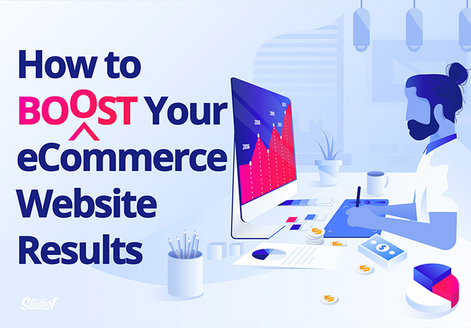
Check out this handy infographic with a bunch of tips that are designed to boost your eCommerce conversions…
Here are the tips in bullet for if you want to copy and paste them =)
Marketing:
- Survey your email list and nurture them with value first
- Don’t just sell to them. Offer value, blog posts, anything helpful.)
- Incentivize customers to give you testimonials.
- Run a competition to win more of your products
- Ask influencers to review your products and promote them
- Use story in your email marketing
- Send paid traffic to your best selling product landing pages
- Offer bundle packs, preferable with your best sellers
Site-wide
- Improve your messaging to have clarity and to talk to your ideal prospect’s pain-points
- Let people know the reasons they should buy from you (Why you’re different to your competitors, etc)
- Add a lead magnet to your website, like Join VIP Club, or a helpful PDF, etc
- Add trust logos like Quality Materials, Money Back Guarantee, Made In USA, etc
- Use other credibility boosting metrics, like years in business, customers helped, Social media fans, etc
- Use white or light background colors.
- Dark backgrounds are not good on a mobile
Product pages:
- Use professional photos of your products, preferably with people interacting.
- Display videos reviews of your products
- Improve your product page by showing the product benefits, not just features
- Make sure the CTA is above the fold
- CTA needs to be a contrast color
- Show the ‘was price’ and ‘you save $???’ on product description pages.
Checkout Pages:
- Improve your checkout pages by removing distractions
- Offer 2-3 payment options
- Offer an Up-sell for a limited time
- Add a live chat & phone number
- Use pre-populated field to show examples of what people should be typing
Mobile Conversion Tips:
- Replace images with flat color where possible, so it loads quickly
- Use a sticky nav hamburger menu
- Have a sticky Call To Action on product pages
- Use collapsed accordion menus for categories
- A ‘Click to Call’ button works best on mobile
If you have an eCommerce site that’s not converting and you’d like one of our world-class design directors to send you an in-depth, free video review of your website, let us know here. We’d love to help.
